.
On well-beaten tracks
unable to enjoy views
a dreary aisle seat
.
by Scooj
.
On well-beaten tracks
unable to enjoy views
a dreary aisle seat
.
by Scooj
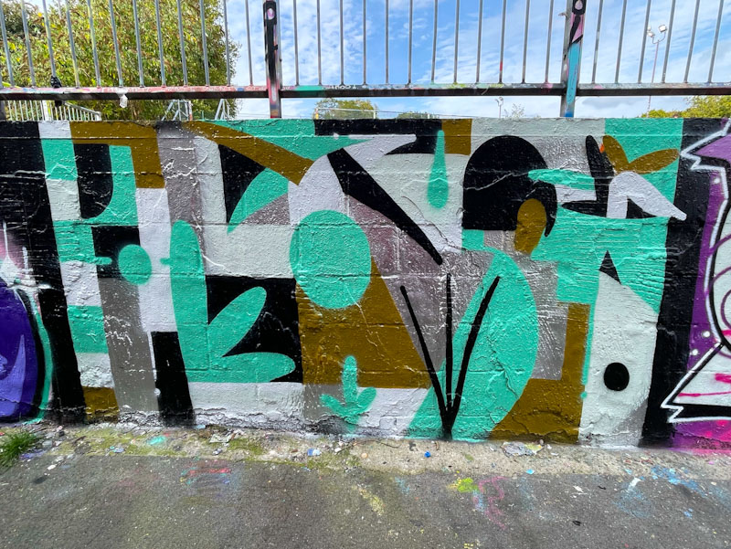
There are some street artists who simply don’t appear to want to be followed, or at least that is how it seems, and it might be for a number of legitimate reasons. The first time I managed to pin down a name for this artist, he called himself j9449j on Instagram, followed by @Dr3amc0re94 and @all_4_n0thing, and now I can’t find him at all. My protocol for attributing artwork to artists who constantly change their names is to go with the first name I used for them, other examples include Slim Pickings (TES) and Biers (WD40).
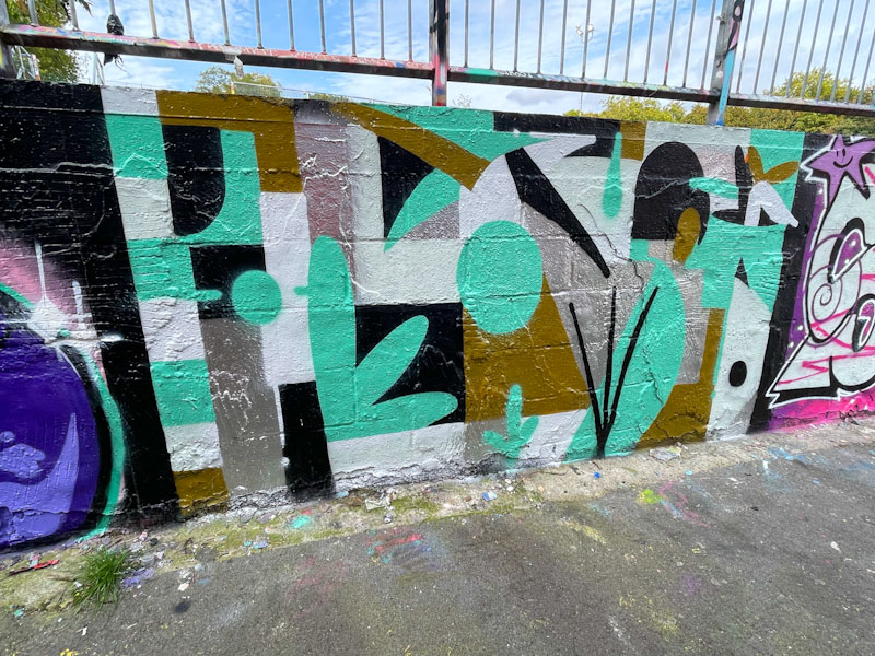
The design of this piece and the colour palette are exquisite, with the chrome and bronze working perfectly with the black, white and turquoise. The abstract design carries, as always, a reflection of natural elements, such as leaves and grass, a feature of j9449j’s work. An attractive piece that is easy on the eye.
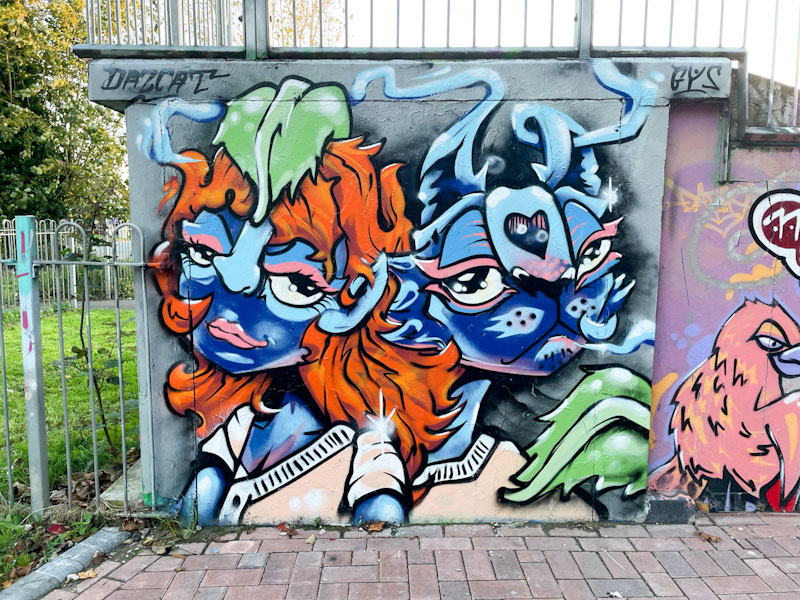
I don’t visit Horfield skate park all that often, maybe two or three times a year, as turnover tends to be very slow there, but there can sometimes be one or two surprises, and amongst them on my last visit was this beauty from Daz Cat.
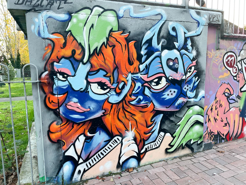
This double portrait piece featuring a fusion of Daz Cat’s cat and human forms is a feast for the eyes. The female on the left is more human (in spite of the blue skin) and the male on the right, more cat-like. Together they make a nice pair and demonstrate Daz Cat’s continual improvement.
.
Stop the clocks again
we remember and reflect
courage and duty
.
by Scooj
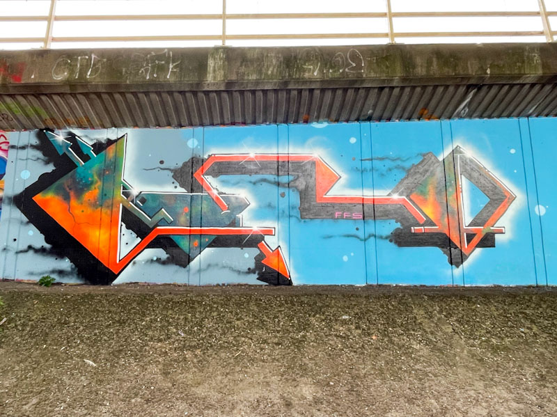
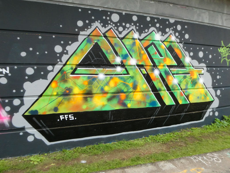
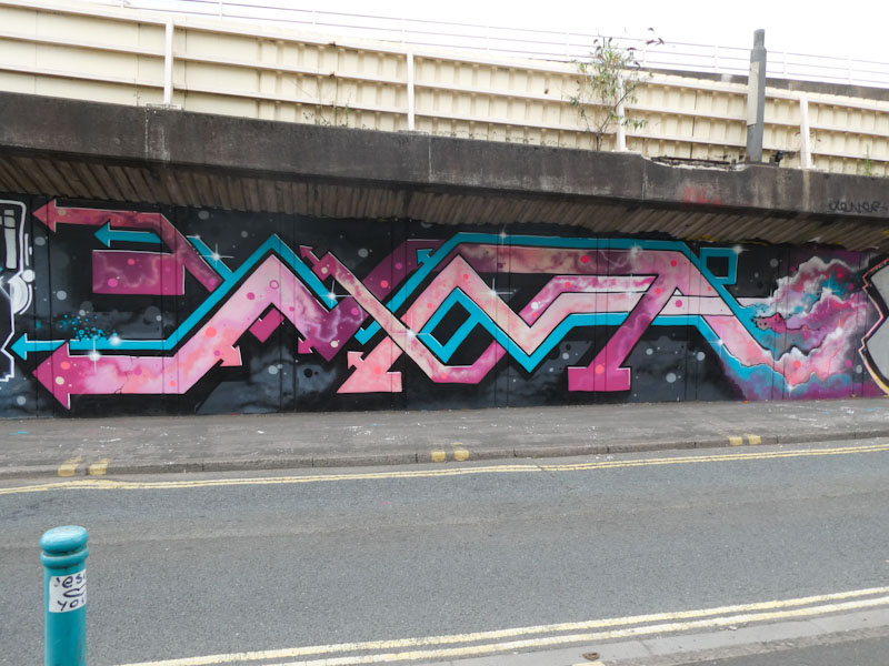
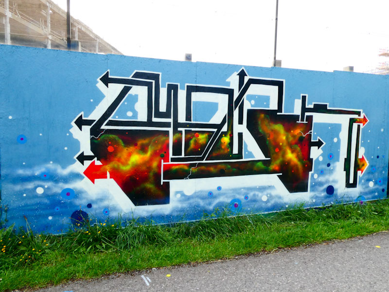
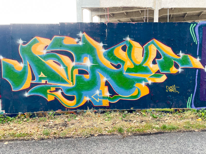
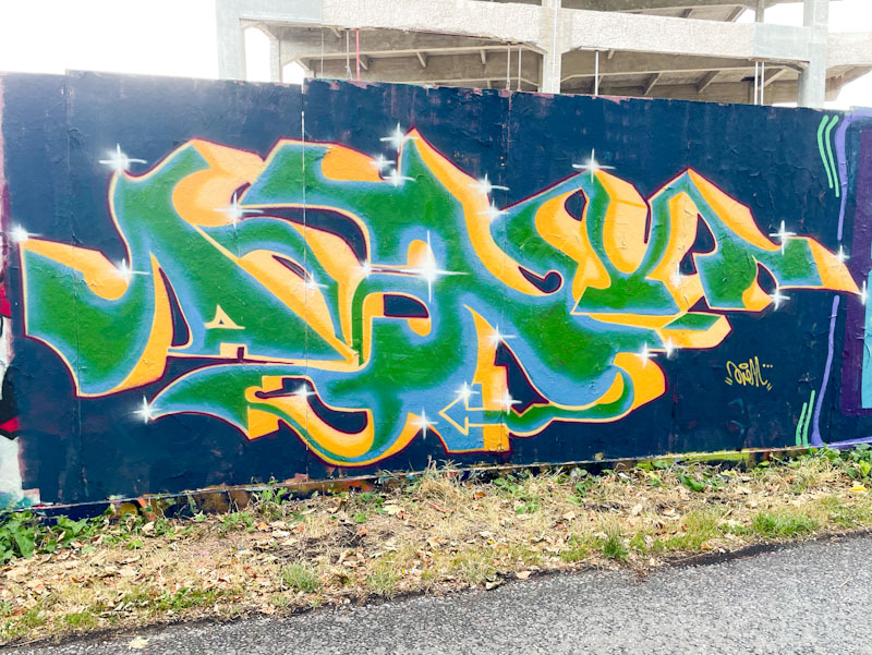
A gallery of outstanding cosmic abstract graffiti writing from Marckinetic.
Instagram: @marckinetic
All photographs by Scooj


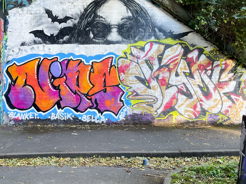
Although I have posted many pieces by Nips, I think that this is a first on Natural Adventures from Redeye, in spite of having dozens of his pieces in my archive. I perhaps ought to put that right. I believe that the artists might be partners, although they might simply be painting buddies. Redeye, on the right here, tends to write variants of the letters of his name and in this instance has written Ryde – not to be confused in any way with Ryder. His letters here are filled with a concoction of red, yellow and white in lovely patterns and formations, bound by a strong black line.
Nips presents her letters with growing confidence, and this piece is beautifully presented in all aspects. Her strength is in her variety of fills and here she brings together a superb blend of warm and comforting oranges and purples, including some subtle reversed out spots. The drop shadow and white border to enough to define the letters and the little white highlight lines add significant depth. A fine piece from Nips.
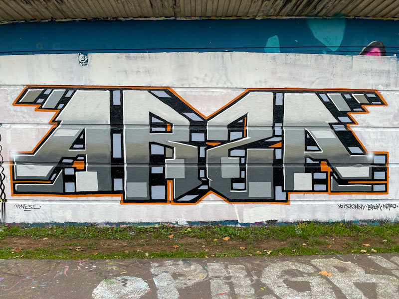
By now, regular readers will be getting quite familiar with the distinctive ARS(Z)A letters from Totosoapcity. This is a recent piece from the artist in one of his favoured spots, Cumberland Basin.
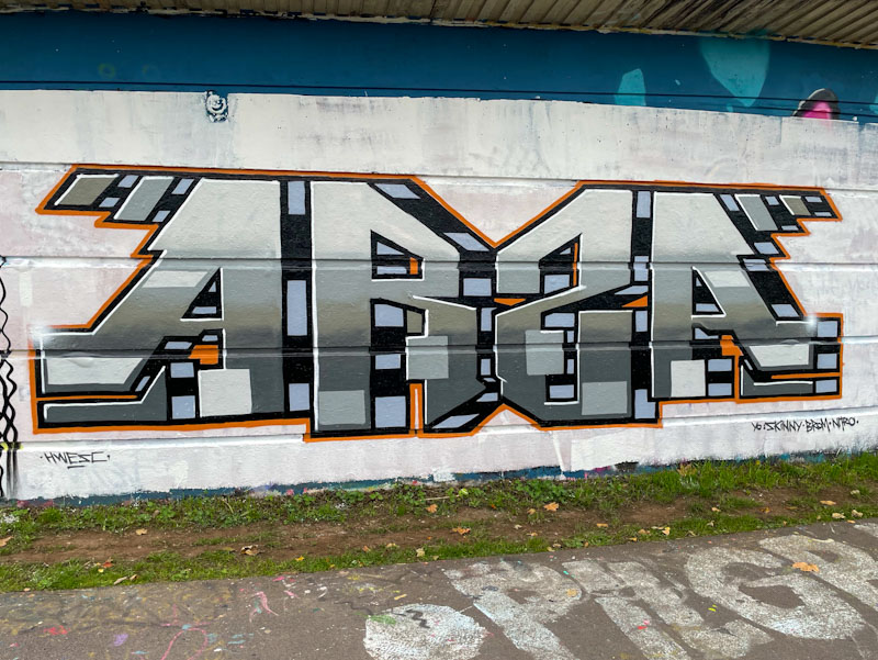
The letter shapes of Totosoapcity’s pieces remain broadly the same, so it is the decoration that we can focus on. In this piece, the skilful application of greys provide a metallic look to the piece which jumps out from the wall thanks to the stripy drop shadow. This symmetrical piece is assisted in its regular shape thanks to the indented lines on the wall, which so many writers make use of to keep proportions true. A nice piece.
.
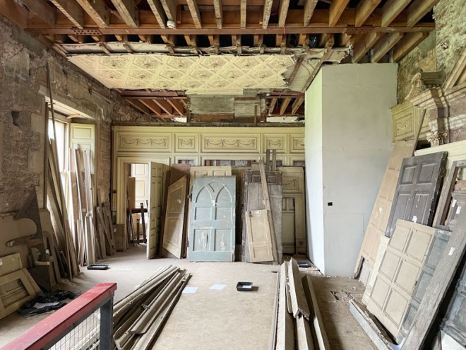
Dilapidated
Greville-Smyth family home
closed from public view
.
by Scooj

Even though Lis painted this piece well in advance of Halloween, such is my huge backlog of photographs, I am still several days late posting it, and I have loads of other Halloween pieces that I might just clear by Christmas.
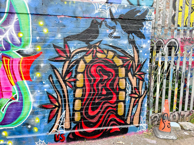
This piece reminds me of one she painted under the M32 as it is like an archway with a vortex into another world or domain. A couple of menacing crows holding weapons in their beaks add a bit of horror threat, and of course there are a couple of spider’s web decorations. A nicely painted piece as part of a mini paint jam with Rowzgraff and Ozuk.
It gives me great pleasure to ‘discover’ an artist that is new to me, and Avem808 fits the bill really nicely. Following yesterday’s post of a lively piece by the artist in Peel Street Green, I recalled this piece from Greenbank back in August and thought I’d publish them consecutively, something I rarely do on Natural Adventures.
This clean and tidy piece, spelling AVEM is similar to the Peel Street Green one in that it appears to have a flat surface which is lifted from the hoarding with the help of a lovely golden two-tone 3D drop shadow. It is interesting that Avem808 doesn’t use any white highlight lines on his letters to give depth, preferring to retain a ‘flat’ surface to the letters. He has incorporated, however, some little starbursts which add variety and interest. Nice work from Avem808… looking forward to finding more.


