

This is a rather small but pleasing piece by Butch at the end of the long wall at Peel Street Green. I have made no effort to hide the fact that I really like Butch’s writing, perhaps, because the letters are interesting, and the way he arranges them appeals to me.
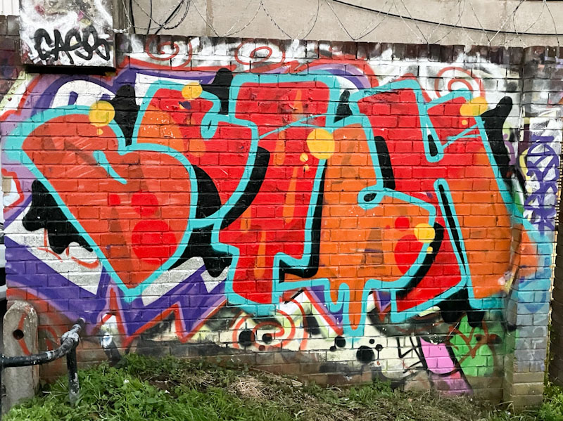
The red letters are bordered with a light blue line, and the combination works surprisingly well. The way that the letters are irregularly presented, although with a consistent overlap, is part of Butch’s USP and to my eye really attractive. There are some subtle drips and spots in the fills to add interest and some yellow spots to finish. This piece somehow feels really representative of the Bristol graffiti scene.
