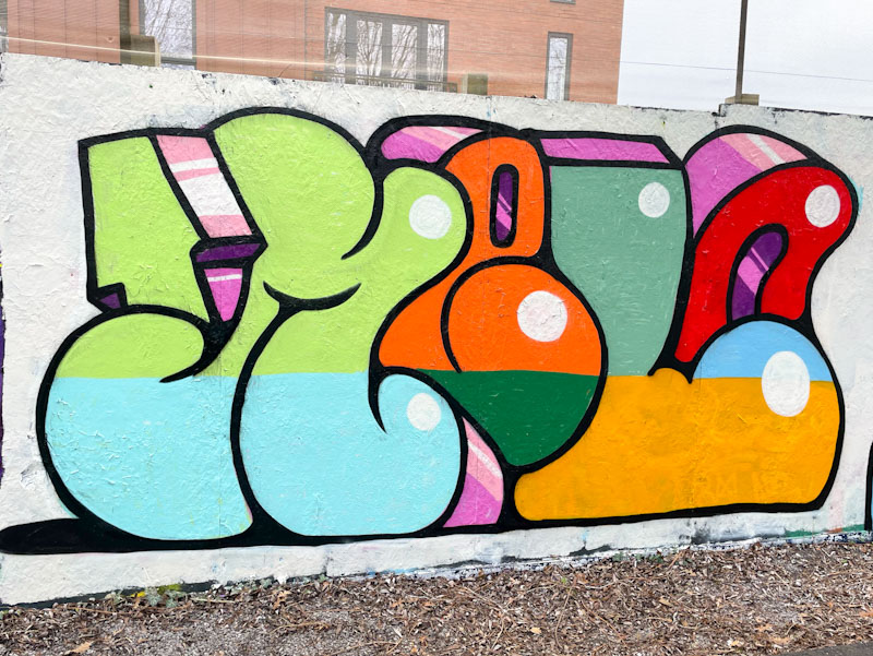
Before Christmas, I had a little jaunt through my archives and managed to pull out a few wonderful pieces that I missed first time round. This is a gorgeously colourful and upbeat piece by Esme Lower from January this year.

The simple letters filled with great colours spell out MELO, the central letters of her name combined. The 3D drop shadows are unruly, drifting off in all sorts of directions, but it kind of works. I particularly like the white dot highlights, which are an unconventional take on creating depth to the piece. Nice, clean work from Esme Lower, and part of her exploration and improvement.

What a year she’s had . . . 💣💥🔥
LikeLike