
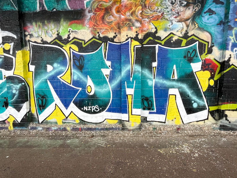
There are a few writers who stick to their letters and work on improving them from piece to piece, this being one of them. This might be the best I have seen so far from Roma, which was painted alongside Bbygwya (Luxe/Flux).
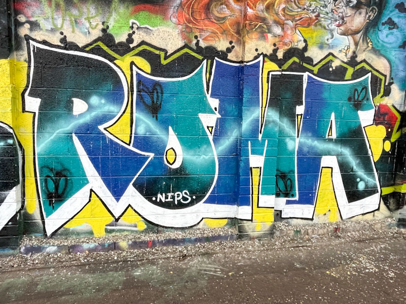
The turquoise, blue and black colours work well together in this piece and the steady drop shadow in white contrasts nicely. A light blue plasma streak runs through all the letters, giving off a bit of a glow, which adds interest to the whole idea. Some scribbled butterflies finish the piece off nicely. All good work from Roma.

She’s definitely improving . . .
LikeLike