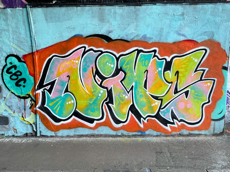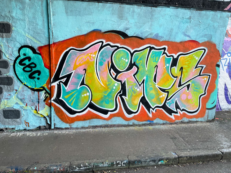
I am particularly fond of graffiti writers who present clean, clear letters conforming to a rough ‘house style’ where the differences from one piece to the next is in the creativity of the fills. None more so than Nips, whose excellence in this genre just keeps on improving.

The letters lend themselves rather well to graffiti writing, with perhaps the exception of the ‘N’ which can be a bit clunky. Nips has provided a nice clean red ‘canvass’ on which to present her letters, which are filled with some delightful blended pastel colours and a few decorative squiggles and spots. Nips has had a very strong end of 2025, and unlike other artists hasn’t been put off too much by the inclement weather. Great work.

Scooj, I have been gone a long time (long story) and have missed your posts. I am gong to ty to get back OnTrack with more regular visits. I will try to start posting again.
LikeLiked by 1 person
It is genuinely great to hear from you, and I hope that you’ll get back into the rhythm of posting. I have always enjoyed reading your blog, and have missed you.
LikeLike
Love the colors
LikeLiked by 1 person
Yes, those pastels work well with the contrasting red.
LikeLike