
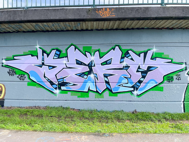
It feels like Werm has stepped up a level recently. His work has always been technically sound, and he has always been up for adjusting his style from time to time, but there is something about his presentation and confidence that has gone up a level.
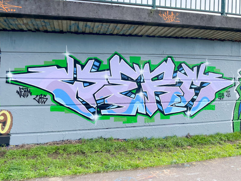
This is a super piece, which looks on the surface to be a ‘simple’ piece, probably because of it’s clean and tidy appearance. It takes a huge amount of talent and experience to create a piece like this. The symmetry of the letters is very well worked, and the seamless wavy pattern of fills, appears effortless, but is really tricky. There is a nice stripy drop shadow, and a touch of green decoration around the outside. The piece looks extra excellent because it is painted on a cleanly buffed wall. Really great stuff here from Werm.
