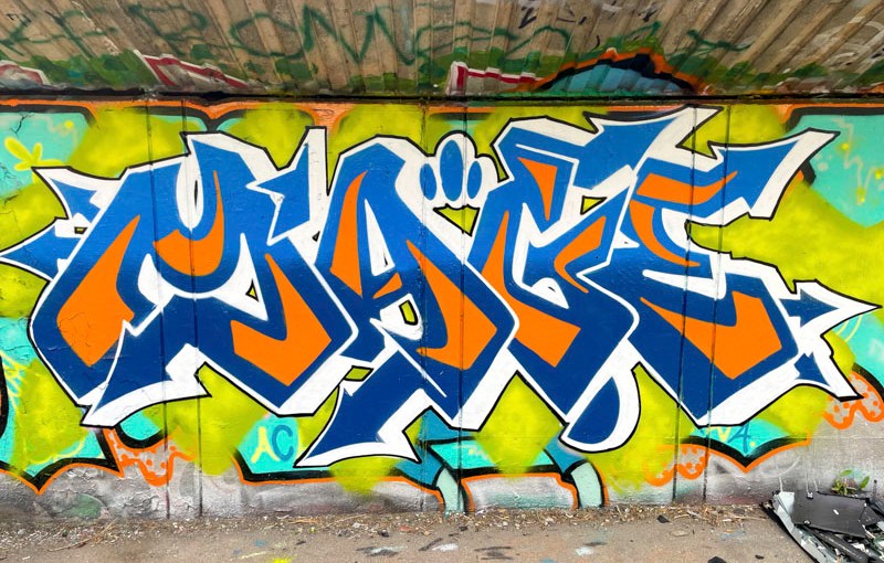
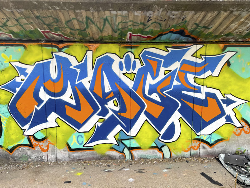
About 20 years ago I bought a Nike sweatshirt which didn’t have the tick logo, just the word Nike, and it was the exact same colours as the letter fills in this piece by Mage. This piece reminds me of that top, which I was very fond of, and I can’t unsee it in this piece.
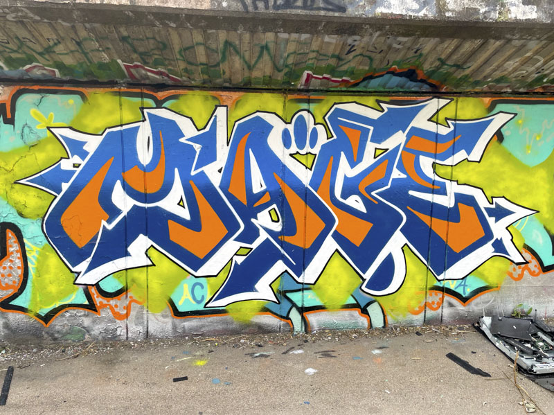
Sometimes Mage’s execution can look a little rushed, but not in this piece, everything is absolutely on-point. The clean dynamic two-colour fill is attraxctively presented, and supported with a whuite drop shadow and fine black border. Some greeny-yellow dusting creates an interface between the letters and the former occupant of this spot. I am not too sure about the colour selection of this, but I am splitting hairs a bit. A very nice tidy piece of writing from Mage.


