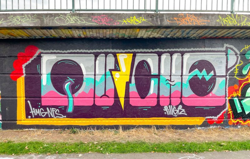
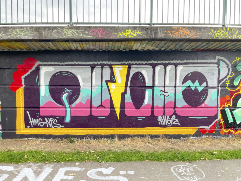
Well, this is something a little different from Dirtygypo. I can’t think of a piece by the artist that has strayed from his typical presentation, but this piece, although instantly recognisable as the work of Dirtygypo is surprisingly different.
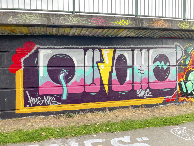
I love it when artists deviate from their standard and experiment. The letters are much more uniform in height and rather “blocky”. I think they spell out QUICHO. There are some interesting fill colours which have hard interfaces between them, rather than blended and the whole thing is set within an interesting frame. A look at his gallery will show how different this piece is.


