

.
Beneath my large feet
tiny pink flowers emerge
spiny restharrow
.
by Scooj
.
Beneath my large feet
tiny pink flowers emerge
spiny restharrow
.
by Scooj
Over the last couple of months I have tried to post three pieces a day (upped from two a day before) to try and do justice to the sheer quantity and variety of artwork in Bristol. The harsh reality though is that about 60-70%, still, of the art I photograph never sees the light of day. I could make things easier for myself by being more selective and only posting ‘high-end’ pieces, but that is not what this blog is all about. Within these pages I strive to include, new entrants alongside established artists, stencils alongside graffiti writing and so on to reflect the diversity of the street art/graffiti scene in the city. So I shall plod along driven by my own enthusiasm and desire to share the amazing art in this Bristol.
This is the second piece by Dirtygypo that I have posted and it most definitely won’t be the last. His work is bright and energetic and although different in style to Grimes, for example, it leaves one with a similar feeling of excitement and positivity. These two artists, and there are others, appear to be bringing something fresh to the mainstream that we are used to here, and I thoroughly welcome it. Great use of colour and unusual letter shapes, nicely defined with a black border combine to make this a really rather good piece.
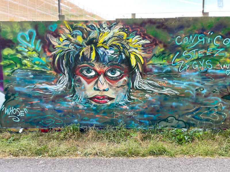
Conrico has been super-busy lately both painting on the street, and in his studio. He has a fabulous imagination, and much of his art is influenced by the culture of the Far East, in particular Japan. I don’t know what the connection is, but it adds an exotic flavour to many of his pieces.
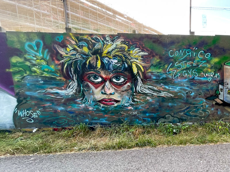
This is quite an unusual portrait piece, that in contrast to what I have said in the previous paragraph, appears to be of a Central/South American person wearing face paint and with feathers in their hair. Once again, Conrico’s unique can-work gives the impression that the piece has been painted with brushes, and doesn’t have that ‘clinical tight finish that so much street art tends to have. More still to come from Conrico.

I shan’t go into a drawn out conversation about my reluctance to post promotional street art, because I did all that about a week ago, and would be in danger of becoming (more) boring. I choose to concentrate on the left-hand side of this piece by Awkward, painted on the side of a graffiti shop and gallery ‘Veeez’, which does a great job with supporting the culture in and around Bristol. Veeez is also an artist who has features a number of times in Natural Adventures.
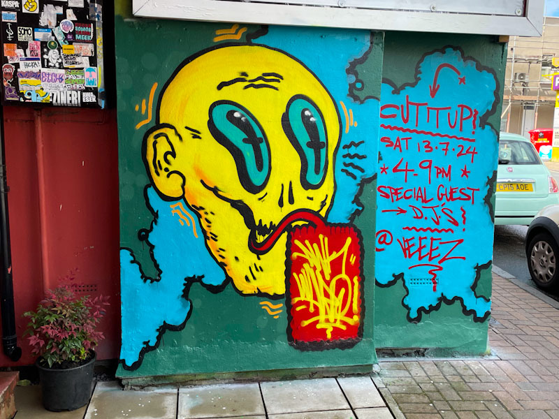
The Awkward character is exactly what you’d expect from the artist. A kind of skeletal face painted in an irregular style, with enormous eyes and a speech bubble with the work AWK-WARD written in it. There is plenty of movement generated by the little wavy yellow lines around the outline. Another one for the gallery.
.
Peerless aeronauts
I feared they would not return
sky-high joyful flight
.
by Scooj

It is a rare privilege to witness a character artist segue so seamlessly into graffiti writing, and Bloem, with this outstanding piece, proves what I already knew, that she is a natural. Not only has Bloem managed to give writing a go, but she has created a very neat and tidy piece, of a standard that many wannabe graffiti writers never reach.
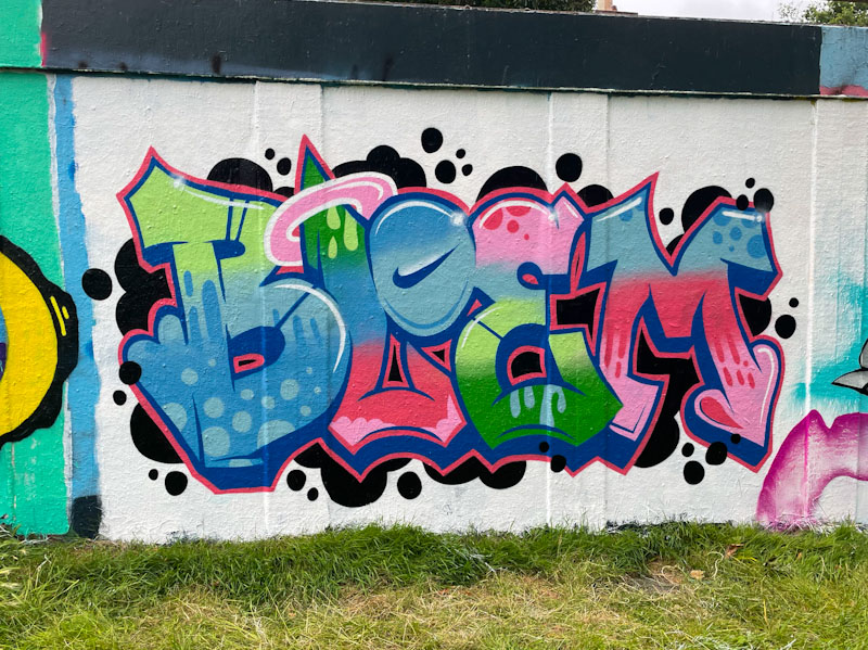
Her colour selections are excellent and blended expertly as they transition through the letter fills. The letters are very nicely proportioned and regular enough, without being too regimented. All the borders and lines are clean and crisp, patterns simple and well executed, and the white highlights do enough to create a 3D look to the writing. It helps that the graffiti writing is presented on a white background with some black spots, creating contrast and framing everything very nicely. I very much look forward to more experimentation from Bloem.

I’m not too sure how it happened, but somehow this piece by the fabulous John D’oh got caught up in my production line, and was supposed to have been posted quite a while ago. Perhaps it feels appropriate that I should post it today, coming so soon after President Biden has said that he will not stand for the presidency in the forthcoming election.
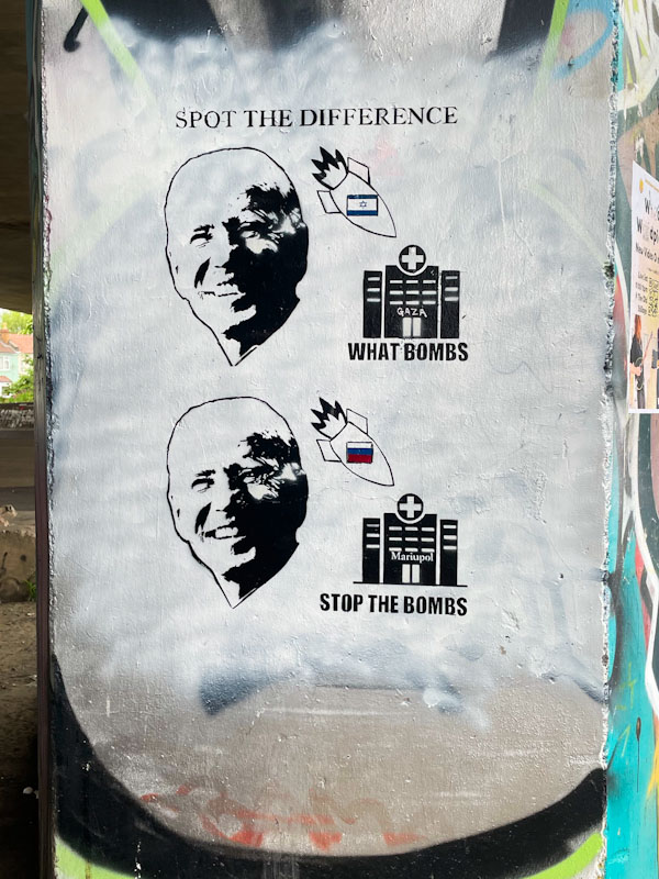
This simple ‘spot the difference’ stencil, highlights Joe Biden’s apparently inconsistent approach to the bombing of Gaza by Israel and the bombing of Ukraine by Russia. Turning a blind eye (sponsoring) one and condemning overtly the other. Heaven only knows what might happen if Donald Trump gets a second term. What a mess. Nice commentary piece once again from the talented Mt John D’oh.
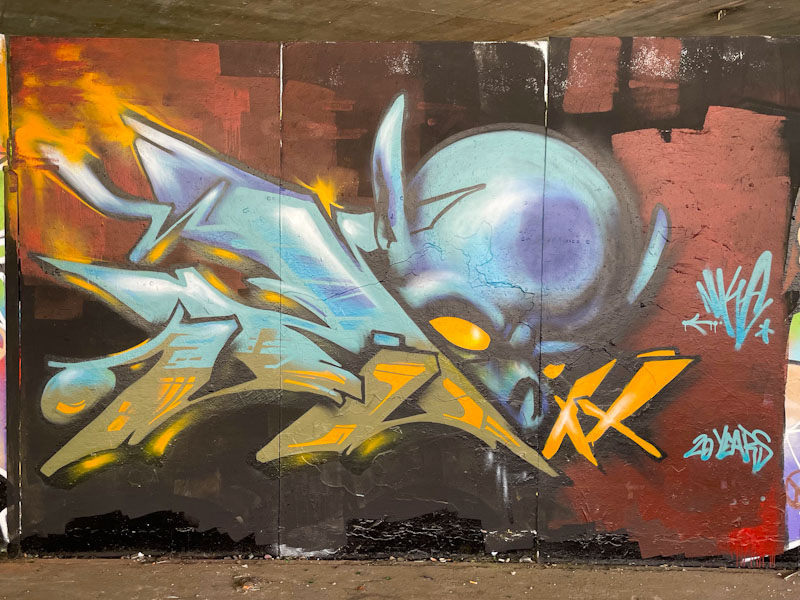
I get a little bat squeak of excitement when I see a piece that is obviously by an artist new to me, tempered by mild anxiety that I don’t know who they are and may not get to post their work until I find out more. Everything happened quite quickly with this wonderful piece by Nuke, thanks to Instagram, and I am thrilled to be able to post this debut piece for Natural Adventures.

This is a very interesting and compelling graffiti writing/character combination piece that has an interesting quality to it. It has a ‘soft-focus’ appearance and yet is clearly defied and masterfully painted. The 20 years refers to the length of time that Nuke has been painting, and his experience certainly plays out in this piece. I don’t know if he was passing through or whether he is staying in Bristol, but this is one of two recent pieces painted in the city by the artist.
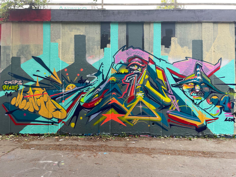
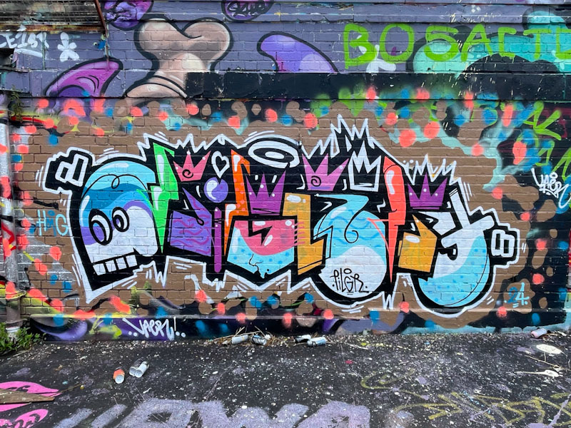
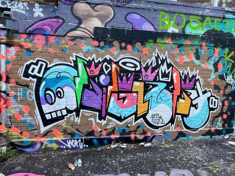
Just as I was beginning to think that Minto was going on a bit of a ‘slow-down’ he comes up trumps with several new pieces in a relatively short period of time. This is an interesting piece that was created during a paint jam at the roundabout. I have noticed that Minto has changed his style a little recently and appears to be undergoing a ‘period’ of deconstruction, where the elements of his work appear to be a little fragmented, as if several thoughts are going on all at once.
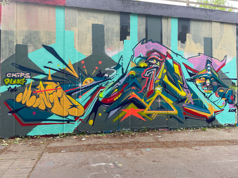
Concealed within the piece are the letters MINTO, with the ‘INT’ being reasonably clear, but the ‘M’ and ‘O’ are more tricky to see. For clarity, he has signed it in yellow bubble writing on the left. The colourful piece is full of eclectic decorations and a couple of characters, but for me lacks a little cohesion. The blue and grey background I would guess has some kind of meaning, but it is a little lost on me. Lot more to come from Minto soon.
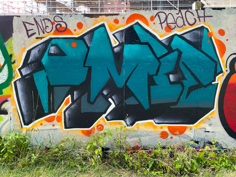
In Bristol, there are dozens, literally, of writers bubbling under the surface. Many of these are not as well known as some of the more established graffiti writers, but every once in a while one of them breaks cover and rises up a level or two. This often coincides (unsurprisingly) with their appearance on Natural Adventures. Omie is one of those artists whose work I have noticed and admire.
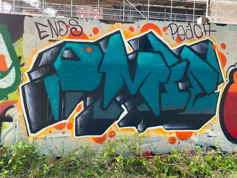
The refreshing thing about Omie’s work is that every piece is completely different from the last in style and composition, which keeps things very interesting. These heavy block letters spelling out OMIE in dark grey-green tones are given extra weight by a chunky 3D drop-shadow. Some orange decoration around the outside provides plenty of contrast to help the piece stand out. Nice work from Omie.


