.
Eighteen years ago
you switched things up a little
my dear baby girl
.
by Scooj
.
Eighteen years ago
you switched things up a little
my dear baby girl
.
by Scooj
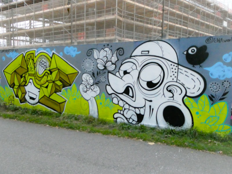
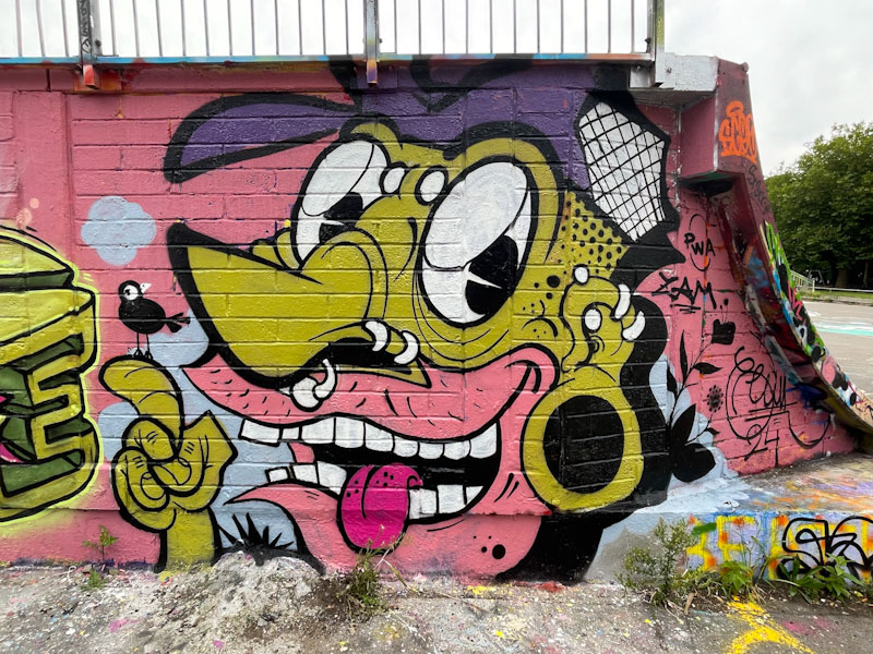
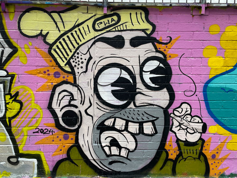
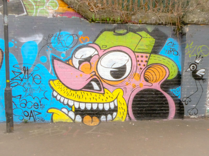
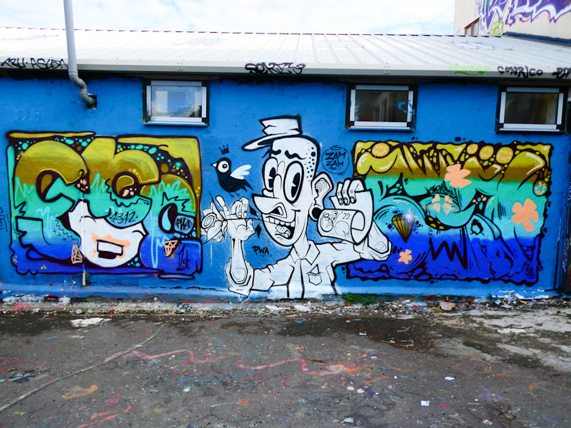
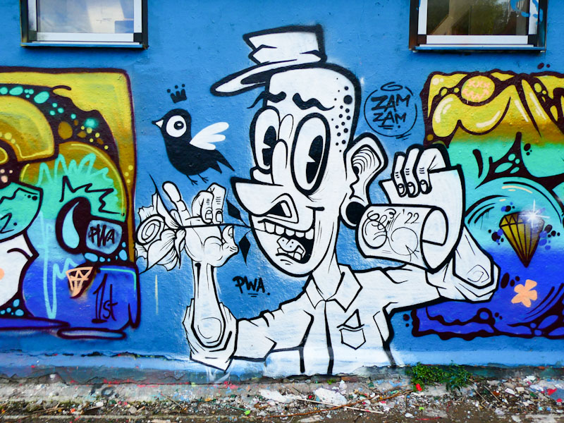
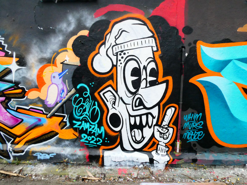
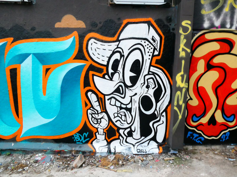
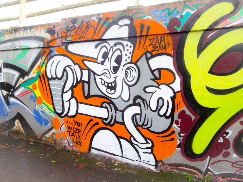
Pirate Wall Art (PWA) has been quite a dynamic crew over the last couple of years, with the inclusion of Nightwayss and Chill, and then the departure of Nightwayss (not from the crew, but from Bristol). Chill has embraced the group of friends with gusto, and regularly paints collaborations, often in the company of Face 1st, who I get the impression is always up for a paint.
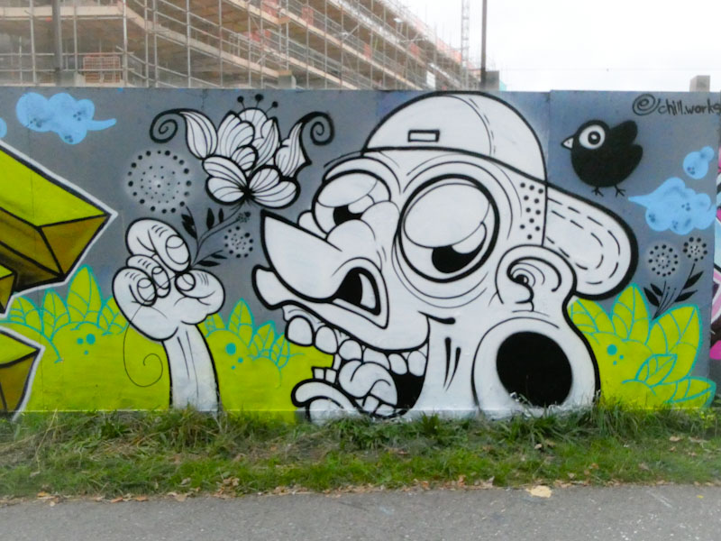
The collaboration is beautifully presented on a grey buffed background with green foliage, flowers, clouds and a little bird by Chill. His cartoon character is wonderful, but it is the hand gently holding the flower that works so well… some real tenderness.
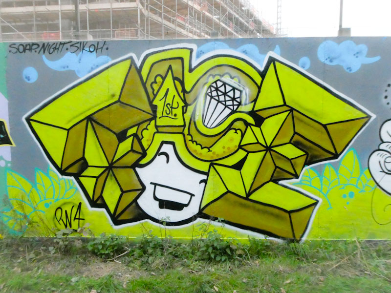
Face 1st has reverted to his girl with FACE for hair, written in a chunky block script. The shading on the letters F and E gives them a 3D effect, while the A and C are flatter, sitting back. It shows you what you can do with shading to make elements of a piece stand out. Of course, the girl is smiling, and the piece is a happy one. This is a fine collaboration from the PWA pair.
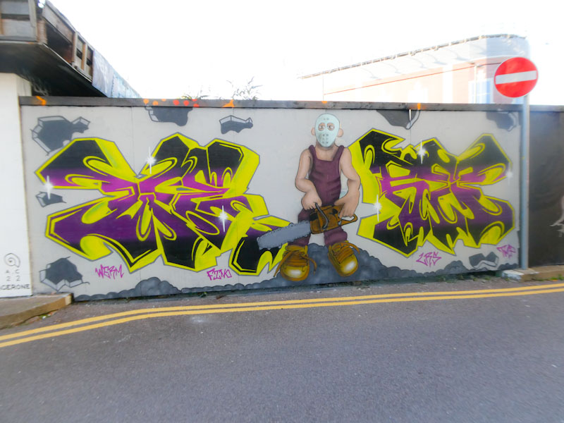
Chatterton Square is a stone’s throw away from Bristol Temple Meads station and boasts two stretches of wall that tend to be relatively untouched by tagging, and it is a great place for artists to go to town with ‘special’ pieces. This is a rather nice collaboration between two LRS artists, Werm and 3F Fino.
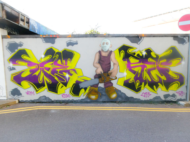
The writing is by Werm and spells WE-RM. It is technically very well done, with a great colour transition in the fills and a deep drop-shadow that has a central vanishing point. The rather intimidating character, perhaps loosely based on the ‘Texas Chainsaw Massacre’, is by 3F Fino. Although the proportions of the character are a little inconsistent, it is well painted and certainly conveys an element of fear.
What I really like about Mote’s approach to street art is that he is a very tidy artist. He likes to have a buffed wall to paint on, so that there are no distractions, and he keeps everything clean and tidy. Nice solid fills and crisp sharp lines. I am guessing he is a bit of a perfectionist.
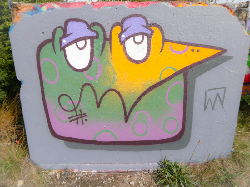
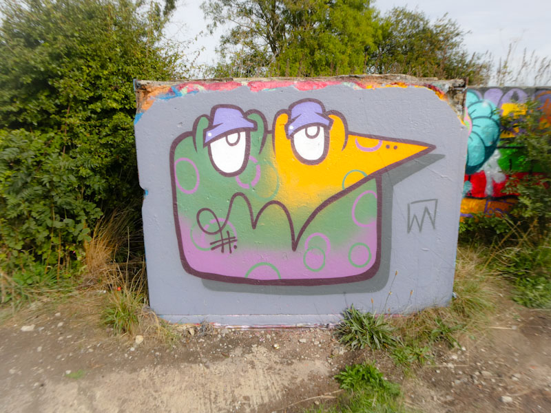
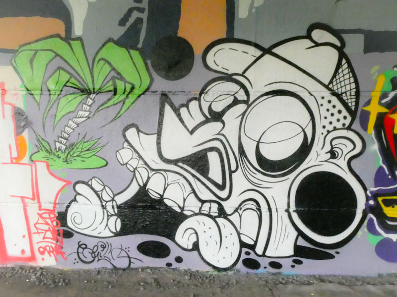
This charming monster piece up at Purdown is a wonderful doodle character, with some nice colour fills and details. The eyes and eyelids work well, and the shadow cast onto the wall lifts the piece out. Altogether this is a rather good piece, one of many.
I have only once before come across Madderdoit, and that was a column stencil piece under Brunel Way in Bristol, so it was good to see a couple more pieces by the artist in the skate park for the Cheltenham Paint Festival, of which this is one.
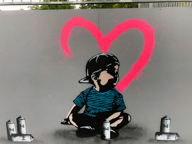
The kid sitting among a bunch of spray cans reminds me a little of an early Dice67 piece, and is nicely done. The brightly sprayed heart is also a nice touch, without which the whole thing would be duller. I like the spread of spray cans, but would have created two or three stencils for these and perhaps coloured the tops – but there I go again nit-picking. This is a nice fresh stencil from Madderdoit.
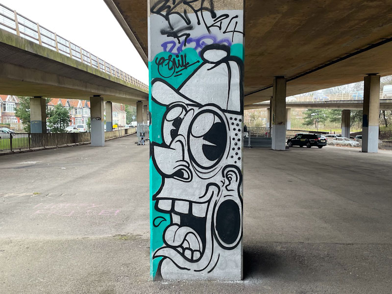
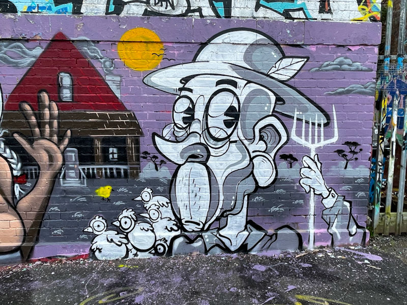
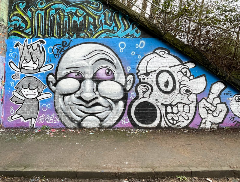
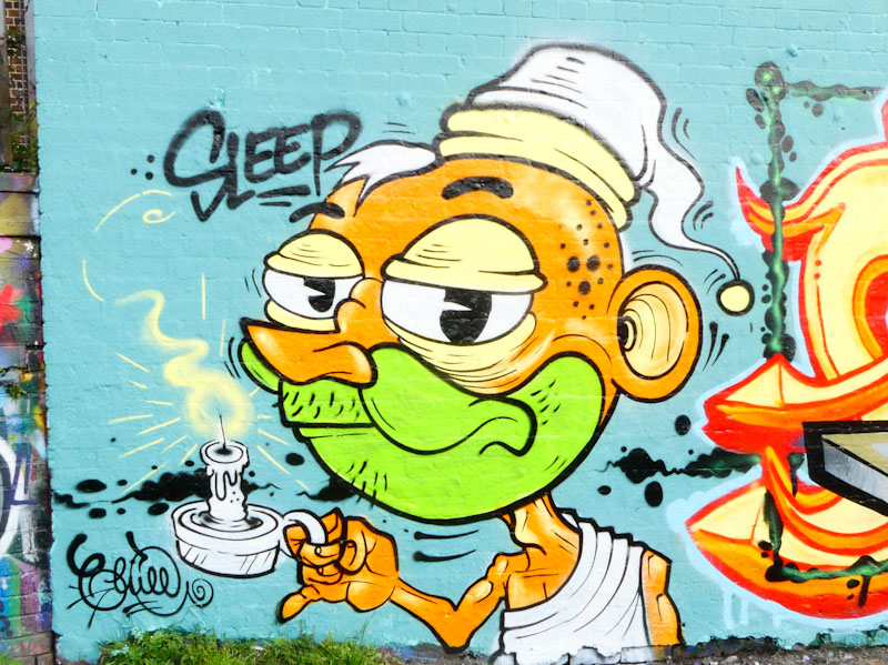
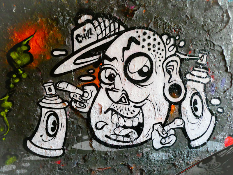
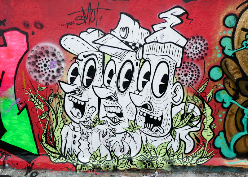
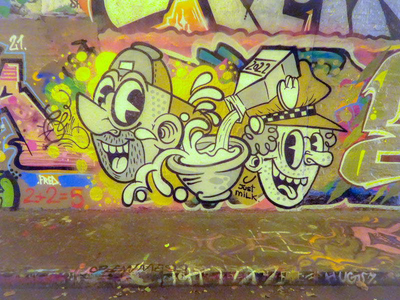
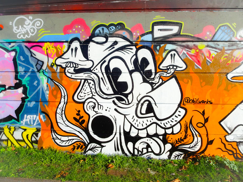
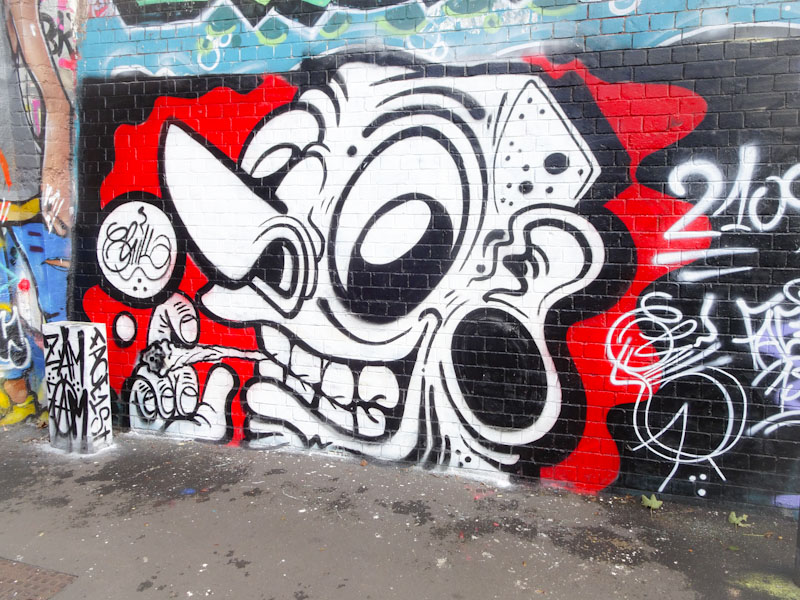
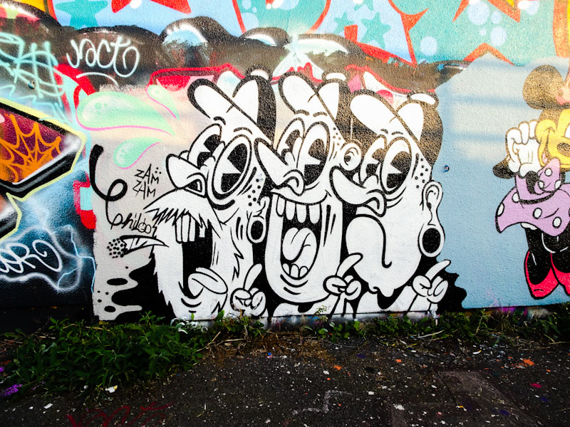
A gallery of fantastic cartoon-style work from Bristol street artist and tattooist, Chill (PWA)
Instagram: @chill.works


.
Without contrition
claiming they are listening
fooling nobody
.
by Scooj
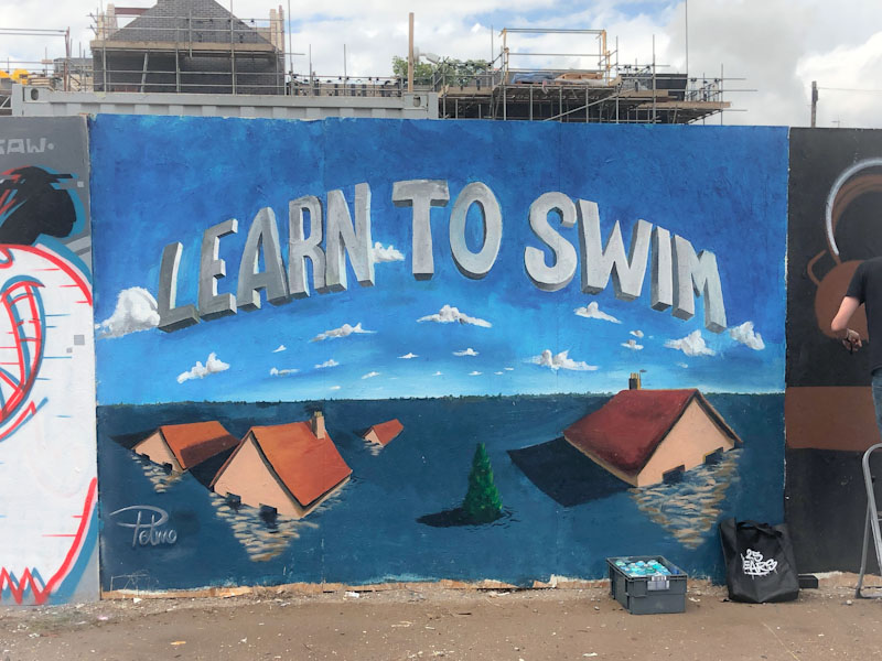
One of my favourite Bristol artists is Pelmo. His work is usually well thought out and is about so much more than the artwork, often there are messages of love, affection and care with the relationships between characters. In this unusual piece, there are no characters, but a very strong climate message.

Having worked in environmental communications for twenty years, some of it on climate change, I have seen many images like this one, and they are not uncommon. What is different here is that it is not a corporate ‘explainer’ but a heartfelt warning. Pelmo has captured the jeopardy of failing to act in a gentle, but effective way. I could look at this piece for a long time, it chimes for me and has a serene quality to it. Great work from Pelmo.

There is a very strong relationship between street art and tattoo art, for example, some of Bristol’s best street artists; 3Dom, Sepr and Chill, among others, are also tattoo artists. So it is no surprise to learn that Helen Harper, who painted this gorgeous lion at the Cheltenham Paint Festival is also a tattoo artist.
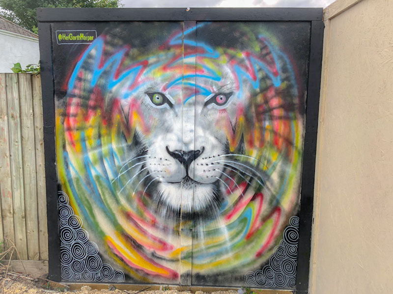
There are three elements to this piece that work nicely together. The black background has some swirly patterning, and the lion’s face is painted in a greyscale that works well with the background. Encircling the lion’s face is a circular burst of colour, radiating outwards. This is the first piece that I have seen by Helen Harper, but I look forward to seeing more in the future.
.
Peter principle
power beyond competence
so out of her depth
.
by Scooj
* Peter principle:
The Peter principle is a concept in management developed by Laurence J. Peter, which observes that people in a hierarchy tend to rise to “a level of respective incompetence”: employees are promoted based on their success in previous jobs until they reach a level at which they are no longer competent, as skills in one job do not necessarily translate to another.


