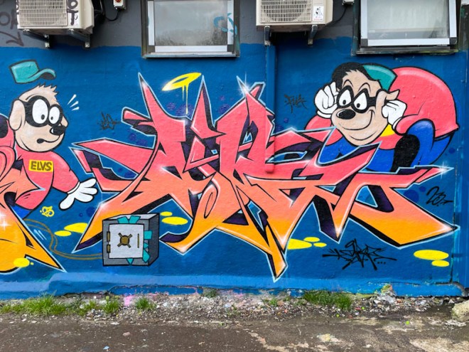
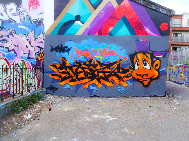
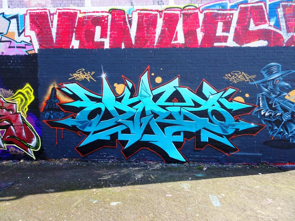
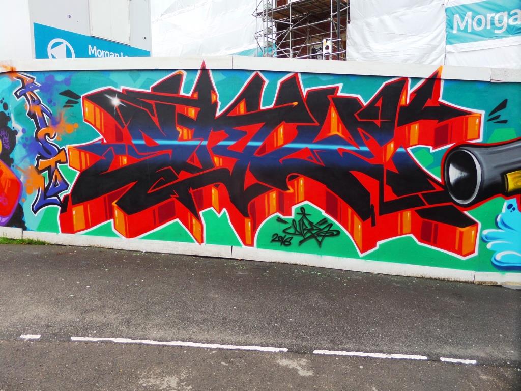
This superb collaboration from Dibz and Shade One was a precursor to their Cheltenham Paint Festival collaboration in the Honeybourne Line tunnel painted last weekend. Unfortunately I didn’t get to see the finished Cheltenham piece, but was privileged to watch the pair working together.
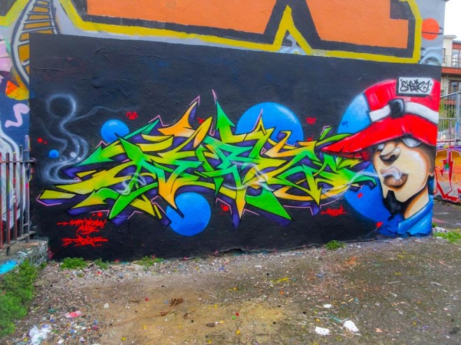
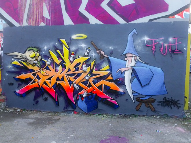
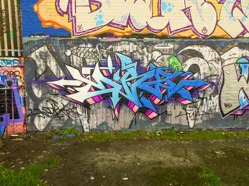
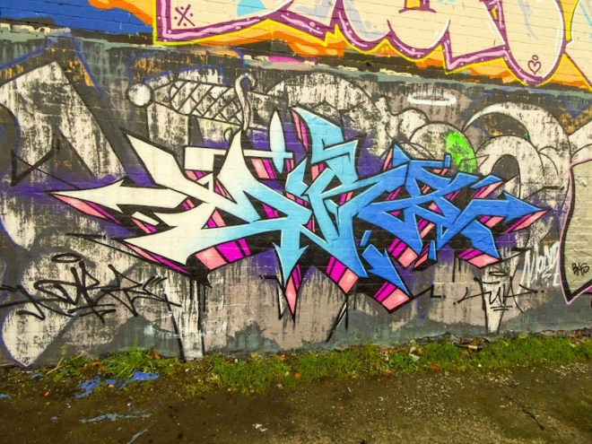
Dibz and Shade One, Dean Lane, Bristol, September 2020
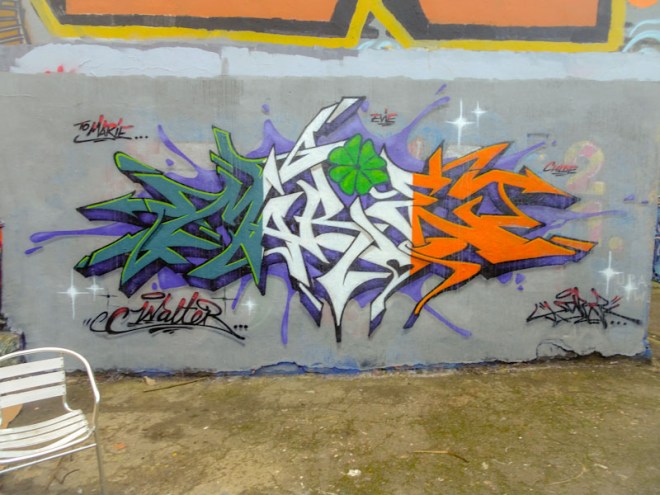
This Dean Lane Piece is truly outstanding, and the quality of design and execution is of the highest order. I particularly like the blue bubbles, the largest of which provides the background for Shade One’s character on the right. What you see here is a near-perfect work from two very talented artists.
Dibz and Shade One, Dean Lane, Bristol, September 2020
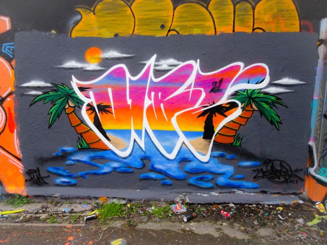
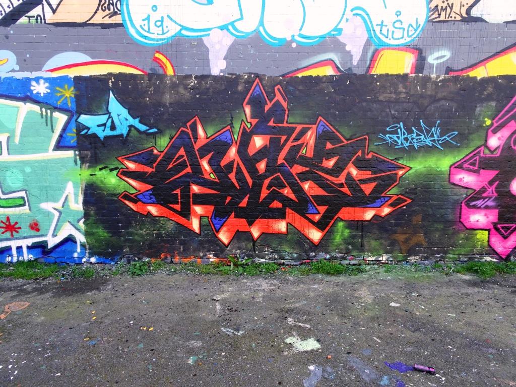
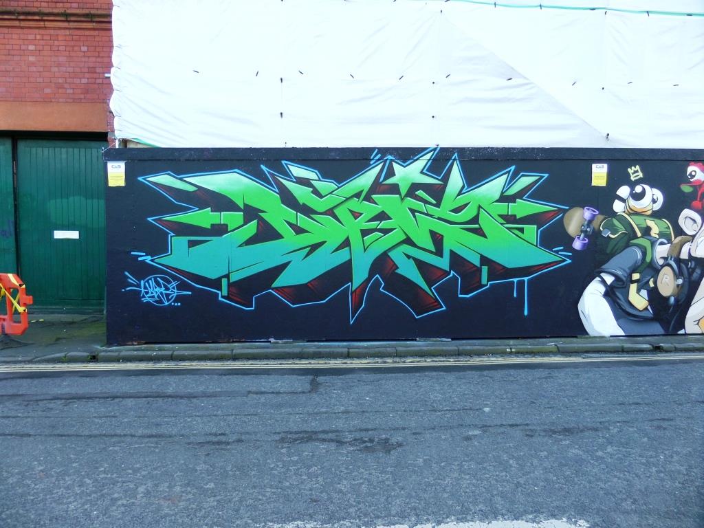
This is yet another stunning piece from Dibz in Dean Lane. I can honestly say that I can’t remember such a productive period from this artist before in my (sometimes limited) experience.
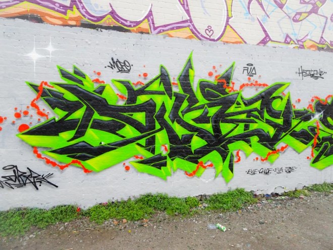
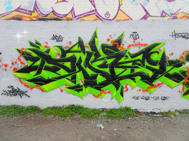
Dibz, Dean Lane, Bristol, July 2020
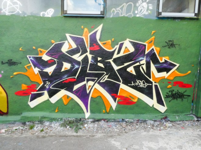
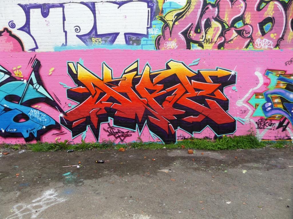
Superb writing with a green surround is brought to life with delicate red thread encircling the whole piece. This is classy writing of the highest calibre and really something to behold. Great work from a great artist.
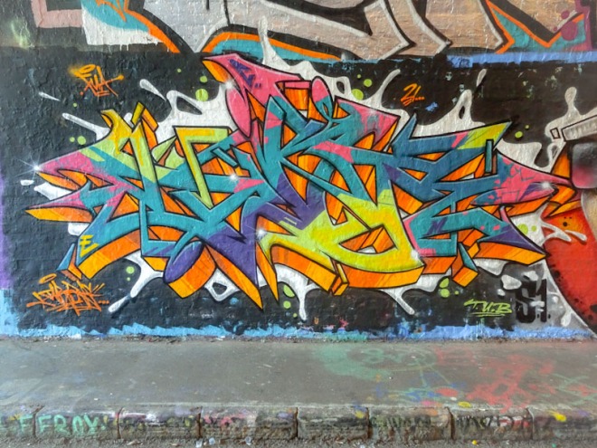
I have said it before that Dibz has been painting a lot recently, like so many other artists since lock down eased. I am guessing that many artists have been furloughed and have therefore had more time on their hands than usual. I expect that as time passes and things get back to our new normal many artists will return to work and this frenetic activity will start to slow.
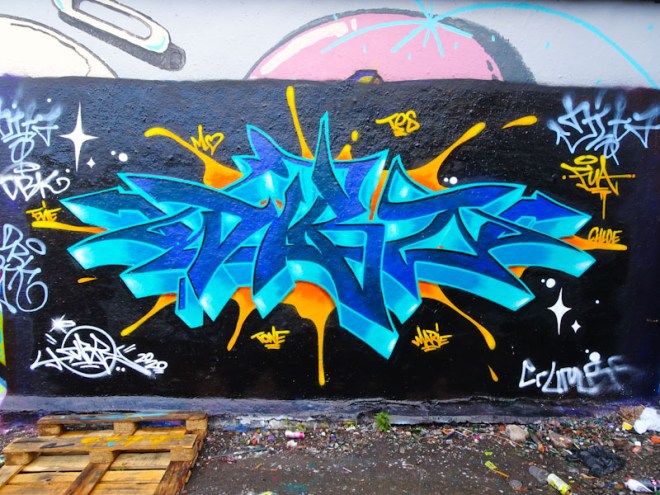
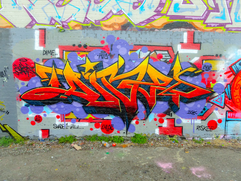
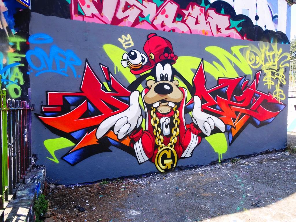
Dibz, Dean Lane, Bristol, June 2020
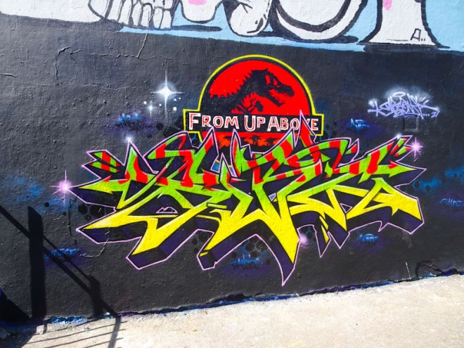
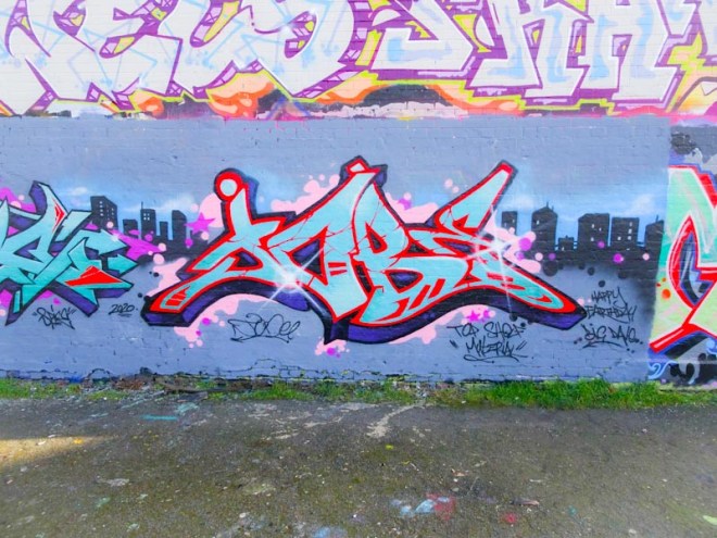
This is an outstanding piece from Dibz, whose attention to detail and sensational finesse is second to none. Everything about this piece is good, from the black background to the colour selections to the design to the brilliant fades in the 3D work and the orange drips. This is a masterful work.
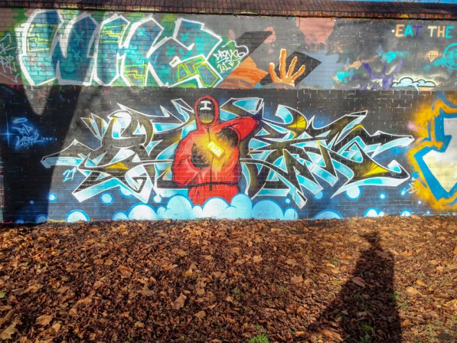
Dibz, Dean Lane, Bristol, May 2023Dibz, Dean Lane, Bristol, May 2023Dibz and Cheo, Dean Lane, Bristol, May 2023Dibz, Brunel Way, Bristol, April 2023Dibz, Dean Lane, Bristol, April 2023Dibz and Turoe, Dean Lane, Bristol, February 2023Dibz, Dean Lane, Bristol, February 2023Dibz, Sparke Evans Park, Bristol, June 2022Dibz, Dean Lane, Bristol, November 2022Dibz, Dean Lane, Bristol, October 2022Dibz, Sparke Evans Park, Bristol, September 2022Dibz, Dean Lane, Bristol, September 2022Dibz, Dean Lane, Bristol, July 2022Ulow and Dibz, Dean Lane, Bristol, June 2022Dibz and Posea, Dean Lane, Bristol, June 2022Dibz, Brunel Way, Bristol, May 2022Dibz, Dean Lane, Bristol, March 2022Dibz, M32 roundabout, Bristol, March 2022Dibz, M32 roundabout, Bristol, March 2022Dibz, Dean Lane, Bristol, February 2022Dibz, Dean Lane, Bristol, January 2022Dibz, Sparke Evans Park, Bristol, December 2021Dibz and Shade One, Sparke Evans Park, Bristol, November 2021Dibz, Dean Lane, Bristol, September 2021Dibz, Dean Lane, Bristol, September 2021Dibz, Dean Lane, Bristol, August 2021Dibz, Dean Lane, Bristol, August 2021Dibz, St Werburghs, Bristol, July 2021Dibz, Dean Lane, Bristol, April 2021Dibz and Shade One, Dean Lane, Bristol, March 2021Dibz, Dean Lane, Bristol, March 2021Dibz, Dean Lane, Bristol, February 2021Dibz, Dean Lane, Bristol, February 2021Dibz and Shade One, Dean Lane, Bristol, December 2020Dibz, Dean Lane, Bristol, December 2020Dibz, Dean Lane, Bristol, November 2020Dibz, Dean Lane, Bristol, October 2020Dibz and Shade One, Dean Lane, Bristol, September 2020Dibz, Dean Lane, Bristol, July 2020Dibz, Dean Lane, Bristol, June 2020Dibz and 2Keen, Dean Lane, Bristol, June 2020Dibz, Dean Lane, Bristol, June 2020Dibz, Dean Lane, Bristol, March 2020Dibz, Dean Lane, Bristol, February 2020Dibz, Upfest, Bristol, July 2018Dibz, Dean Lane, Bristol, September 2019Dibz, Dean Lane, Bristol, May 2019Dibz, Dean Lane, Bristol, March 2019Dibz, Dean Lane, Bristol, January 2019Dibz and Cheo, Dean Lane, Bristol, June 2018Dibz and Sikoh, Dean Lane, Bristol, April 2018Dibz, Dean Lane, Bristol, April 2018Dibz, Brunswick Square hoardings, Bristol, March 2016Dibz, Raleigh Road, Bristol, July 2017Dibz, Dean Lane skate park, Bristol, July 2016Dibz, Dean Lane, Bristol, June 2017Dibz, Raleigh Road, Bristol, March 2017Dibz, Dean Lane, Bristol, June 2016Dibz, Dean Lane, Bristol, May 2016
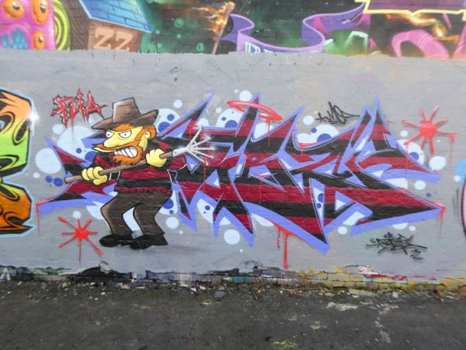
A short while ago there were a few tribute pieces that appeared around Dean Lane for the graffiti writer Desire, of which this was one. This piece is by Dibz, 2Keen and Shade One, although I’m not too sure which bit the latter painted because the Dibz bit is obviously Dibz and the 2Keen character is obviously 2Keen. Perhaps he did the rest of the writing, I don’t know.
Dibz and 2Keen, Dean Lane, Bristol, June 2020
I don’t know much about Desire, but this is a fine tribute and I like the touch ‘Rest in Power’. It is so good to see Dibz so active at the moment, and I haven’t seen a new 2Keen piece for a very long time indeed. This is a high quality collaboration.
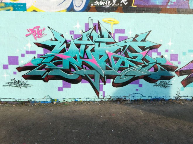
So many artists have has a creative rush since the easing of lock down and one of them is Dibz. Ordinarily you’d be lucky to see a new Dibz piece once every two months or so, but I have seen three in the last month of which this is one.
Dibz, Dean Lane, Bristol, June 2020
Dibz is a precision graffiti writer. I have never seen anything by him that isn’t really tight, clean and crisp and I have never to my knowledge seen a throw up from him. This is a very classy piece of writing with a beautifully graded fill from dark red through to orange and yellow. The slim yellow edging on the upper sides of the letters creates a lifting effect. This is a piece for connoisseurs.
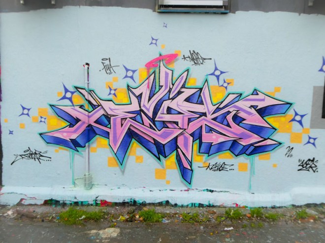
This is what can happen when two outstanding writers combine their efforts. This supreme collaboration is by Dibz and Shade One, painted in Dean Lane on the same day that Rusk, Soker, Inkie and Hemper painted on the other long wall back in March. A red letter day indeed. The whole collaboration is set on a clean blue background with a magnificent silhouetted cityscape running horizontally through the piece.
Dibz, Dean Lane, Bristol, March 2020
On the left is an absolutely faultless piece from Dibz as we have become accustomed to expect. The fills are really subtle, dradig from a lighter blue at the top to a slightly darker one at the bottom, and the letters have just the right amount of accents in red to set the piece off nicely. This is what great graffiti writinng looks like.
Shade One, Dean Lane, Bristol, March 2020
On the right we have some equally high-class writing from Shade One, an artist I know relatively little about. In this piece I particularly like the tiny ‘cracks’ in red through the letters and the stellar accents on the first and last letters. Magnificent. I am not too sure what the letters say, nor their significance, it looks like JOBE or TOBE. The only other post I have made from this artist was an Upfest piece from 2018.
How brilliant is this? set on an unprepped wall, this remarkably tight piece from Dibz is close to graffiti writing design and execution perfection, and its magnificence is exaggerated by the untidiness of the backdrop. It is like a black and white TV that has unexpectedly discovered colour.
Dibz, Dean Lane, Bristol, February 2020
Dibz is a local graffiti writer whose work is almost exclusively reserved for these walls in Dean Lane. It is rare to find his work elsewhere. Since I photographed this one, he has painted another excellent piece in the same place, on what turned out to be a red letter day on Friday last week. More about that to come soon.
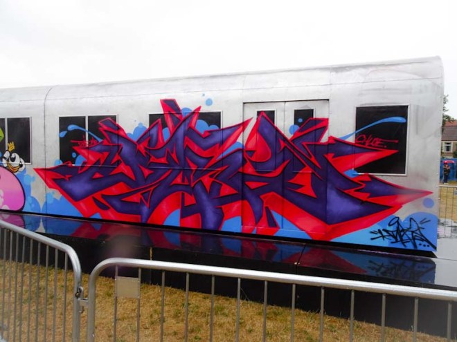
Dibz is a Bristol graffiti writer whose work is always first class and beautifully tight. It is unusual to see his writing outside the confines of Dean Lane skate park, but at Upfest 2018 he ventured a little further afield and sprayed the side of the mock railway carriage with one of his beguiling pieces.
Dibz, Upfest, Bristol, July 2018
Dibz tends to keep quite a low profile with his work, which is often unannounced, and hey presto he works his magic. This upfest piece, by his high standards, I would say is not his best work and I suspect it might have been somewhat comprimised by the changeable weather experienced during the festival. It is however a great piece.
Tight is probably the best word to use when describing the work of Dibz. Always meticulously thought out, clean lines, perfect 3D shading, crisp fills and more often than not, fabulous colour choices. Dibz really pays attention to his pieces and each one is carefully constructed to produce a complete and stylish work.
Dibz, Dean Lane, Bristol, September 2019
This one in Dean Lane is simply another example of just how accomplished the artist is, and what he lacks in quantity, he more than makes up for in quality. There is beauty in this, and I challenge even the most ardent critics of graffiti writing not to concede that this is a high quality piece. Nice one.