6879. M32 roundabout J3 (675)

Minto, M32 roundabout, Bristol, March 2025

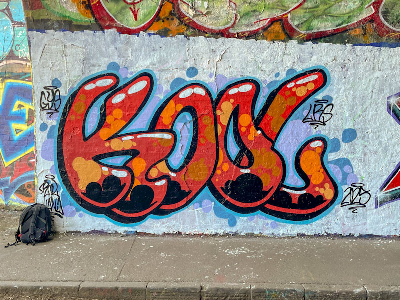
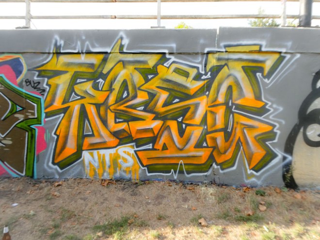
This is an outstanding piece of graffiti writing from Minto, and is a great example of what is not there as being as important as what is there – if that makes any kind of sense. There is a lot of empty space alongside multiple illustrations and decorations throughout.

Minto, M32 roundabout, Bristol, March 2025

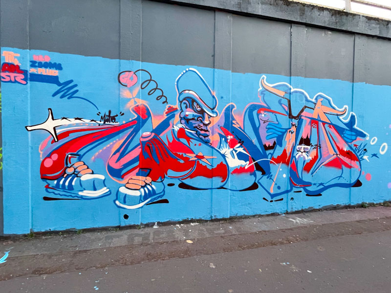
The letters spell out MINTO, and there are some regular motifs that the artist has used before, such as the character and a pair of sneakers at the base of the letter M. I’m not sure whether there is a coherent story or whether the piece is simply a collection of ideas and thoughts bundled up together. Either way, there is plenty to look at in this energetic piece.

6859. St Werburghs tunnel (489)

Kool Hand, St Werburghs, Bristol, April 2025

This piece by Kool Hand was part of a recent collaboration in the tunnel, but alas his third only lasted about 24 hours. On the upside I was fortunate enough to see it, literally moments before it was painted over by Mr Klue.

Kool Hand, St Werburghs, Bristol, April 2025

I have said it before, but Kool Hand is a bit of an unsung hero of Bristol street art. His unique blend of colour, characters and writing is a central part of the heartbeat of the Bristol scene, without which it would feel diminished. The letters KOOL and nicely presented in very Kool Hand orange, with some great solid fills and spots. The background in softer purples and blues provides a perfect counterbalance to the graffiti writing. Nice work from Kool Hand.

6713. St Werburghs tunnel (473)

Bloem, St Werburghs, Bristol, January 2025

Carrying on the theme of female artists today, this is a superb piece of graffiti writing from Bloem. There seems to be no stopping her so far this year, and that can only be a good thing. What is so unusual about Bloem’s work, for an artist who is relatively new to graffiti writing, is the precision and clarity of her lines, which comes with incredible can control.

Bloem, St Werburghs, Bristol, January 2025

The irregular letters BLOEM pop so well from the wall, thanks to the brilliant white drop shadow. The red letter fill is blended so brilliantly, it isn’t possible to be sure where one shade ends and the next begins. On top of that, the circles and spots are perfectly applied throughout. Wrapping the whole piece up is a black and green border, which has a life of its own with ‘flames’ and drips. Every component of this piece comes together so well, and in Bloem we have an emerging superstar.

5884. Brunel Way (261)

SkyHigh, Brunel Way, Bristol, March 2024

How great it is that ShyHigh and Roo have friends/family in Bristol, because it means that if we get lucky, they swing by to visit and while here, decorate a few walls for us. Their latest visit yielded this exceptional piece from SkyHigh on the fat pillar wall underneath Brunel Way. Roo also painted a few nearby spots (to follow).

SkyHigh, Brunel Way, Bristol, March 2024

As I would expect, the large piece from SkyHigh is a wonderful mash up of letter styles to create the whole words SKY HIGH. Each letter is perfectly presented, and although discrete, somehow works with the letters adjacent. I love the ‘paper-based’ letters, ‘S’ written on note paper and the ‘i’ written on a ‘Hello my name is’ sticker. Brilliant work from a brilliant and creative writer. Come back soon.

5080. Cumberland Basin

SkyHigh, Cumberland Basin, Bristol, March 2023

Back to the here and now, I bring you this magnificent large piece from the visiting SkyHigh. Although it was only painted a few days ago, it has already been painted over, which I have to say I find a little disrespectful, but I guess most graffiti writers don’t know how long the piece they are overpainting has been there. Some though are resentful and malicious and deliberately target work superior to their own to exert some kind of childish power… when that happens we are all losers.

SkyHigh, Cumberland Basin, Bristol, March 2023

Sky High has absolutely nailed his style of writing, choosing different block styles for each letter of the word. He also manages to keep everything so clean and tight, even down to the white frame for this piece.

SkyHigh, Cumberland Basin, Bristol, March 2023

The colour selections are great and there is an element of symmetry in their deployment. I particularly like the style of the ‘Y’, which I think is probably the most challenging letter technically in the piece. I’m already looking forward to his next visit to Bristol (with Roo, of course).

4681. M32 roundabout J3 (428)

Kosc, M32 roundabout, Bristol, August 2022

It would appear that Kosc is enjoying his writing at the moment, and why not, with several pieces appearing lately. This one on the M32 roundabout is a classy beauty. Painted with all the confidence of an accomplished artist, the letters KOSC, with the characteristic ‘Kosc’ orange, have a kind of soft metallic look to them.

Kosc, M32 roundabout, Bristol, August 2022

Letters are nothing new to Kosc, although his old letters were rather different from these, what remains is the class and talent of his work. The transitions are worked really well and the ‘raised’ centre-line of each letter creates a clever 3D effect. Overall a lovely piece, and nice surprise.

3840. Upfest 2021 75×75 (28)

There is real craft and ability in the work of Emily Joy Rich, and her training and work as a graphic designer certainly come to the fore when you see her work. Her letters are so clean, tidy and sharp and her designer’s eye uses the space beautifully. I have only seen a handful of her pieces and like each one of them, she seems to be, in a way, upholding the art and craft of the sign-writer.

Emily Joy Rich, The Tabacco Factory, Bristol, July 2021, Upfest 21

‘You are not alone’ reminds me of the Close Encounters tag line ‘We are not alone’ but the two have very different connotations. The hashtag #youarenotaloneart, seems to be a ‘thing’ and checking it out on Instagram highlights some beautifully written murals from across the world. This one is a corker from Emily Joy Rich and I particularly like the two-tone grey shading on the word ‘Alone’, which gives it loads of perspective and lifts the word out from the wall. Highly accomplished work and another triumph for Upfest 75×75.

3655. Brunel Way (99)

Stivs continues to turn out some of the best calligraphy writing in Bristol and this is an absolute beauty under Brunel Way. The photographs simply don’t do this piece justice… in the context of the slightly gloomy spot, the bright blue and purple letters illuminated the space and demanded to be looked at. A real humdinger.

Stivs, Brunel Way, Bristol, April 2021

I am not even going to attempt to tell you what the letters spell out, although I was thinking of having a go, I can tell you however that it is not his customary STIVS. I think the really clever touch lies with the thin bright blue outline on the black background that gives the whole thing a little lift. A nice piece.

3627. Brunel Way (96)

Because of its association with graffiti and street art, Bristol is a bit of a magnet for visiting artists and what fortune that Kane Rose paid a visit while painting alongside the No Frills crew a few weeks back. I don’t know the artist, but know that he is a tattoo artists who also paints walls, like so many of our own Bristol artists.

Kane Rose, Brunel Way, Bristol, April 2021

When I first saw this I wondered whether it might have been by SkyHigh, because there is a definite similarity of styles. I have to confess that I had to wait until I saw the piece appear on Instagram before I could be sure of the artist. The block letters, each with a different colour and style, on first inspection appears to spell USA, but I have a feeling it actually says UPSTART. A lovely piece.

3331. M32 Cycle path (88)

Another very nice piece from Pl8o, an artist who I would put in a cluster along with Phour, Mena and Mest, because they all have a similar approach to their work. Each of these artists write their names clearly and legibly in predominantly the same style from piece to piece, but the magic is in how they decorate and fill the letters. Pl8o is perhaps the one who tinkers with his letter shapes more than the others, but his pieces are always instantly recognisable.

Pl8o, M32 Cycle path, Bristol, November 2020

This one on the cycle path is in pinks set on a blue background, always a winning formula, and the letters are broken up by fine blue lines creating an interesting effect. To add further interest, the 8 has been split into two pinks. This is a lovely piece from an emerging talent whose work is improving all the time.