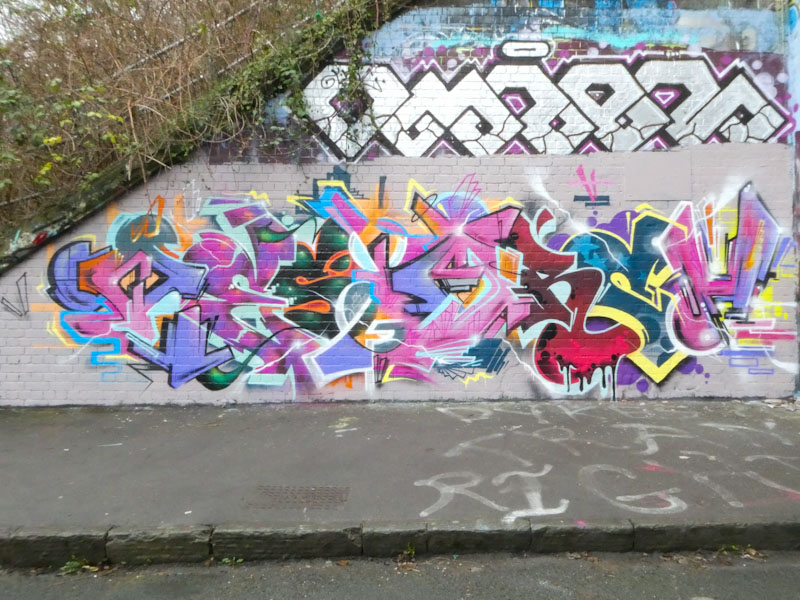
Sait Bare appears to be painting more often, or maybe I am simply seeing his pieces more often, either way, it is great to find his work. This piece took a couple of trips to record, because the first time I saw it, it was incomplete, and I had to return a few days later to see the final rendition.

It is interesing to see, from the work in progress, the layering and sequencing that Sait Bare undertakes in producing his work. This is not the first time that Sait Bare has used this particular design idea of presenting two entirely different colour schemes mashed up together in sections, and thee final effect is stunning, if not a little confusing.

The letters spell SAIT, and while the font is consistent through the piece, the background and fills most definitely are not. So the overall appearance is that one piece has been painted over the other and then half of it ripped down. You need to ask yourself which one was painted over the other? An interesting illusion.