
A gallery of wonderful graffiti writing from Bristol artist Sait Bare, sometimes writing SAIT and sometimes BARE.
Instagram: sait_bare_sb7
All photographs by Scooj


A gallery of wonderful graffiti writing from Bristol artist Sait Bare, sometimes writing SAIT and sometimes BARE.
Instagram: sait_bare_sb7
All photographs by Scooj
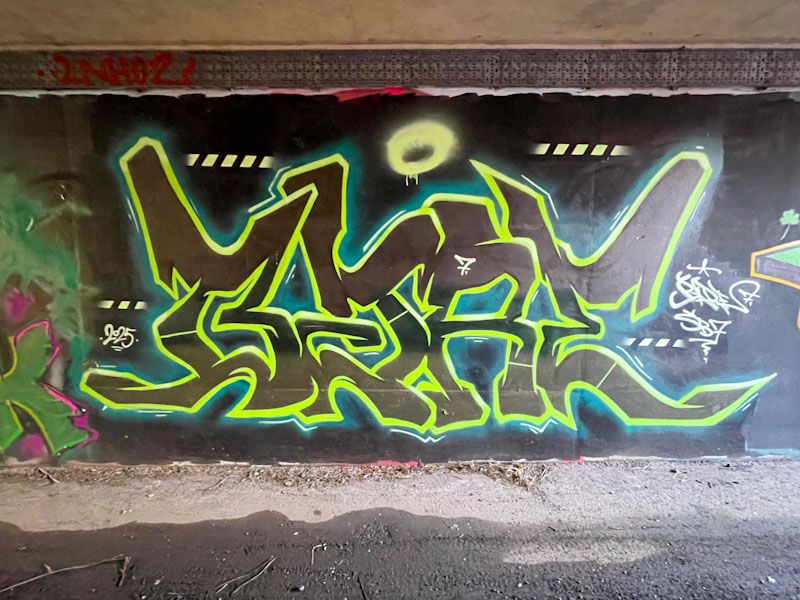
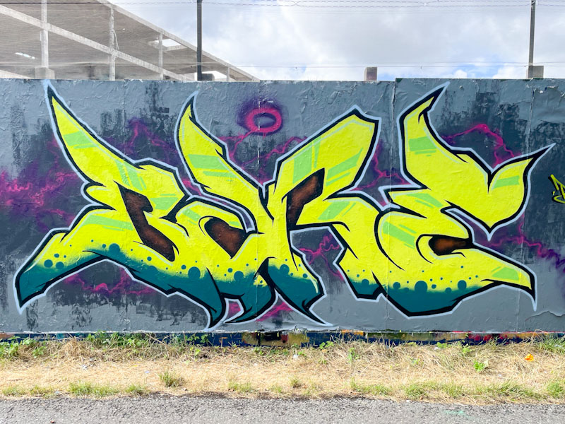
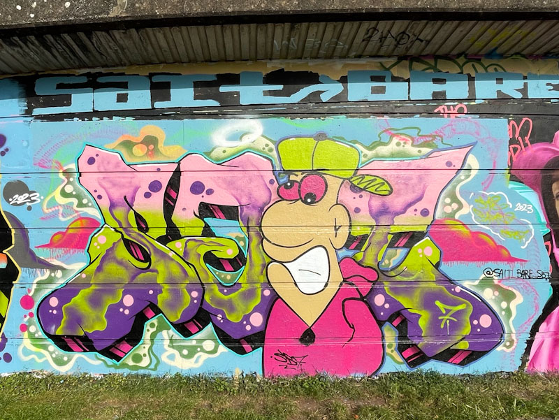
Sait Bare seems to have had a little bit more time on his hands to get out and paint recently. His flurry includes this interesting piece in the long foot tunnel underpass at L Dub. He is definitely in a ‘Bare’ phase at the moment, which is different from the ‘Sait’ period when I first encountered his work back in October 2023.
Sait Bare usually paints pieces with plenty of colours and form, but unusually, he has kept this one to a minimum, using black letters bordered with a vibrant lime green outline. There are minimal additional interventions pretty much restricted to some accent lines outside the letters and some stripey lines. All good stuff from Sait Bare – note to self… time for a gallery methinks.
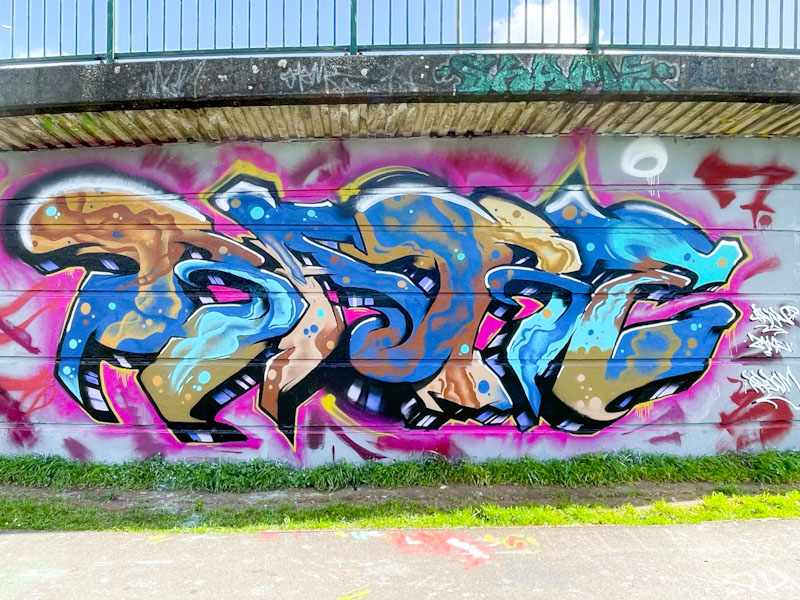
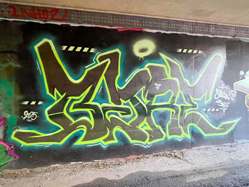
Sait Bare is an artist I have yet to have the pleasure to meet, although we have exchanged the odd message on Instagram. He is painting reasonably regularly these days and is definitely preferring writing BARE these days, as opposed to SAIT, which he used to write more often a year or so back.
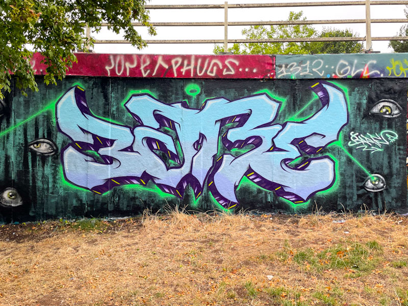
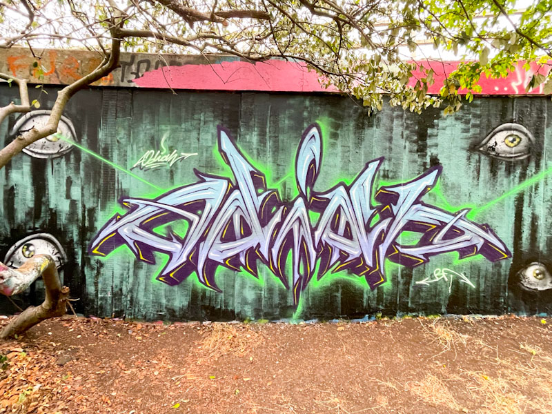
This is a rather dreamy piece of graffiti writing in which the slightly unruly letters appear to drift into one another as if they were clouds. The colours are beautifully selected, and the whole piece has a sense of relaxed slow movement – it is amazing really how these artists can portray different moods and tempos through their designs and colours. This is a lovely piece from Sait Bare.
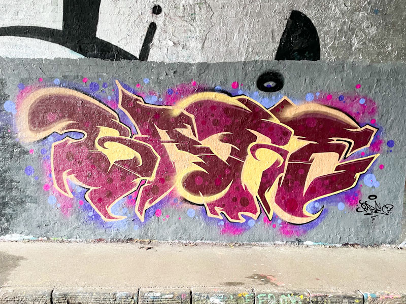
Sait Bare is an artist I haven’t yet met, so I can offer little insight into him or his motivations, but his unusual work is constantly developing and improving. Recently he has switched things up a little and changed from writing the letters SAIT to writing the letters BARE, as in this case.
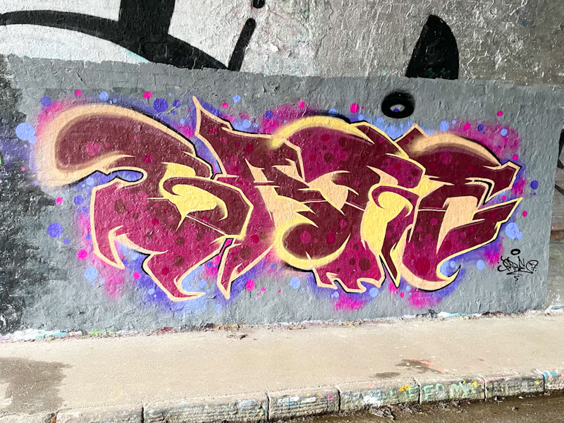
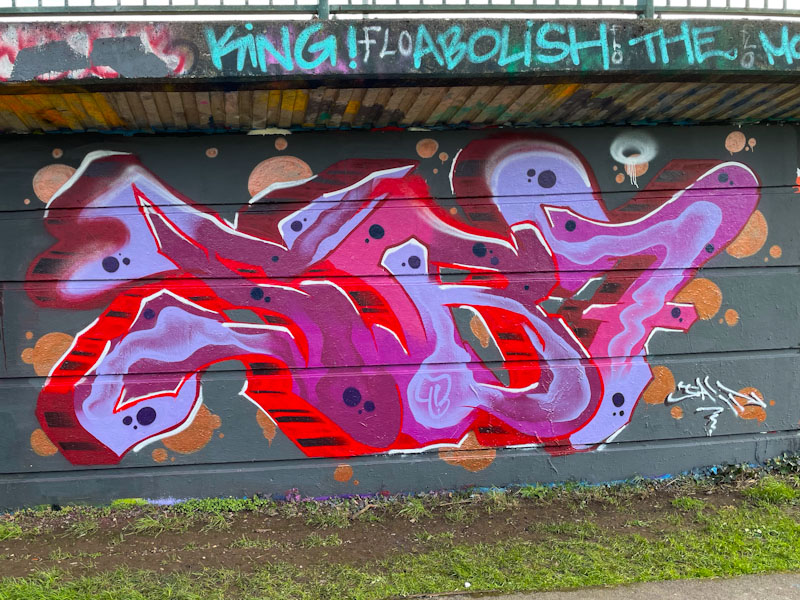
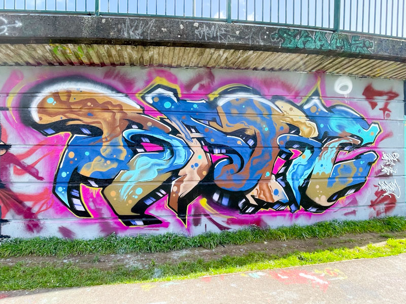
The colours he ha selected for this piece have a wonderfully rich quality, with the two tones of deep red and the reversed out spots contrasting really well with the sandy yellow. . The letters are set in a grey buffed wall with some nice pink and blue (that winning combo) spots. This is a lovely looking piece from Sait Bare.
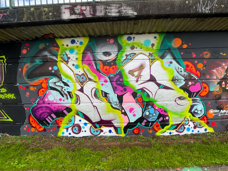
It is nice to see painting partnerships form between artists, and one of them that has been flourishing over the last year or two is that between Sait Bare and Hire. Their classy collaborations tend to be of the nature where there is little read-across between them, but that they are painted side by side.
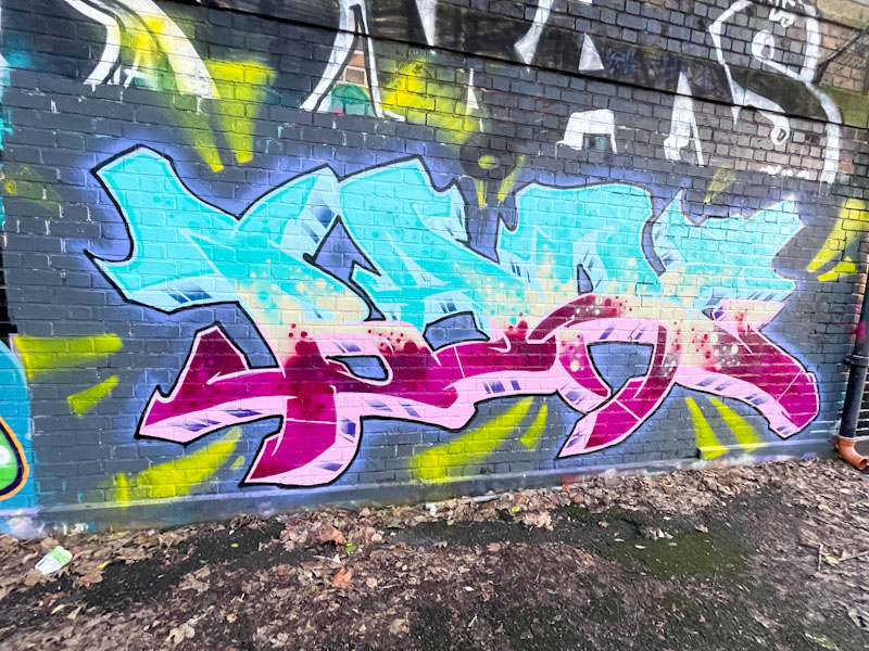
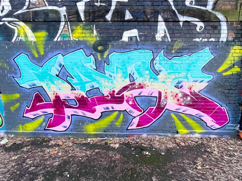
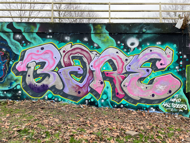
Usually we see the letters SAIT when Sait Bare paints his graffiti writing, but in this instance he has spelled out BARE. The winning combination of pink and light blue are used to great effect in this dazzling piece, and the transition line between the colours is filled with creamy froth, beautifully done. Some yellow background splashes surround the piece, but I am not sure they quite fit the style and don’t really add anything… in my view the letters are enough. A nicely presented piece from Sait Bare.
I mentioned a couple of days back that Hire and Sait Bare have formed a collaborative partnership this summer which seems to be proving rather fruitful. This is a lovely colour-themed collaboration from the pair on the long hoarding on the Bristol to Bath cycle path.
Hire has written the most common of his letter forms HIRE, with some nice script letters in yellow that are far removed from his early pieces that were much more jagged and harsh. He has gone for an interesting interstitial fill within the boundary of the letters, which creates an interesting effect. The writing is painted on a background with a rather subtle pink cloud set on a grey buff.
Sait Bare has written BARE using the same yellow colour and background, which brings some synergy to the collaboration, but his letter style is quite different. There is a nice transition from solid green and bubbles through to solid yellow and some subtle green patterning. As a pair, these two are working well together and I look forward to more collaborations.
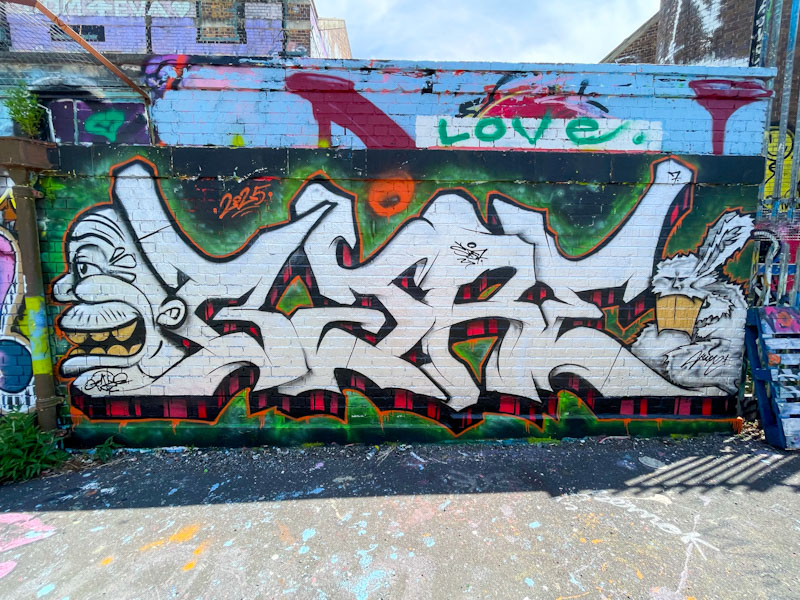
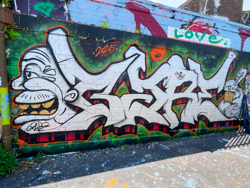
This is a wonderful piece of graffiti writing from Hire, that was painted alongside Sait Bare. Together they seem to have struck up a painting partnership and have collaborated a few times recently – I posted Sait Bare’s piece adjacent to this one a little while ago.
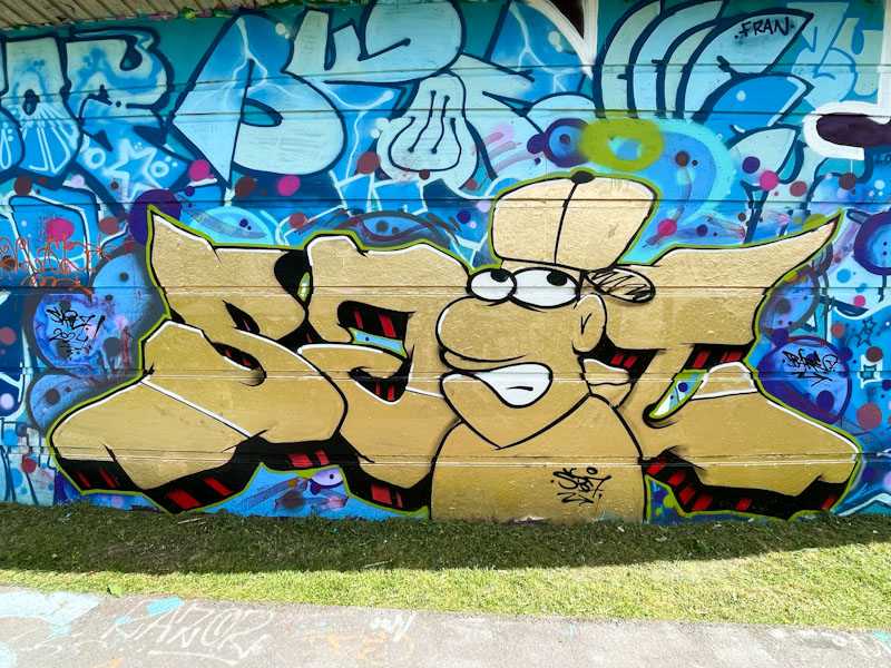
Hire has painted his ODIAH letters, which he does from time to time, and they look absolutely splendid. This is a tight piece of writing with some great fills including mid-line which offers depth to the letters as do the 3D drop shadows. The whole thing is painted on an interesting background of roughly rollered green on black – an interesting effect.
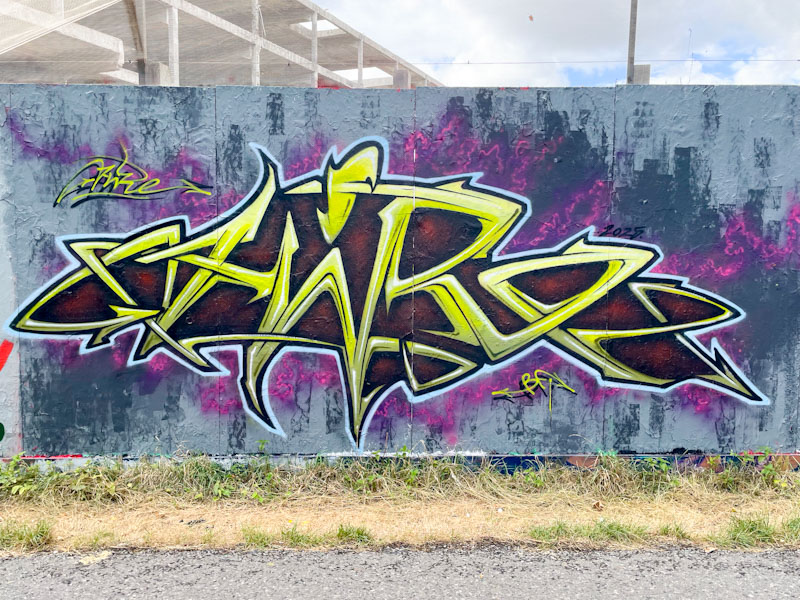
In Bristol we have so many different styles of graffiti writing, and a lot of these fit into certain defined categories such as wildstyle, anamorphic, calligraffiti, anti-style, script, bubble writing and so on, but with some artists, it is really difficult to stick them in a particular pigeonhole, and I think Sait bare is one of those,
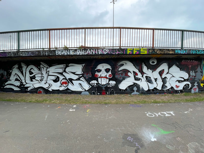
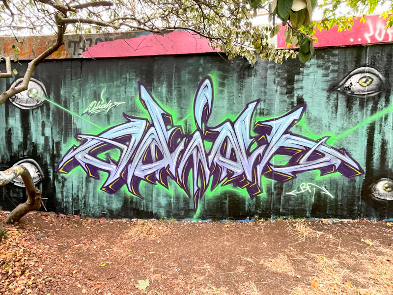
This is a nice piece painted alongside Hire, a pairing that seems to be increasingly common. There is a bilateral symmetry emerging in this piece, which is perhaps the key focal point, as the fills are quite plain. The drop shadow converging on a central vanishing point and the glowing green border highlights provide plenty of depth. Also, the eyes, which are common to both this piece and the adjacent one by Hire, definitely add interest.
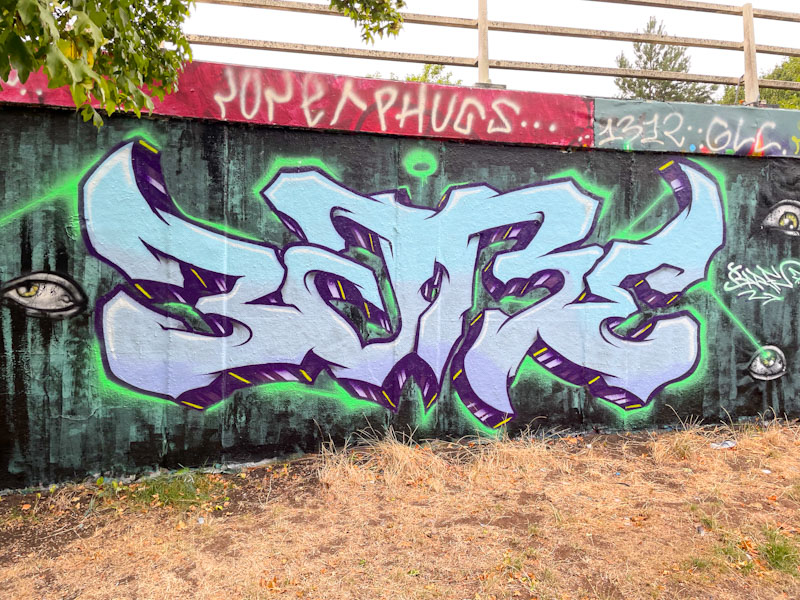
This piece from Hire had me raising my eyebrows, in a good way, because it is quite unlike anything I have seen from him before. I would normally associate his work with quite intricate, spiky, angular letters, but here he has gone for something altogether softer and more fluid – to be honest I hind it a little disorientating. (Update – I am being particularly dense, the writing is, of course, by Sait Bare, which is why it is so different in style. I couldn’t see the wood for the trees.
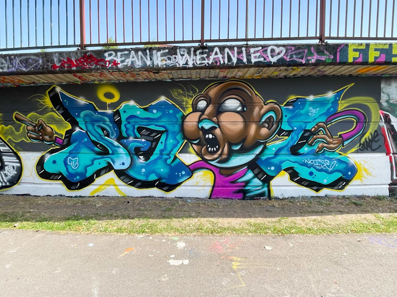
The combination of letters and two characters works well, with a face on the left and one of his trademark rabbits (see, it is spiky) to the right. The letters have a traditional 3D drop shadow with black and red stripes. This whole thing looks like Hire is experimenting a bit, departing from his customary style, and that has to be applauded.
I have to be a little brief this morning. I am staying with family, and I think breakfast is ready…
I have noticed that Sait Bare likes to paint in this area by the river, and would guess that he probably lives nearby.

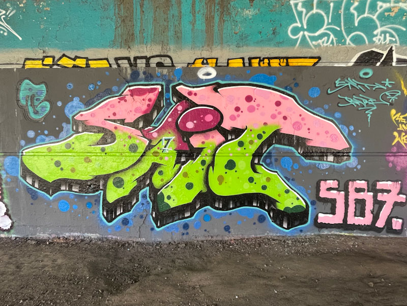
Perhaps the most notable thing about this lovely piece is the colour selection, which reminds me of a stick of rhubarb, and once seen that way, it can’t be unseen. The letters SAIT are nicely filled in the base colours and liberally decorated with colour- matched dots. The whole thing is nicely rounded off with a black and white stripy drop shadow. An attractive piece of graffiti writing.


