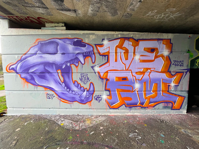
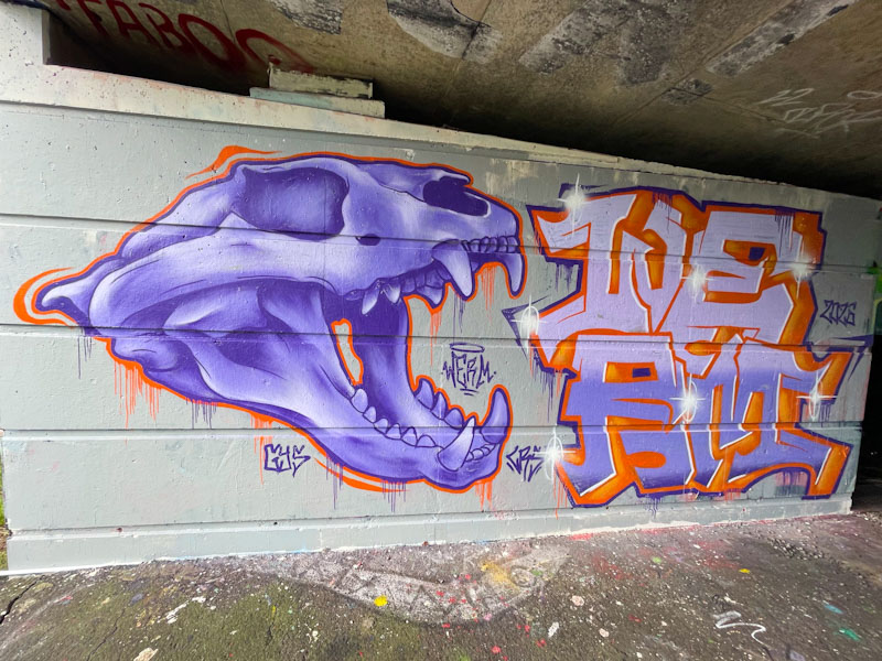
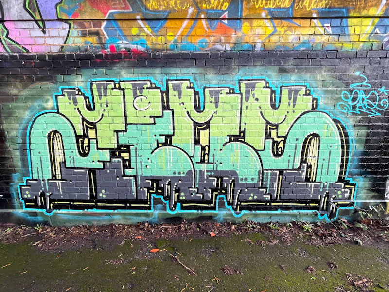
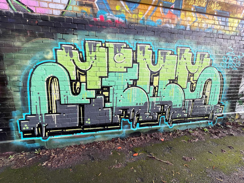
I was so pleased to find this piece by Werm, who like many other artists has struggled to paint this winter, I assume, because of the rain. Werm painted this spot some years ago with a skull piece, and I think that this is a throwback piece to the original painted in February 2023.
Werm, Cumberland Basin, Bristol, February 2026
I guess you could call this a combination piece, although the skull and letters are discrete. On the left, the skull (from the cat family I guess) is beautifully observed, with some great shading to bring out the form and depth. The proportions work really well – skulls can be very difficult to paint. The writing on the right spells out WERM stacked, two letters on top of the other two. Overall, this is a fine work from Werm and almost like a study to practice his craft.
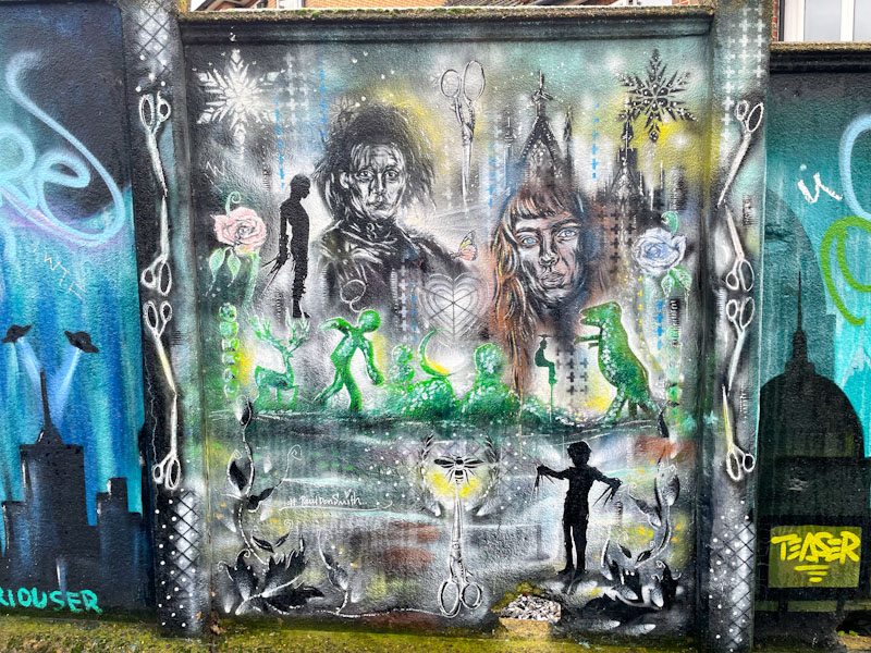
Paul Don Smith, Surbiton Station, London, February 2026
This is another piece from the surprise wall at Surbiton Station, this time one of three pieces by the artist Paul Don Smith. I know nothing about the artist, but from what I see, it looks like he likes to paint scenes in a collage style from television shows or films.
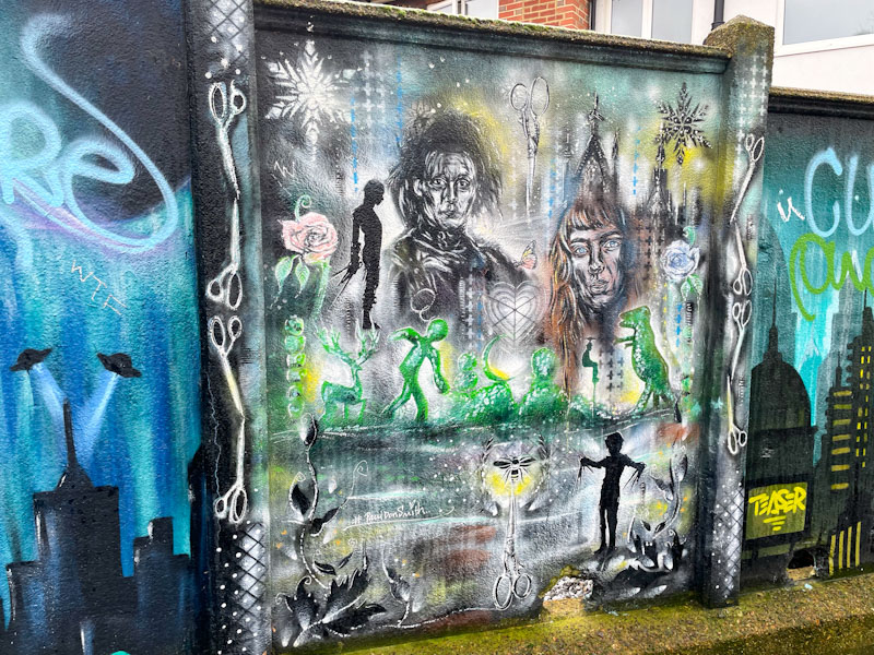
Paul Don Smith, Surbiton Station, London, February 2026
Paul Don Smith has chosen to feature Edward Scissorhands in this square piece, creating scenes and images from the film, including a nicely trimmed hedge and plenty of pairs of scissors. The artwork is a fusion of stencils and paintwork. It is difficult to know how much is brush work and how much is spray paint, but the overall effect seems to work and is quite unique. More to come from Paul Don Smith.
There was a time when finding a Trafficity piece was something of a rarity, but it feels like he has ever so slightly turned up the dial over the last couple of years and is in a good rhythm. Trafficity’s work is quite remarkable in that he sticks to his intricate design piece after piece, with only colour changes and minor decorations. His consistency is his trademark.
Trafficity, Dean Lane, Bristol, February 2026
Like Cort (see previous post), Trafficity belongs to the PAD crew, which is mainly composed of Polish artists. Bristol is full of these little communities of artists, sometimes defined by nationality, sometimes by gender, sometimes by friendship or sometimes a combination of all of these. The letters spell ZIOS, which is reasonably easy to see once you know. It is always good to find pieces by Trafficity.
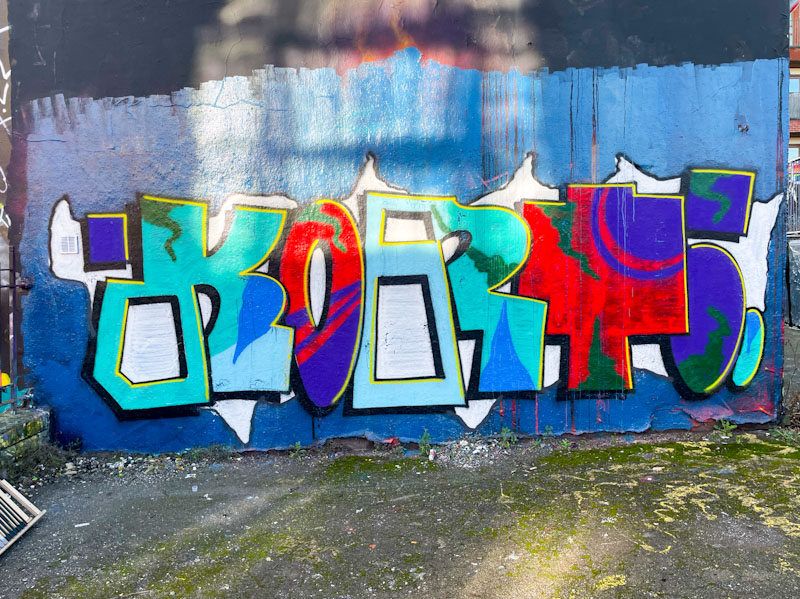
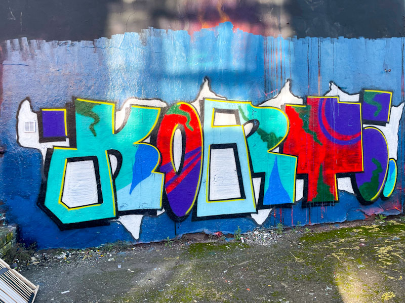
Cort tends to bring some lovely colours into his work, often choosing ones that both contrast with and complement each other well. This approach brings into focus just how important colour selection can be, and that it is not a random process for most artists, but a carefully considered process.
Cort, Dean Lane, Bristol, February 2026
The sunlight on this piece isn’t very helpful, but I think you get the picture. The KORT letters are so typically written in his unusual style, and pairs of letters are filled in common. It looks like he was running low on some colours, or the piece has been badly rain affected, because it is possible to see the paint lines in some of the fills. Another nice piece from Cort.
Doors 343 – Doors from the City of York, York Minster, (Part IV), June 2024
This week I am concentrating on one building in York and its many external doors, the world-famous York Minster. I shall let the Interweb do some of the heavy lifting on a description of York Minster, in the interests of time efficiency and (likely) accuracy.
York Minster is one of the largest and most magnificent Gothic cathedrals in Northern Europe. Its origins date back to 627 AD, when a small wooden church was built on the site to baptize King Edwin of Northumbria. Over the centuries, this early structure was replaced by stone churches, including a Norman cathedral erected after the Norman Conquest. Following a devastating fire in 1220, the current Gothic minster began to take shape, with construction continuing for over 250 years until its completion in 1472.
Architecturally, York Minster is a masterpiece of medieval English Gothic design, showcasing Early English, Decorated, and Perpendicular styles. Its vast nave, intricate stone vaulting, and soaring pointed arches create a powerful sense of verticality and light. The cathedral is renowned for its extraordinary stained glass, including the Great East Window—one of the largest expanses of medieval stained glass in the world—and the famous Rose Window in the south transept.
The building’s central tower rises above the city of York, serving as a dominant landmark and symbol of ecclesiastical authority. Inside, finely carved choir stalls, detailed tracery, and an impressive chapter house with its octagonal design highlight the craftsmanship of medieval masons. Together, its layered history and architectural grandeur make York Minster not only a place of worship but also a monument to centuries of religious, political, and artistic development in England.
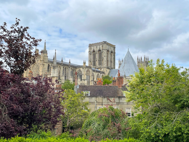
When I visited York, I didn’t have time to go inside the Minster, instead I walked around the outside snapping away. The building is large, and with the proximity of surrounding shops and houses it was difficult to take pictures without using the wide-angle lens, leaving some of the photographs looking a little distorted. I hope you enjoy these pictures of one of the great buildings of England.
View of York Minster from the city wall, York, North Yorkshire, June 2024
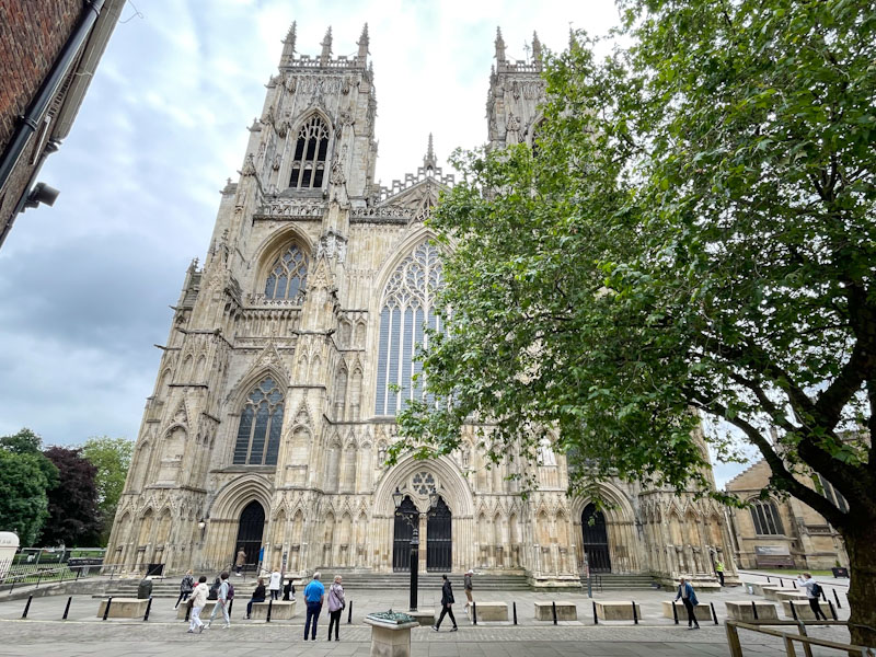
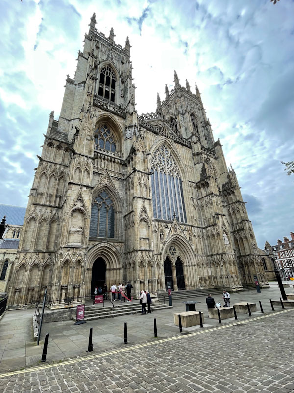
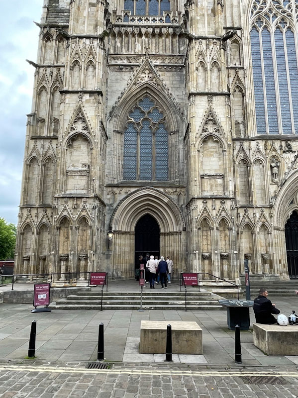
West front of York Minster with three entrances, York, North Yorkshire, June 2024
West front of York Minster with three entrances, York, North Yorkshire, June 2024
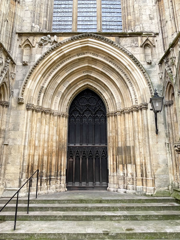
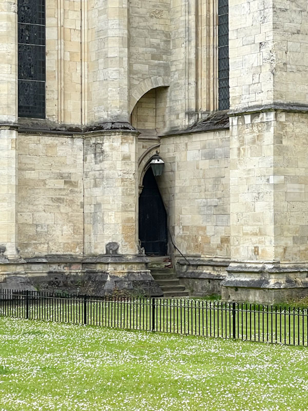
Left-hand door and entrance on the west front of York Minster, York, North Yorkshire, June 2024
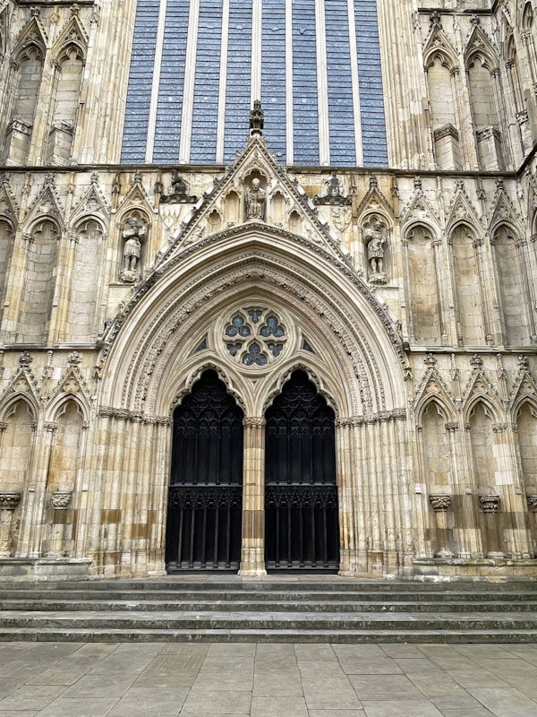
Central doors on the west front of York Minster, York, North Yorkshire, June 2024
Right-hand door on the west front of York Minster, York, North Yorkshire, June 2024
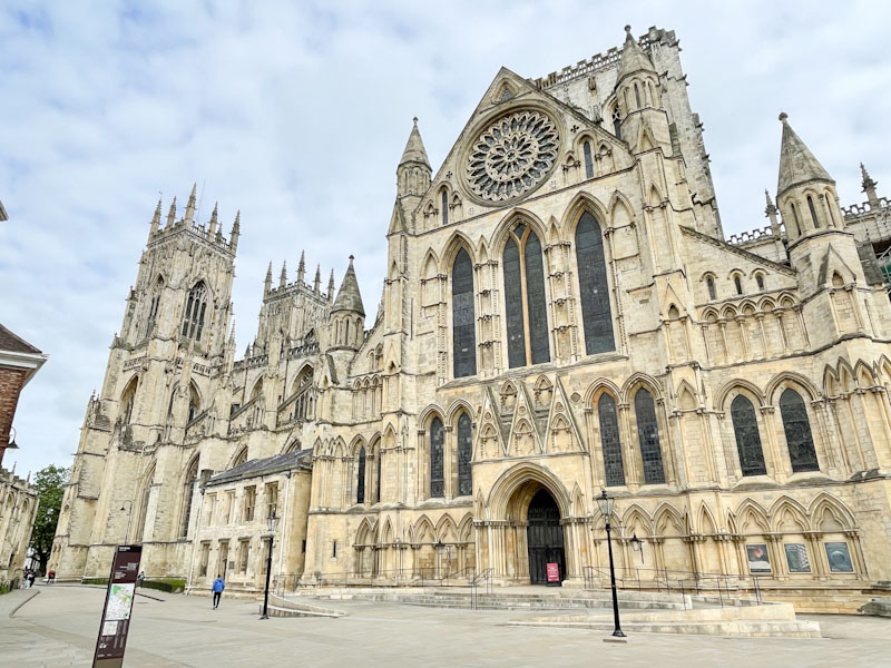
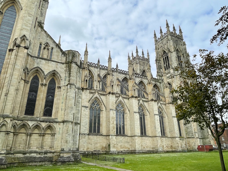
South side and transept of York Minster, York, North Yorkshire, June 2024
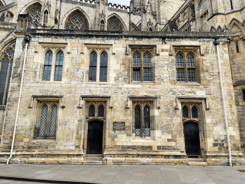
Doors to the diocesan registry and chapter clerk’s office, York Minster, York, North Yorkshire, June 2024
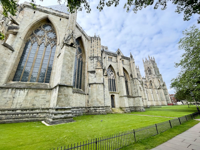
The north elevation of York Minster, York, North Yorkshire, June 2024
The north elevation of York Minster, York, North Yorkshire, June 2024
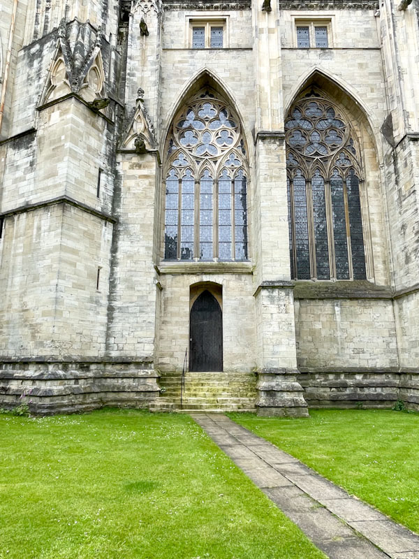
Small door in the north elevation of York Minster, York, North Yorkshire, June 2024
Hidden door on the north elevation of York Minster, York, North Yorkshire, June 2024
It is a pity that the skies were a little overcast during my visit, but I don’t think that it diminishes the impressiveness of the building at all. When I visit again, I must make time to go inside. Next time, some more doors from the streets of York, until then, have a great weekend.
If you have made it this far, you probably like doors, and you really ought to take a look at the No Facilities blog by Dan Anton who has taken over the hosting of Thursday Doors from Norm 2.0 blog. Links to more doorscursions can be found in the comments section of Dan Anton’s weekly Thursday Doors post and his Sunday recap.
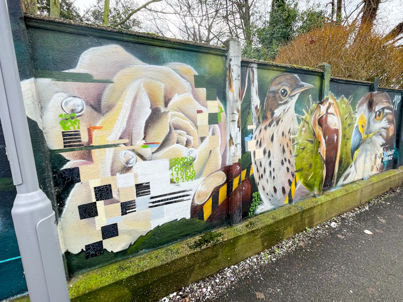
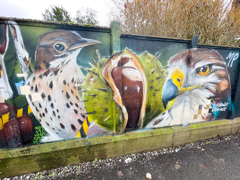
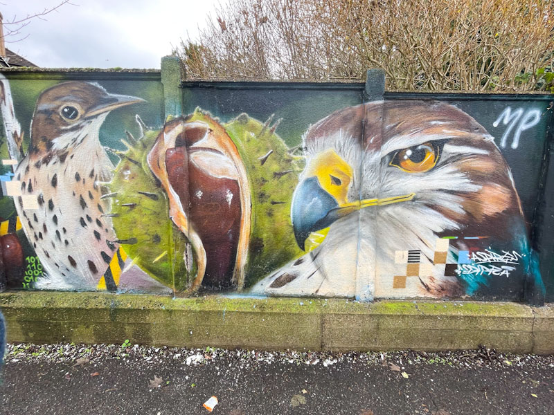
Another highlight of the ‘discovery’ I made at Surbiton Station, was this absolute beauty from Aspire, formerly of Bristol, and an artist whose work I have admired for many years. The piece was painted in a narrow alleyway, and difficult to photograph head on, even with a wide angle lens.
Aspire, Surbiton Station, London, February 2026
The outstanding piece features a pixelated rose, a thrush, a stunning conker and a bird of prey – maybe a hen harrier. There is a tenderness and love for nature that comes across so strongly in all of Aspire’s work, and he loves to be true to the birds he paints. I have to say, I absolutely love the conker – not something you see all that often in street art. A great find, albeit painted some time ago.
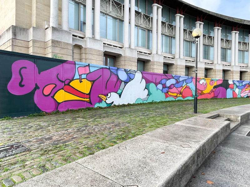
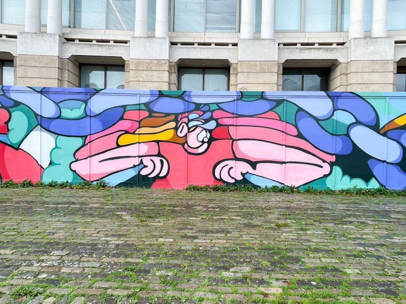
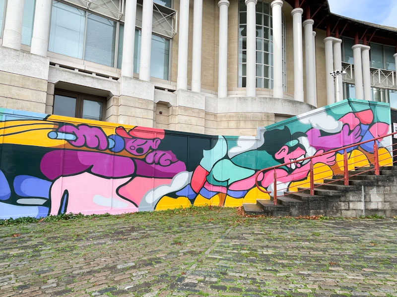
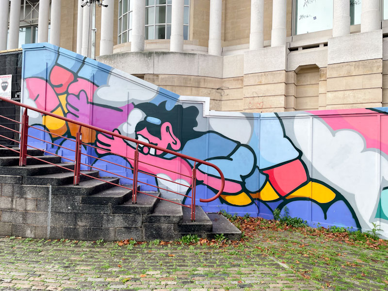
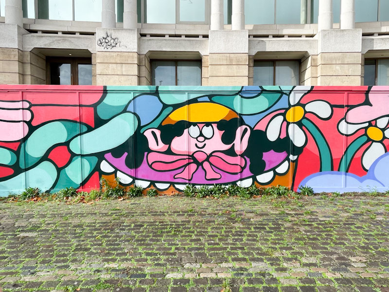
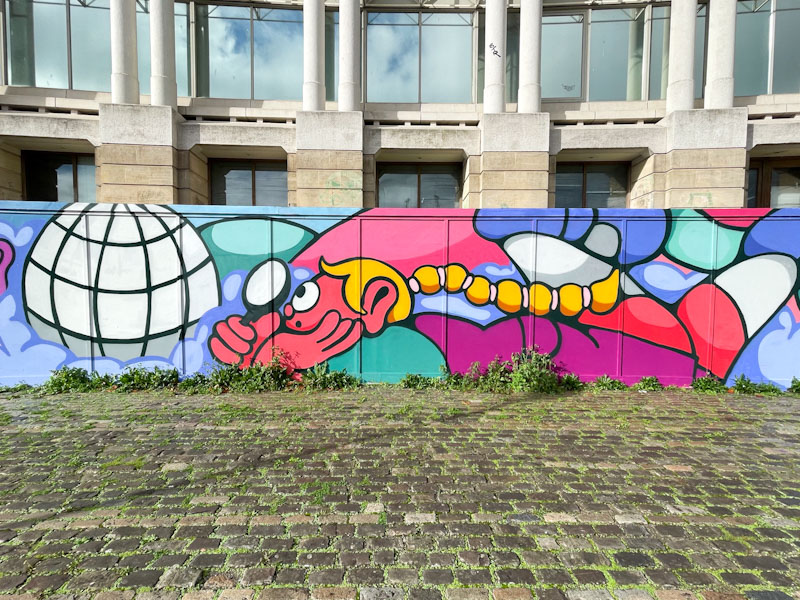
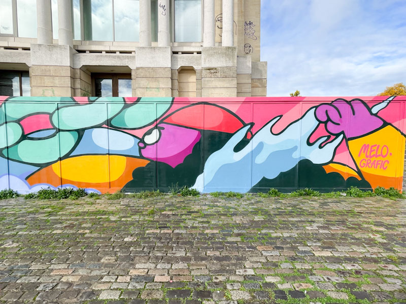
Esme Lower (Melo) absolutely smashed it with this massive commission on the harbourside from September/October last year. The opportunity was facilitated by Upfest and supported by Bristol Bid and Redcliffe and Temple Bid.
Esme Lower, Monarch’s Way, Bristol, October 2025
The brief was to bring together elements of the Women’s Rugby World Cup, inspiring women of Bristol and local references to the harbour and businesses. So not too much of a challenge there then. Her upbeat cartoon scenes and characters lent themselves very well to the brief, and the outcome is hugely impressive, as the pictures below show. Well done Melo!
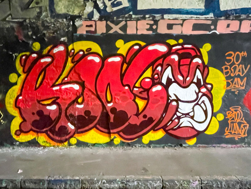
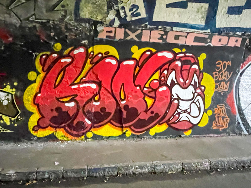
This was a piece from a little while ago by Kool Hand, celebrating his own birthday with some friends in the tunnel. For some reason, my iPhone was playing up that day, and my photographs a little blurry – some kind of auto-setting might have kicked in because of the low light levels.
Kool Hand, St Werburghs, Bristol, October 2025
The combination piece has the letters KOOL accompanied by a trademark orangutan head, and the whole thing is very nicely presented. Kool Hand is an artist whose work just keeps on developing gradually but consistently. A very nice birthday present to self.
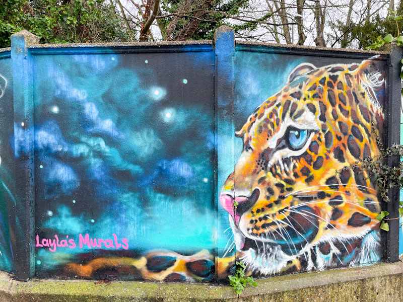
Layla’s Murals, Surbiton Station, London, February 2026
This wall at Surbiton Station was the gift that keeps on giving. Although this piece by Layla’s Murals is several years old – it took me a while to find it on her Instagram page – it is still looking rather good, and hasn’t been tagged at all.
Layla’s Murals, Surbiton Station, London, February 2026
The stunning portrait of the leopard stands out alongside a large and dramatic sky. Ordinarily such a large space would be filled with bits and bobs, but Layla’s Murals clearly has the confidence and belief in her composition, and it works really well.
As a slight aside, I am learning Shakespeare’s wonderful ‘seven ages of man’ monologue, because I want to, and this picture reminds me of one of the lines…
‘Then a soldier, full of strange oaths and bearded like the pard’
The ‘pard’ is a leopard, and here you can see why a soldier might be bearded like one. Great stuff.