
I realise that some of you might think that I am overdoing it a bit with the Oner thing – this is my fifth post from this writer since mid-May – but I think that both his artistry and productivity deserve it.
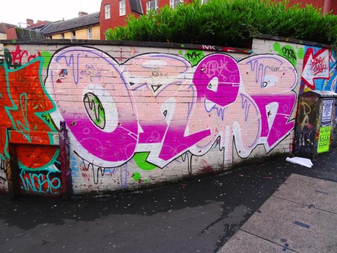
At first glance the piece may look a bit messy, but there is lots that is good about it. His lines are clean and he has cut in the edges of his letters really skillfully so that each is distinct from the next. His shading regime has been reversed on the ‘e’ with the dark pink at the top and the light pink underneath. He has added in some nice drip decoration and if you look closely you can see some subtle bubbles on his dark pink. I think I could learn a lot from this writer.
