
Cort is one of Bristol’s regulars who will often be found painting alongside Laic217 but occasionally paints alone. His writing is quite different from other people’s and has a very distinctive font which is perfectly demonstarted in this piece.
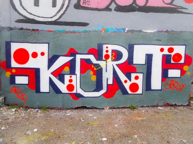
Painted on a grey-buffed wall the letters spell out KORT . These have a nice 3D shading off to the left and contain some nicely painted red dots. Adding a bit of interest behind the lettering is a red splosh and some little orange circles for good measure. A nice touch is the two yellow rings joining the O and R of the piece. Great work.

It feels a little unbalanced to me. Perhpas it is the T……………..
LikeLiked by 1 person
His letters often look unbalanced, it is kind of his thing.
LikeLiked by 1 person