
Hot on the tail of his first piece on Natural Adventures, I am pleased to bring you this second one from last month. Of course, there are a whole ton of his pieces in my archives, but it will take me a little while to unearth them all.
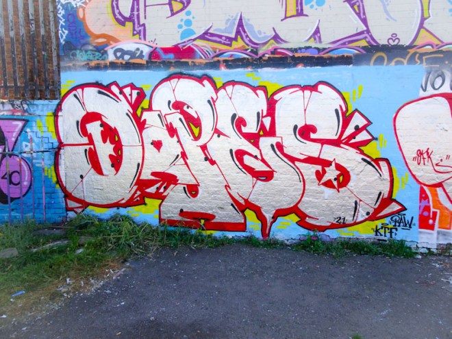
Dopes seems to favour these large letters with chrome or other bold solid fills and accent highlights and the overall effect is a good one. I know he takes care with his work, and it is clear to see from the sharp and clean lines that he is really conscientious about his work. Lots more to come.
