
Regulars will know that I really like Bnie’s work. She fits into a school of writers whose letters are not cryptic… what you see is what you get, and the magic is created in the colour schemes and in the fills and patterns. Some, for example Mena in yesterday’s post, try something a little different from time to time, but it is in perfecting what you enjoy that shines through the most.
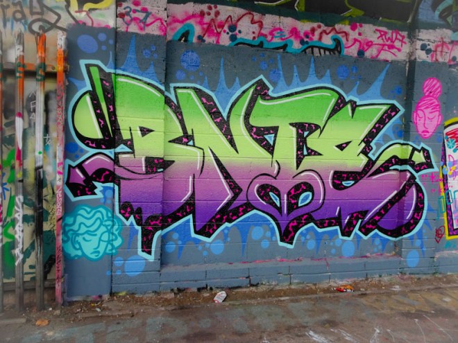
This newish piece on the cycle path, part of an RBF paint jam, does incorporate some slightly new letter shapes and the horizontal fade from purple through to green in four shades is beautifully worked, but it is her distinctive patterned (in red and black this time) 3D depth that is truly masterful. Great piece.
