
Oof! I am absolutely loving these script writing pieces that Mena painted in the late autumn, and the departure from her customary blocky letters is inspired. It is so good when writers experiment with new styles, and this is a winning formula in my opinion.
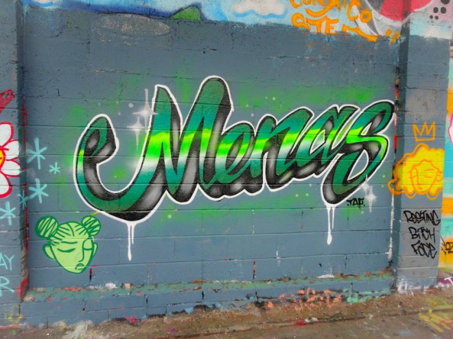
Painted alongside fellow RBF artists, this is a real stunner. Looking like a neon sign, the clever horizontal fills are really effective. Also the sharp lines are so skilfully done. All in all a really classy piece.

Yeah she’s really taken her letters to the next level and with a little help from STIVS here and there I’m sure that’s only going to continue . . .
LikeLiked by 1 person