
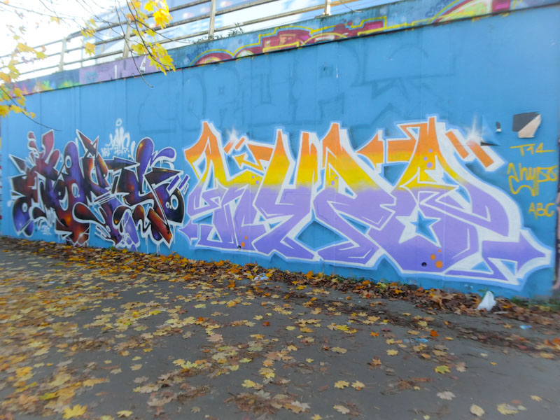
This collaboration by Hemper and Hypo was painted at least a month ago, and I photographed it is November, I also photographed it this month as a way of reminding me to post it. It would appear that these two have been encouraging each other to get out more often lately, as they have painted together a few times in the latter part of the year.

Hemper’s writing is never, ever duplicated. Every piece is a spanking brand new and creative design, way too complex to ever be repeated. This piece is a joy to behold, crazily explosive, with so much happening on each of his HEMS letters, and the graduated fills are simply perfect. Incredible writing from one of Bristol’s masters.

To the right, we have a rather calmer piece by Hypo, whose neat letters contain an interesting fill colour selection, not exactly what I would call natural bedfellows. It almost feels like two independent colour selections have been squished together and I’m not too sure it works as well as it might have done with other selections. But then again, what do I know? The letters are nicely crafted and this modest piece by Hypo is the perfect counterbalance to Hemper’s energetic piece.
