

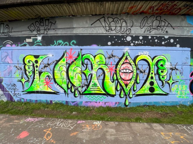
This is another piece in a series in which we see Lee Roy spell out his name with his unconventional font that teeters on anti-style graffiti. There is a lovely symmetry about this piece, and something about the style, colours and composition that has hints of the Indian subcontinent (although I don’t think that is necessarily the intent).

There are many similarities with a recent piece he painted in Cumberland Basin recently, and it would seem that he is playing with themes and ideas. It is great to see this pulse of activity from Lee Roy, and I look forward to finding more as the weather improves and artists get busy (as if I don’t have enough to keep up with as it is).

Love Leroy’s colors.
LikeLike
Actually, Lee Roy!
LikeLiked by 1 person
His pieces certainly stand out, and usually have a single colour theme going on.
LikeLiked by 1 person