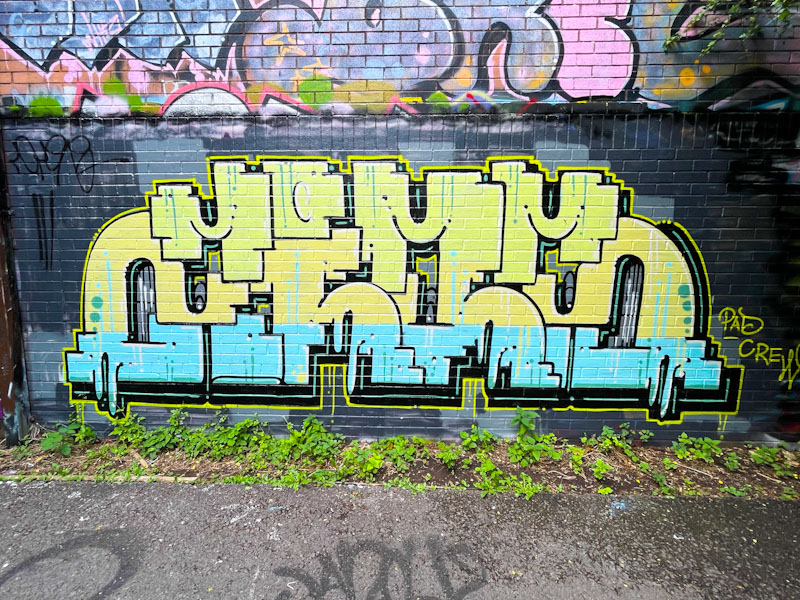
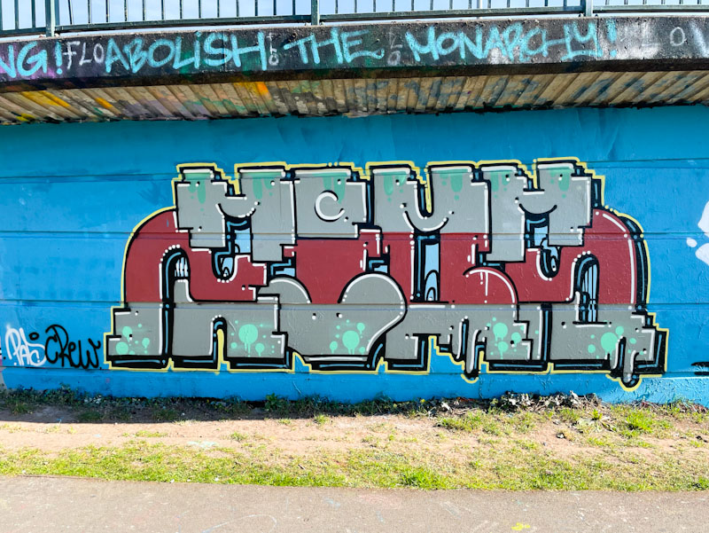
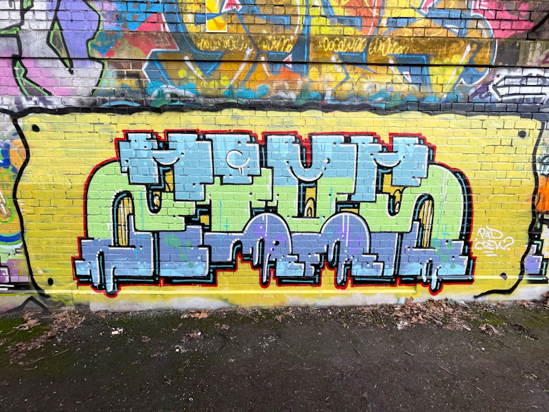
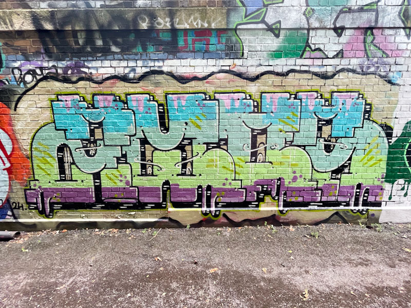
A gallery of outstandingly consistent graffiti writing from Bristol-Polish graffiti writer Trafficity.
ZIOM
Instagram: @trafficity
All photographs by Scooj





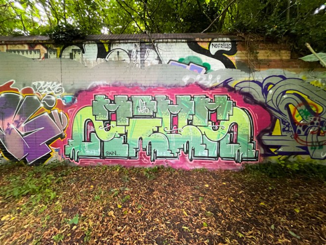

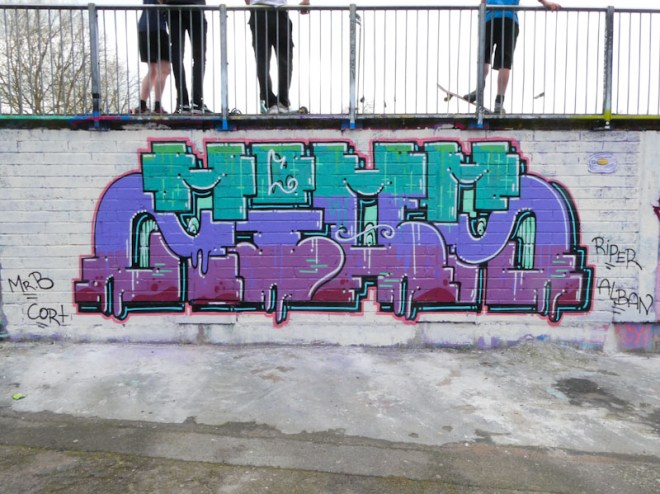
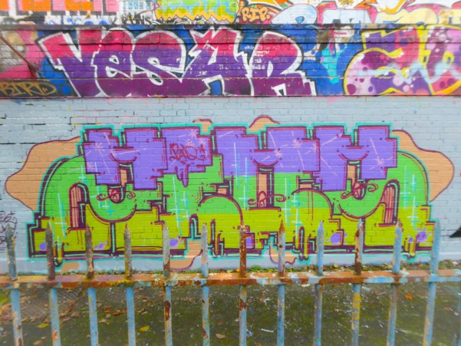
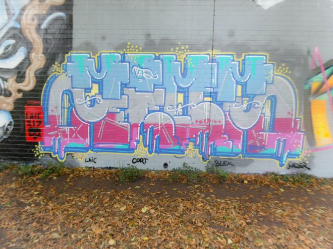

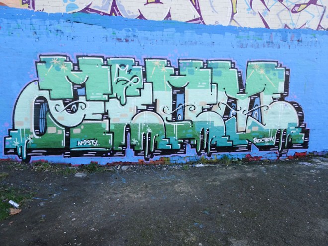


A gallery of outstandingly consistent graffiti writing from Bristol-Polish graffiti writer Trafficity.
ZIOM
Instagram: @trafficity
All photographs by Scooj


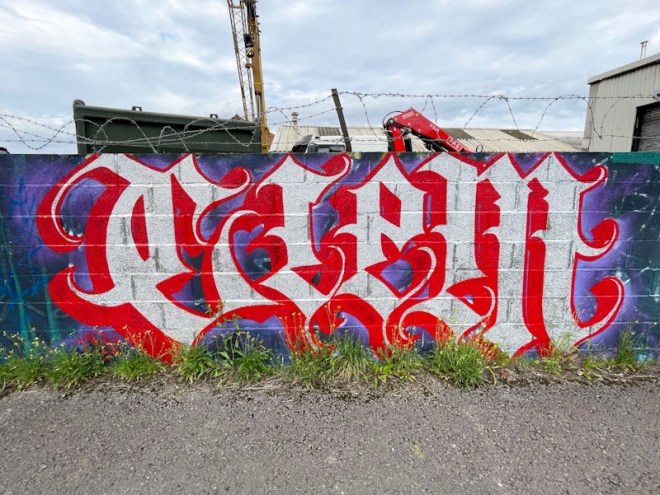
This is a piece that I thought I had posted, which makes me think that it might have been painted some time ago. Having said that, it might be a recent piece. It is so difficult to keep on top of street and graffiti art in Bristol at the moment, because I have never known the turnover to be so high, nor the number of new entrants into the urban art community. Each time I go out, which is most days, I can find between 5 and 10 new pieces, which gives you some idea of the scale of activity in our vibrant city.

Todoaciem is one of two top-class calligraffiti writers in Bristol, the other being Stivs. Most of the time Todoaciem will write the letters CIEM in a Gothic style typeface, maintaining strict conventions in the letter shapes and forms. There is no room for error, as even small mistakes would be obvious in the overall look of the piece. From the photographs and from memory, it is difficult to tell if this is chrome and red or white and red, but I think it is the former. Whatever the colours, the form is fabulous and the piece another fine example of great calligraffiti from Todoaciem.

Enn Kay or NAK, has been knocking it out of the park lately and massively expanded his portfolio of characters in a very short space of time, adding strength to the maxim ‘practice makes perfect’. This piece was painted during Werm’s birthday paint jam and has quite brilliantly adopted the theme colours of blue and pink.

In this piece, Enn Kay has painted a blue cartoon rabbit, looking rather Disney to me, holding a pink spray can, which he has been using to paint the letters NAK. This is a common construct in street art, in which the protagonist has painted a part of the piece in which they exist. This is a beautifully finished piece that sits snugly with the others in this collaboration.
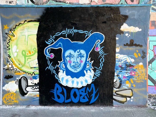
I was really struck by this piece in the tunnel recently and at first I thought it might have been by Rozalita, but on closer inspection it clearly wasn’t, and the name BLEOM was also a bit of a clue. The piece is by Bloem, who is also Hiccup, and because I have posted her pieces under the latter name, I shall be consistent and continue to do so.

The portrait piece, featuring a jester, is really neat and tidy and carries an element of treat in the form of a barbed wire circle around the head. All elements of thee piece come together well, in particular the ruff, and the jester’s expression. The letters are also very sharp and well painted. This is a classy piece from an artist relatively new to the Bristol scene, and I look forward to seeing and writing about more of her work (coming sooner than you might think).
Doors 231 – Lincoln City doors (Part IV) – Lincoln Cathedral
On my work visit to Lincoln a few weeks back, I was running a workshop on the Monday, so I planned my arrival to give myself time to explore on the Sunday afternoon. I had no idea what to expect, having never visited before, and I can’t even remember ever having conversations with anyone bout the city. This was a blank canvas, perfect for a spot of psychogeography.
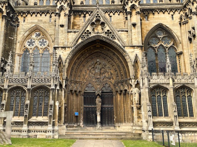
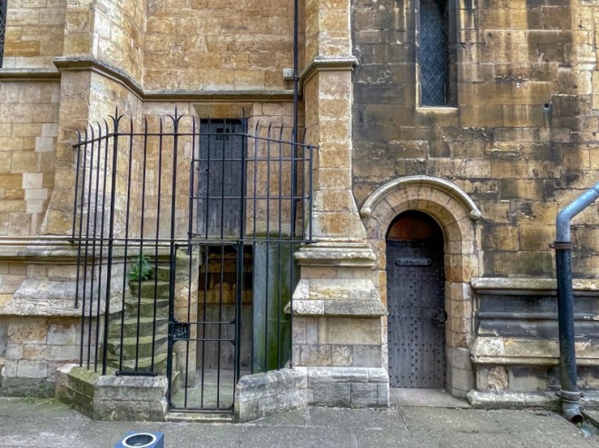
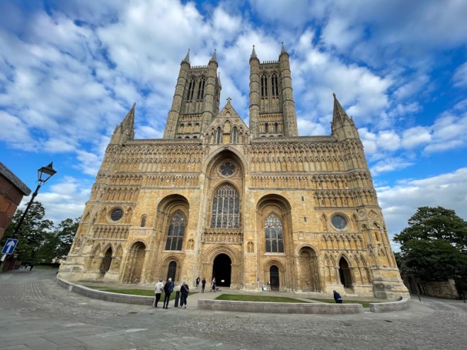
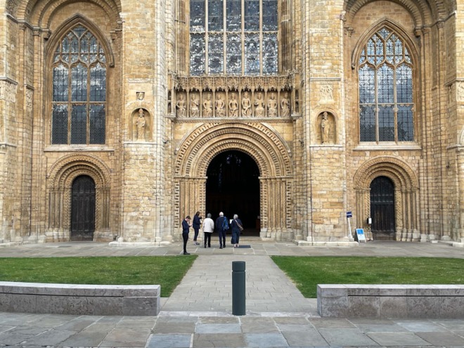
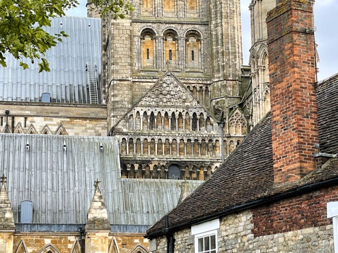
This week, the doors come from Lincoln Cathedral, at the top of the hill in the old city. I think that it is safe to say that I was utterly awestruck and moved by the architecture and aura of the cathedral, and I believe it to be one of the finest buildings I have seen in England. Unfortunately I didn’t manage to enter the cathedral, because it was a Sunday evening and people were heading in for a service, it wasn’t really appropriate to be a tourist at that moment, I might have to return sometime. Here are some doors from the outside of this magnificent building, which I hope you enjoy as much as I did:
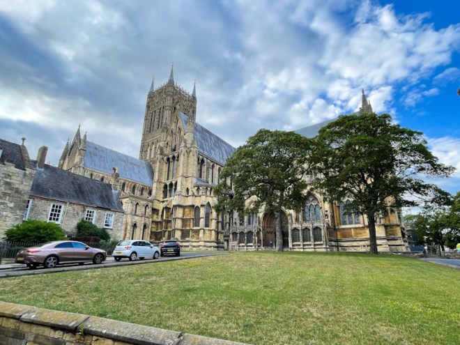




I have more doors to share with you from the old part of Lincoln city next time. I hope you have a good weekend, and I look forward to reading about your doors today.
If you have made it this far, you probably like doors, and you really ought to take a look at the No Facilities blog by Dan Anton who has taken over the hosting of Thursday Doors from Norm 2.0 blog. Links to more doorscursions can be found in the comments section of Dan Anton’s Thursday Doors post.
by Scooj

Peggy is a tattoo artist and street artist who paints wonderful floral murals about the place. She is an active crew member of RBF (Resting Bitch Face crew), and joined in with their recent Barbie paint jam up at Greenbank. What I particularly like about this piece is that Peggy, who I imagine is fairly principled, has not created a piece that is overtly ‘Barbieised’.
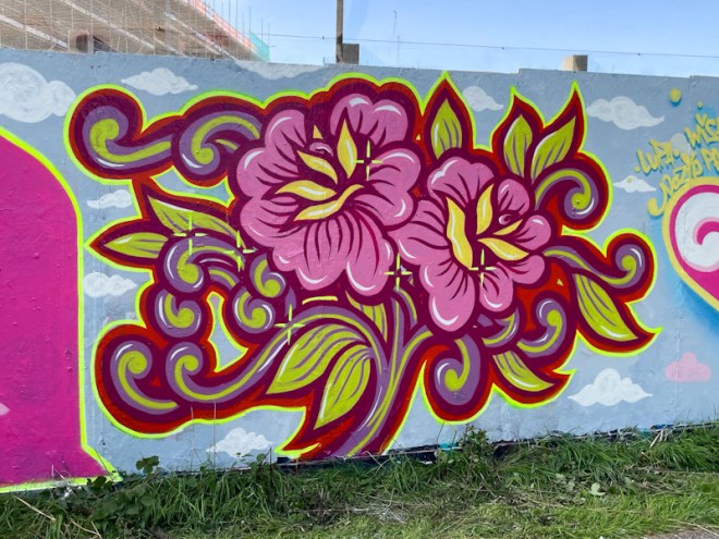
This floral design might have conceded a little bit more pink than Peggy might ordinarily use, but she has kept to her overall style, which I admire. This is one of her larger pieces and is a great example of her beautiful flower designs. Fabulously presented, the piece also has some little feature stars that create focal points that draw the eye, but also provide a bit of sparkle. A wonderful non-Barbie, Barbie piece.
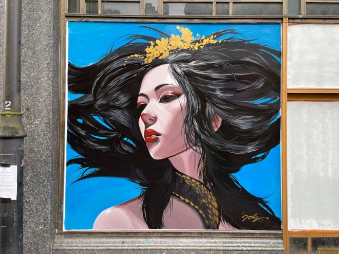
It is very special to see a Jody piece that has been painted on the street without spray cans, but rather with brushes… it doesn’t happen often, but what a magnificent result. This gorgeous portrait piece has been painted as part of the 650-year celebrations of Bristol and an event curated by Upfest in partnership with Bristol BID.

Jody has gone full on renaissance style with this portrait, and in doing so was following the brief. In his own way, he has created something very special, although slightly incongruous being next door to the dreadful Weatherspoons pub. The lady’s hair and hair decoration are eclipsed only by the outstanding detail of her face.

This piece is an antidote to all the horrors of our very own crisis in Britain and demonstrates that there are good and beautiful things in our lives. An ancient beauty for our modern times.

There are artists whose progress is slow and steady and there are others who have accelerated through the levels, hitting many highs along the way, and one of those is DFC1848. Over the last few years, DFC1848 has progressed from toying with ideas to turning out sharp, clean original character pieces that sit comfortably alongside anyone, and this piece is a great example of that.
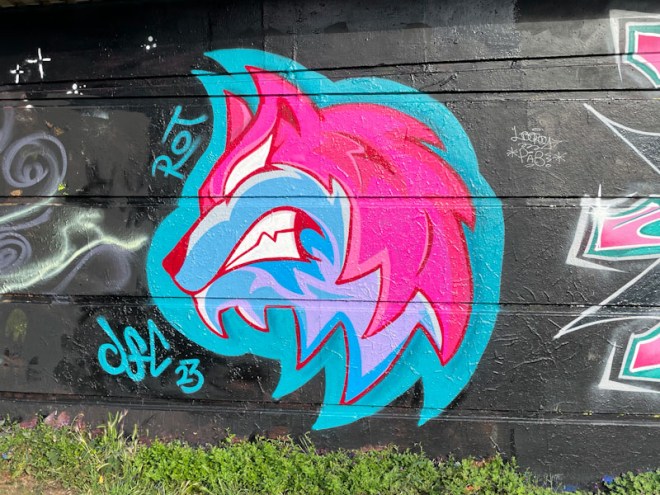
The growling wolf was painted during Werm’s birthday celebration paint jam, and was a stand-out piece, dutifully adopting the theme colours of pink and blue. The design itself is really cool, and technically it is a bit of a beast, with loads of cutting in to achieve all those crisp sharp points. A lovely piece from an artist who clearly enjoys his work.

.
Natural woodland
hugs the riparian strip
planted pines look on
.
by Scooj
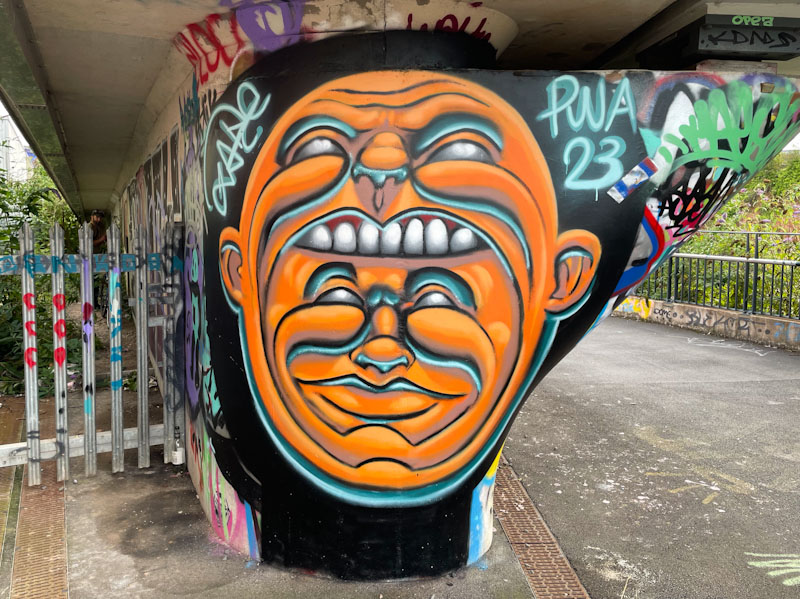
I don’t often hunt down specific pieces that I have seen on social media, preferring to come across them on my walks, as that somehow feels more authentic and retains the element of surprise. However, occasionally I see something, know where it is and actively seek it out and use the opportunity to photograph anything else that takes my fancy. This piece by Zake was one of those I had to go and look for, before it got too tagged up.
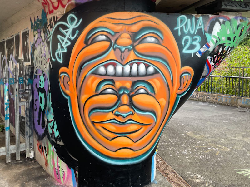
Zake has played with faces within faces, or emerging from faces before, but not quite as mesmerisingly as this. Is the bigger face consuming the smaller one, or is the smaller ne wearing the larger one? Either way, this piece has all the hallmarks of a Zake work, with definition of the features achieved through light and dark shading, creating the most wonderful 3D effect. This piece was well worth the slightly longer walk than I usually do in the area.