
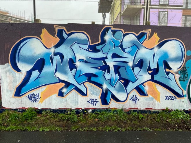
Over the last few months Werm has calmed his pieces a little, from the highly complex and technically brilliant pieces into something slightly easier on the eye, and this piece, for me, represents a mature approach from an artist who doesn’t need to impress any more, but rather, can concentrate on creating a thing of beauty.
The colour palette for this piece seems to work really well, and Werm has blended the fill colours expertly. The orange border and accompaniments augment the writing perfectly, the test of which is to imagine the piece without that splash of colour, rendering it greatly diminished. I like and welcome this new direction from Werm, and greatly admire this piece.

I like the shades of blue in this one…a nice metallic sheen to them.
LikeLiked by 1 person
I agree, it is a good piece.
LikeLiked by 1 person