
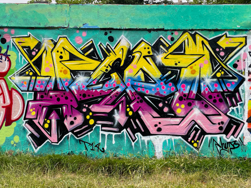
More colourful fireworks from Hypo. This piece reverts to his symmetrical style of lettering, where the ‘H’ and ‘O’ are broadly similar in shape and the ‘Y’ and ‘P’ generally reflect one another. This is a design that Hypo has played with for years and tends to work really well.
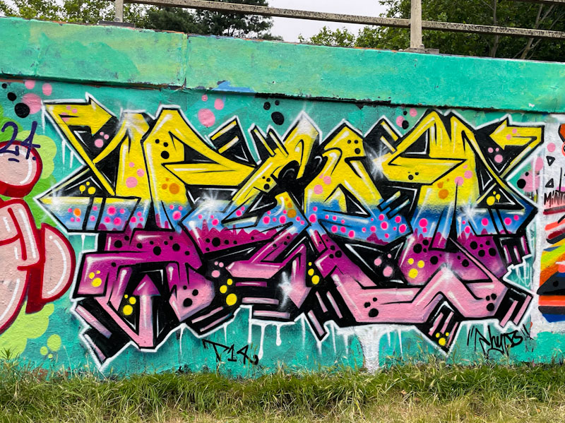
It is the fills though that grab the attention in this piece, with several horizontal layers of colour, I can count at least four, each of which is decorated with well-placed spots. There is a lot of energy piece, which is provided by the depth created and the sparkles at strategic points on the letters. Another great piece of graffiti writing for the collection.
