
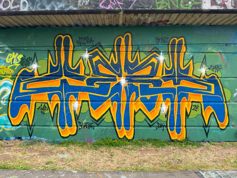
I like the way that Werm is constantly trying to find new ways to present his letters, and explores different looks, while retaining his essential style. This piece takes him into the realms of bilateral symmetry of his letters WERM, which works surprisingly well.
The letter colours contrast strongly with the green background, helping the piece to stand out… it will not be ignored. There is something quite mesmerising about the symmetry, and I like the direction this idea is taking. The left-hand side is stretched a little bit, knocking the symmetry out a fraction, but this is all something that Werm can work on and improve. Great new innovation from Werm.
