
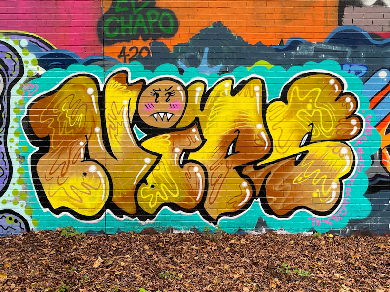
Regular readers will know that I have a bit of a thing for Nips’ work. Her letters are uncomplicated and unpretentious and what sets her apart from other letter writers is her constantly evolving and creative fills.

Whether intentional or not, Nips has created a perfect autumnal piece. The blue background speaks of those wonderful high-pressure blue sky days (we have had a few of those lately) and the gold of the letter fills picks up the autumn leaves scattered at the base of the wall. The fills are a beautifully blended palette of four brown and yellow shades, and are further augmented with some complementary squiggles and dots. The tittle (dot on the i) is a little character face, something Nips does with most of her pieces. The whole thing is nicely finished with white highlights to help the letters pop. This is a fine piece of work from Nips.

I love the way the lettering looks soft, tactile and smooth around the edges almost flowing with movement. Nicely done work! Thank you
LikeLiked by 1 person
I agree. Her work is really good.
LikeLiked by 1 person
Indeed
Simple yet very effective
LikeLiked by 1 person