

Cort doesn’t paint as often these days as he has done in the past, however, what he does paint tends to be pretty good. This stunning piece from the quiet artist is quick to grab the eye, with some simple shapes and colours, reaffirming the maxim that sometimes ‘less is more’.
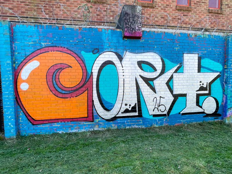
The orange C is quite distinct from the chrome ORT, and given different treatment, creating a juxtaposition within the writing. The splash of light blue behind the letters is a clever design intervention to break up the monotony of the darker blue background. This is a nicely conceived and executed piece by Cort.
