

Serm is an artist who doesn’t paint all that often, but his distinctive pieces are always a welcome addition. This time, he has gone for something a little different and cryptic, hiding his letters in the design.
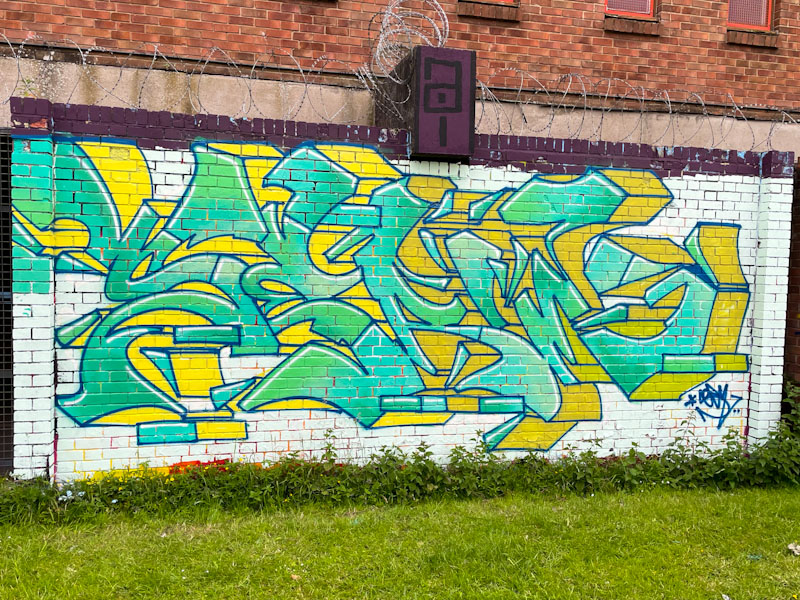
The green fills and yellow drop shadows work well together, although I’m not sure about the white background that makes the whole piece look a little washed-out, and doesn’t create enough contrast with the letters. The green fills is a subtle blend of at least three tones which come together perfectly. I hope the wait for the next one isn’t too long.
