.
With a little rain
a parched landscape gently greens
a slow recovery
.
by Scooj
.
With a little rain
a parched landscape gently greens
a slow recovery
.
by Scooj
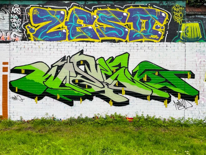
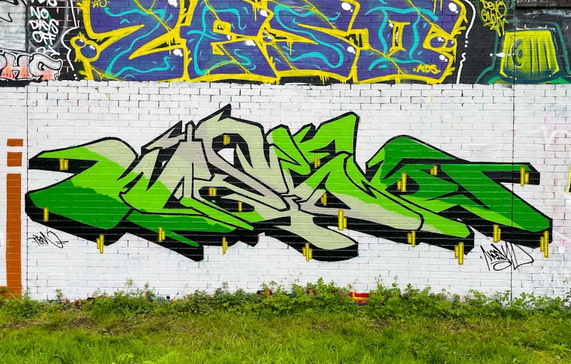
Two significant things are happening today. Most importantly, Arsenal will be getting their hands on the Premier League trophy at Crystal Palace’s Selhurst Park this afternoon, and fans can properly celebrate. Also important is that this weekend is the second of three in the Upfest Street Art Festival in Bristol, which I will be popping down to later on this morning. In the meantime, here is a beautiful piece of graffiti writing from Mesk, AKA Lazureness.
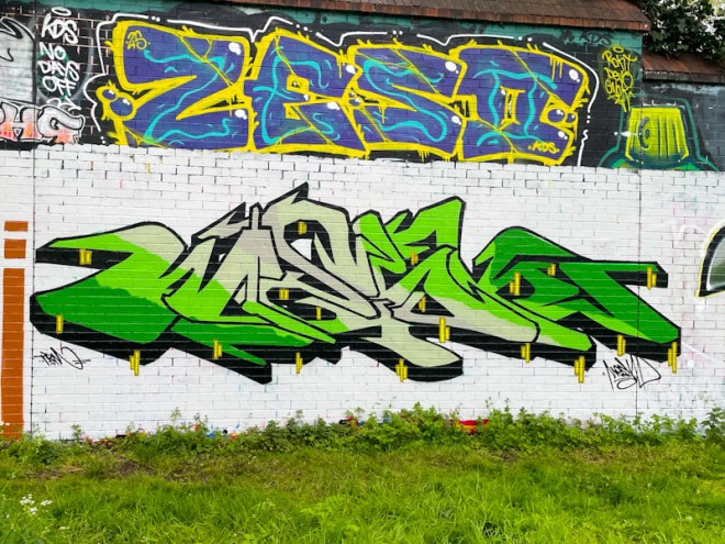
This is a wonderfully fresh piece, set on a white buffed wall, with a lovely clean look to it. The green fills, transitioning through the MESK letters, work incredibly well together, and along with the black drop shadow and small yellow strip detailing, leave us with a near perfect piece. So good to see.
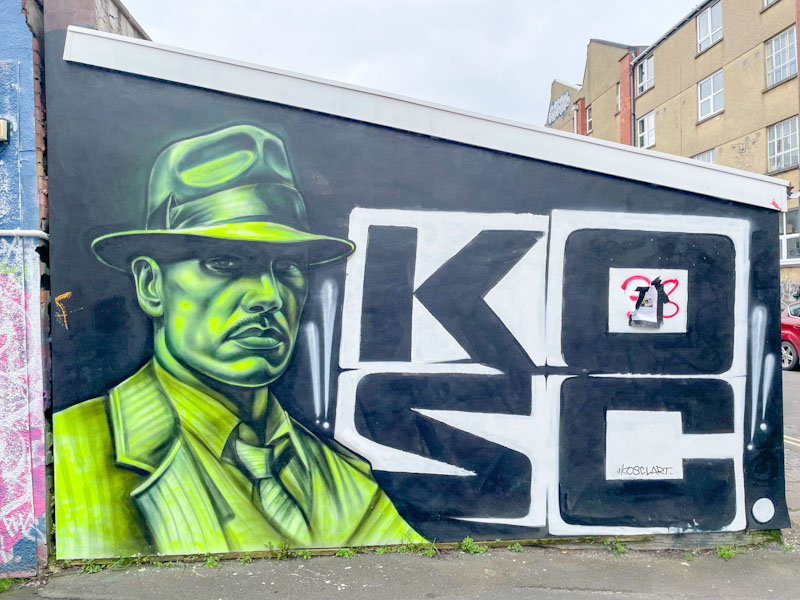
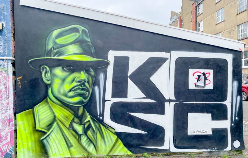
I haven’t seen anything by Kosc for ages, so I am assuming that this is quite an old piece that I haven’t seen before, because it is quite a while since I last visited St Mark’s Avenue. I have just checked his feed on Instagram, and he painted this in August 2025.
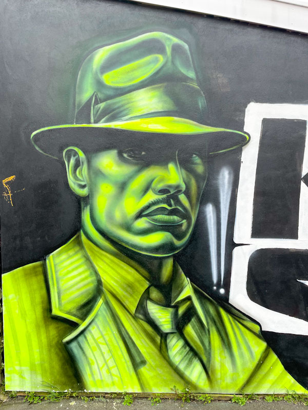
This is a masterful combination piece with a character in green alongside four large stacked letters spelling his name. It is amazing how Kosc has been able to craft such an amazing portrait using only tones of green with black, extraordinary. I sincerely hope we don’t have to wait too long to see more from this hugely talented artist.
 After a couple of very busy days in London, and returning to Bristol late last night, we had a lie in thin morning, the likes of which we haven’t had for many years. What that means of course is that I have to write today’s posts in record time because we have a ton of pre-Christmas jobs to do today.
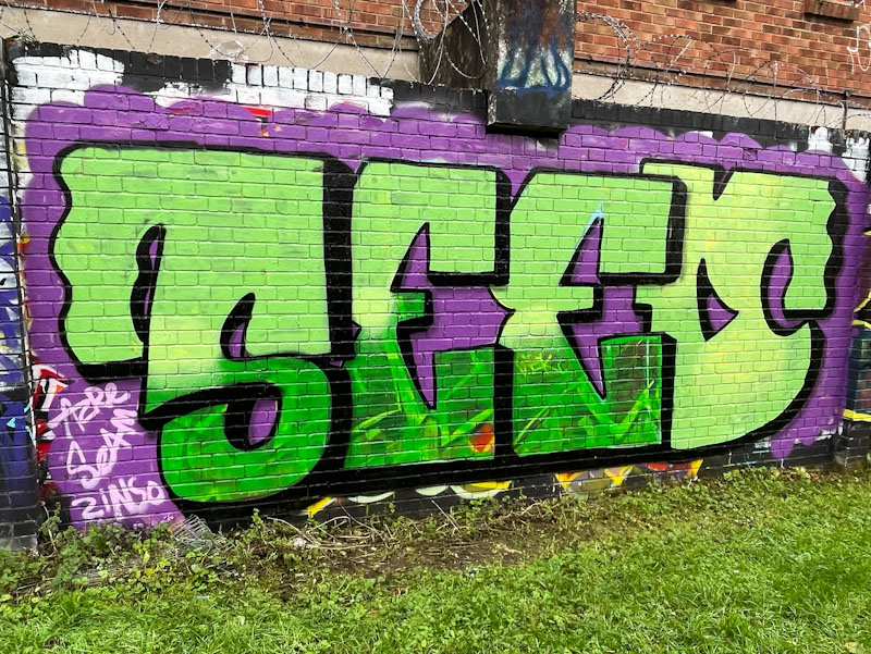
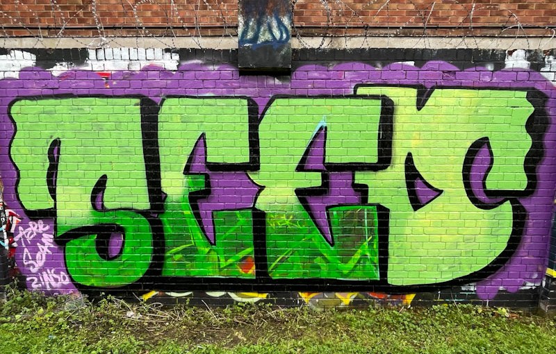
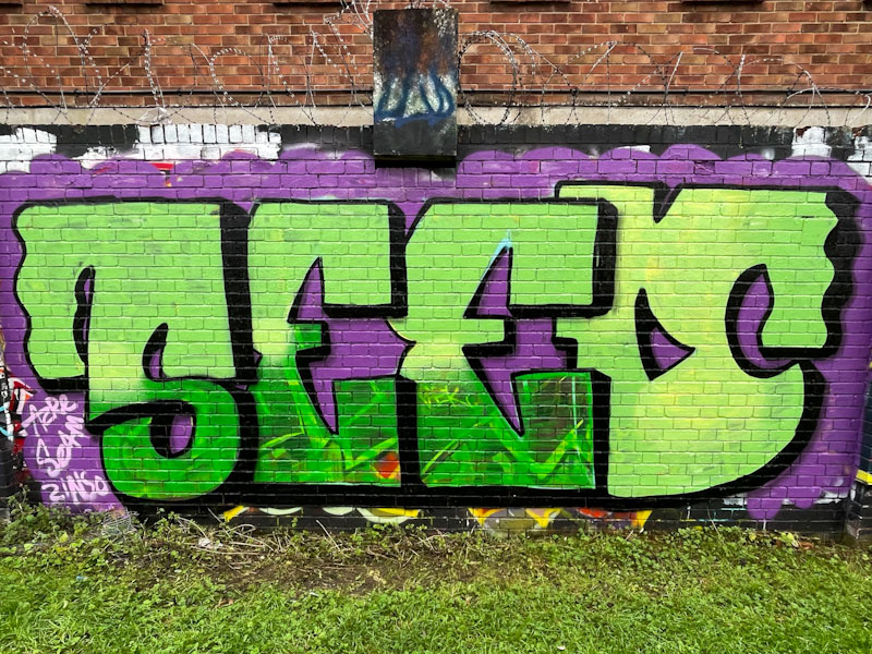
Seed is working really hard to make his mark on the graffiti writing scene. He has hooked up with Asre and Zinso, who will be able to guide him and teach him a few tricks along the way. I have met him only once, but his ambition and desire to improve were clear. This is a rather nice piece with large overlapping letters in a combination of greens. The lower part, I think has incorporated the artwork of the previous occupant of the spot, which fortunately is in complementary greens. Keep your eyes peeled for more from Seed.

.
Perfect colour match
an exquisite deception
to be heard not seen
.
by Scooj

Serm is an artist who doesn’t paint all that often, but his distinctive pieces are always a welcome addition. This time, he has gone for something a little different and cryptic, hiding his letters in the design.
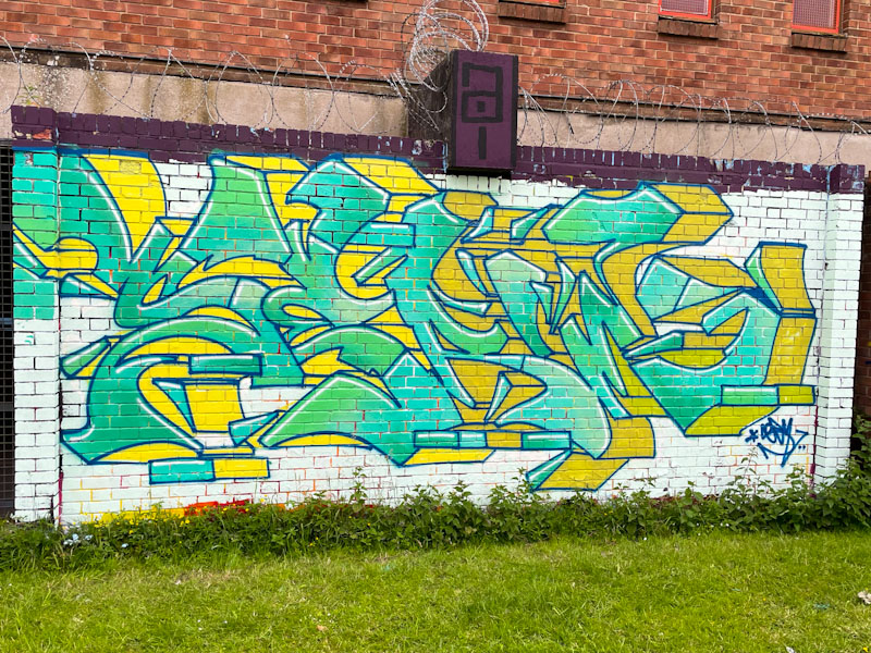
The green fills and yellow drop shadows work well together, although I’m not sure about the white background that makes the whole piece look a little washed-out, and doesn’t create enough contrast with the letters. The green fills is a subtle blend of at least three tones which come together perfectly. I hope the wait for the next one isn’t too long.
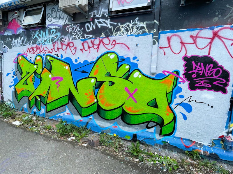
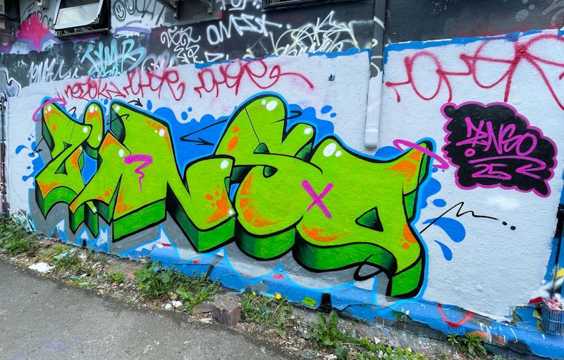
I love finding pieces by artists that I haven’t registered before, and this piece from Zinso is one of a few that I have photographed recently. Although Zinso is new to Bristol, I would suggest that they are not new to painting walls, as this is a tidy and accomplished piece of graffiti writing
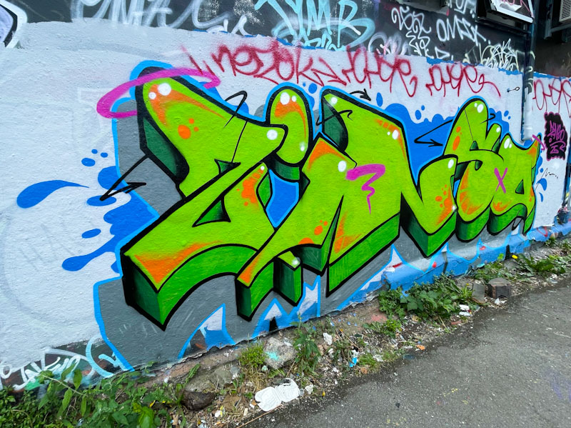
The slightly cartoonish letters are bordered with a confident black outline and filled with a vibrant green with orange marginal decorations. A couple of pink symbols thrown in rounds off this tight, unfussy piece of writing set on a splash of blue. Bravo.
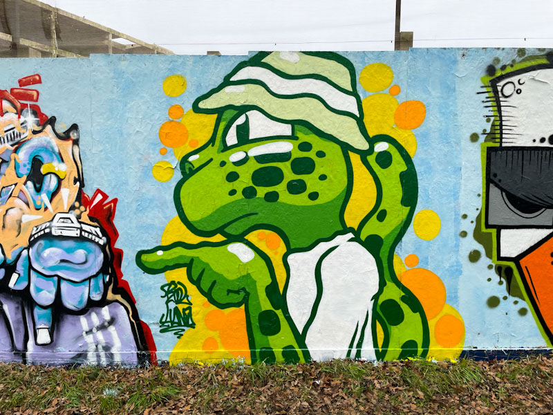
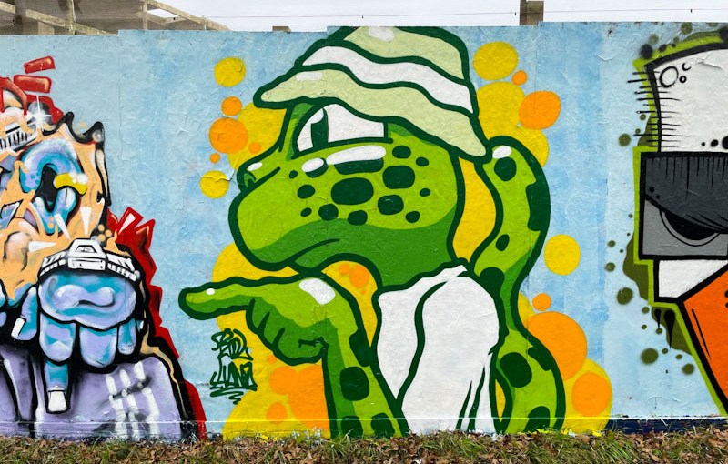
Kool Hand always brings his own very distinctive character style to the party, and has been doing so for some years now. His pieces usually feature animals, in particular, orangutans, leopards and crocodiles. His preferred approach is to have bold black outlines and string colour fills.
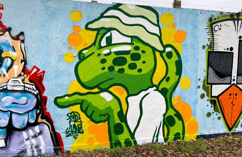
This piece, painted as part of a collaboration, features a green leopard wearing a bucket hat, a pretty cool character. The colours are nice and strong, and Kool Hand has used two-tone green shading to emphasise light and shade, offering a little depth to the character. It is always a pleasure to find Kool Hand pieces, and observe how he is constantly improving and evolving.

This is a neat and tidy piece of Winter writing from Werm painted in his symmetrical theme design. What is particularly attractive about this piece is that the proportions work really well, and it is really tight.
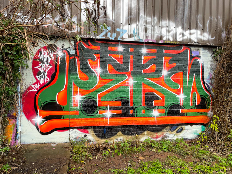
Orange and green are common colour combinations in graffiti writing and are colours that work extremely well together. It looks like Werm too his time with this piece, as all the lines are nice and straight, the fills accurate and the highlights very nicely placed. First-class writing from Werm.
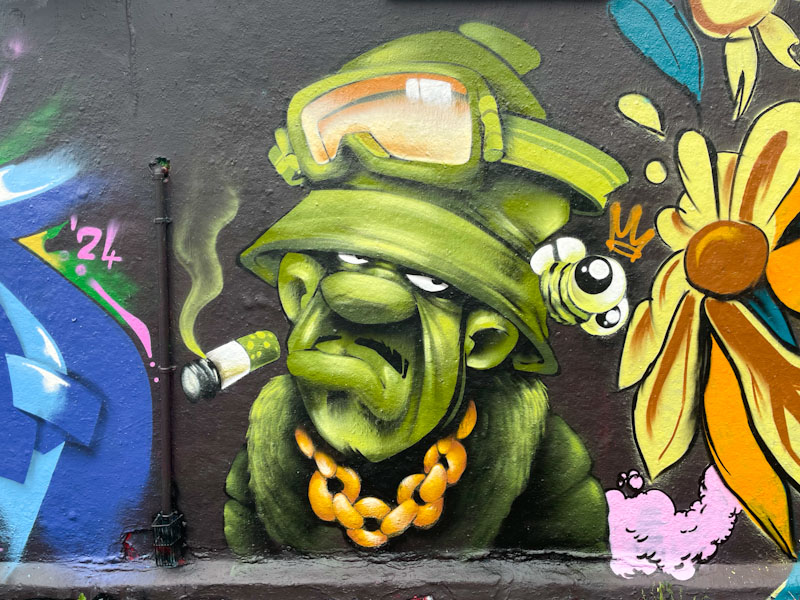
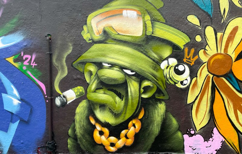
My inclination is not to say to much about this outstanding character piece by Cheo for fear of spoiling it. Cheo has been a mainstay of character pieces in Bristol forever and although he has been relatively quiet in recent years, he can still turn it on when he wants to. This is a beauty.

The character is painted completely in green scale colours apart from the goggles and gold chain – even the bee is green. A small masterpiece from Cheo.