
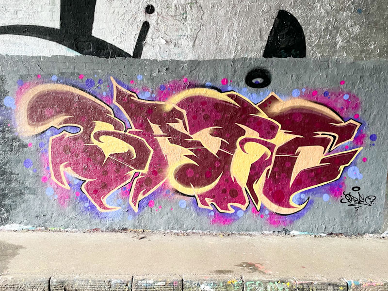
Sait Bare is an artist I haven’t yet met, so I can offer little insight into him or his motivations, but his unusual work is constantly developing and improving. Recently he has switched things up a little and changed from writing the letters SAIT to writing the letters BARE, as in this case.
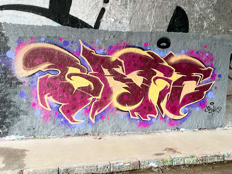
The colours he ha selected for this piece have a wonderfully rich quality, with the two tones of deep red and the reversed out spots contrasting really well with the sandy yellow. . The letters are set in a grey buffed wall with some nice pink and blue (that winning combo) spots. This is a lovely looking piece from Sait Bare.

Caught up with him on his first ever piece here in Bristol down in Cumberland Basin
Another friendly writer from Poland if I remember correctly . . .
LikeLiked by 1 person
In time I will meet him.
LikeLiked by 1 person
Very jazzy
LikeLiked by 1 person