
At Upfest this year, there was a strong contingent of local artists, and some wall space made available to showcase everyday talent that I am privileged to see every time I walk out to take pictures, but that visitors to the festival might not be so exposed to. This balances out the presence of high-end murals in harmony with authentic street and graffiti art.
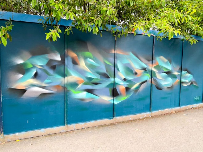
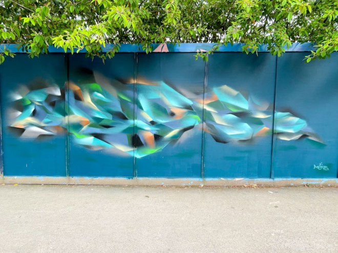
Ments is a Bristol artist who spans the gap between graffiti art and something more sophisticated. I spent a while chatting with Ments as he was finishing off this piece, and he explained that it was loosely based on the letters MENTS, although the ‘T’ kind of melted away. He was interested in the soft shapes and colours, presenting as an abstract form, being simultaneously both familiar and alien. A brilliant artist, and a fine Upfest piece.

Unless it is darn near block letters, I rarely can read the word-art. What I saw in this one was based on the far right end—it looks like a bird beak, on a bird flying with great determination. From that, the rest of the piece flows like a bird in flight. Now, after I “figured” that out, I read your description and I was way off–but I rather like my viewing of it better than just flowing script. 🙂
LikeLiked by 1 person
I think Ments would love your interpretation. I see it too.
LikeLiked by 1 person
Love the colours xx
LikeLiked by 1 person