

.
Called out by their lies
a bad day for charlatans
chaos continues
.
by Scooj
.
Called out by their lies
a bad day for charlatans
chaos continues
.
by Scooj
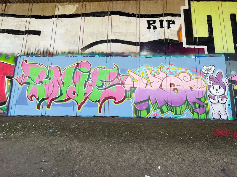
I don’t venture down to this spot very often, because the access isn’t really very suitable for the dog, and I wouldn’t want to take him down there, so my trips are limited to occasions when I have some free time and am dog-free. Making the effort is usually worth it, and on the last occasion, my prize was this lovely RBF collaboration from Bnie and Wispa.
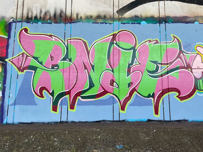
The pair of artists have chosen a salmon and cucumber colour scheme (were they subliminally influenced by the Garrick Club?). Bnie has painted pink BNIE letters which have the letters RBF in green (and blue) overlaid, in a very clever presentation. Neat, tidy and creative, this is another in a string of outstanding pieces of graffiti writing from Bnie.
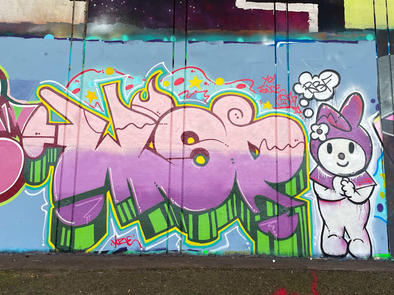
Wispa has gone for a slightly lighter pink in her fill, transitioning to lilac and purple in horizontal strips. A deep 3D fill in green and black helps the writing to pop out from the wall. Wispa often adds extra value with her pieces by incorporating a character, and in this one a cuddly Kawaii rabbit adds to the cute factor. This is a lovely collaborative wall from these two great writers.
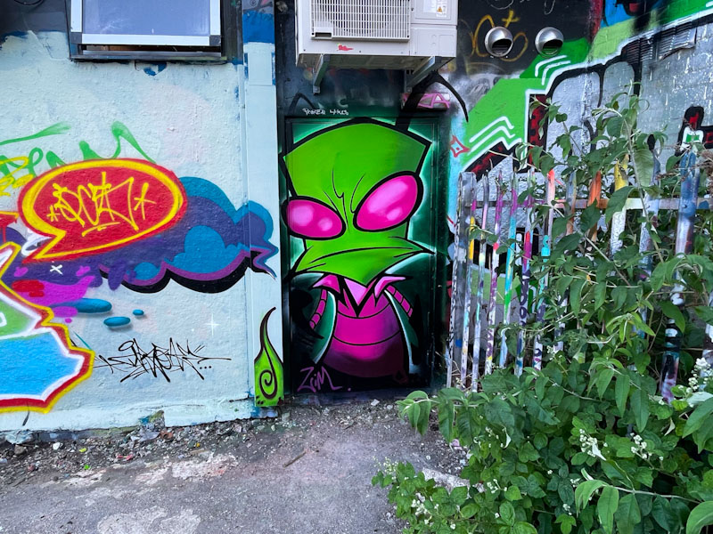
Lately, there has been a bit of a transformation in approach and style from Veeez (VZA), who has featured on Natural Adventures before, but with a rather different look. This stunning piece in Dean Lane is one of a recent series of character pieces and writing that takes the level of his work up a notch or two.
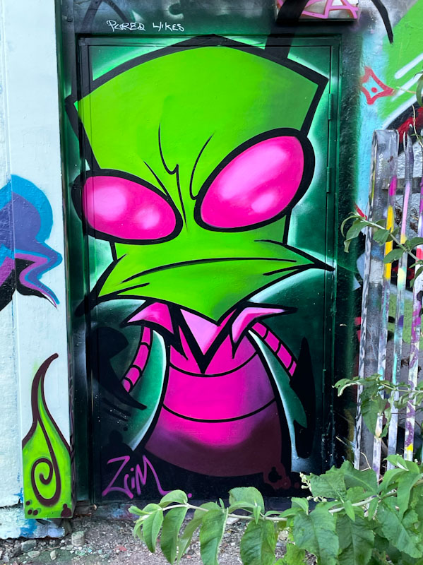
The alien character in vibrant pink and green colours absolutely smacks you in the face, determined not to be ignored. The execution is beautifully done, with some nice shading in the fills to give depth. The black lines and border are crisp and tidy, and the adoption of a second turquoise border lifts the whole piece off the door on which it is painted. Great work from Veeez, with more to come soon.
It is getting close to the time when I say something like, ‘I really ought to pull together a gallery for Werm’, and judging from his productivity over the last three years or so, and the frequency with which he has appeared on Natural Adventures recently, it definitely is that time.
Werm underwent something of a change of approach, from painting cute characters to concentrating on his writing. At about that time, he also discarded the moniker Eman and was reborn as Werm. His progress has been rapid and his technical skills and creativity have blossomed to the point where he is creating complex and busy pieces like this one. His most recent ‘formula’ is to write WERM in smaller letters at the centre of the piece, and to extend the branches of his letters with elaborate designs exploding out from the middle. It would be nice to see him deconstruct this a little and see what he can do with a simpler design. I am thoroughly enjoying recording his journey.

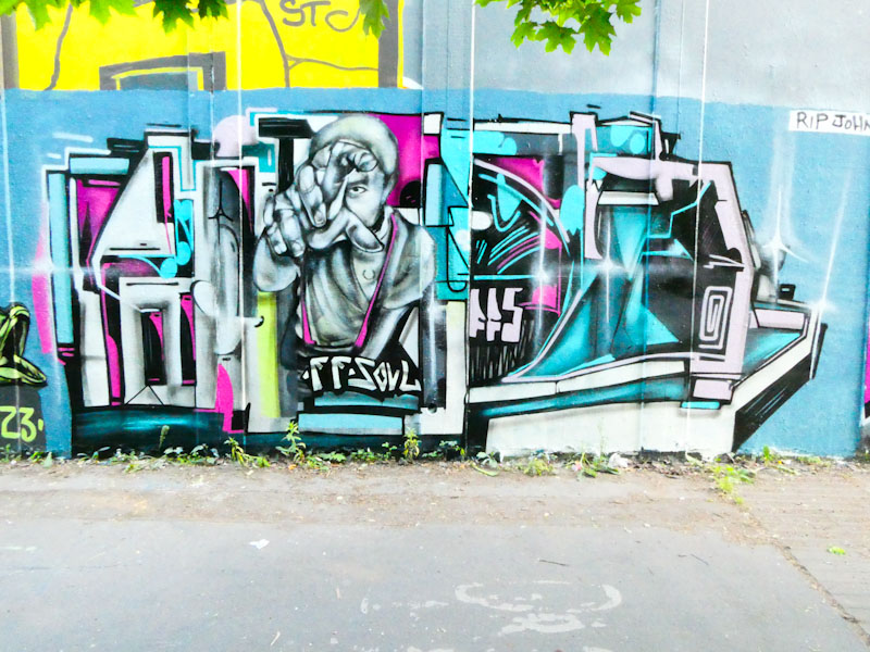
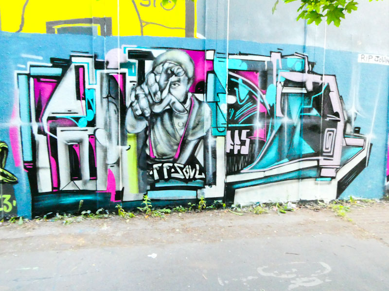
This wonderful Easter RBF paint jam piece by Wispa gives me the perfect opportunity to talk about the importance of light conditions when photographing street/graffiti art. In the first picture, the sun is coming from behind the camera, and as you can see, shadows from the trees have been cast onto the colourful WISPA letters and Kellogg’s Tony the Tiger character.
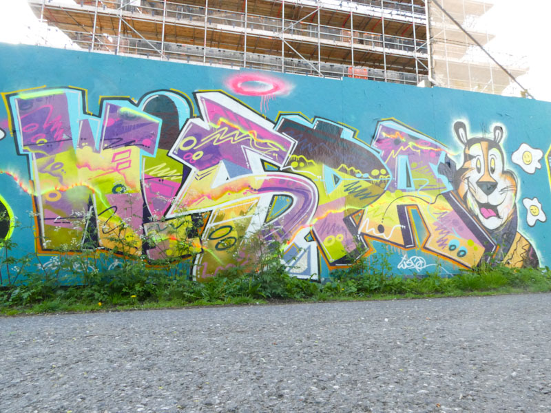
The same piece on a different day with the sun setting behind the hoarding, and flaring can be seen behind the piece and the colours look dull and washed-out. The lesson here is that this spot should be photographed only on overcast days. Wispa is a hugely accomplished writer who seems to be tireless, painting only a fraction of her creations in Bristol. Fabulous colour fill patterns and character – they’re grrrrrreat.
This is another busy and eclectic piece from Kid Krishna. An explosion of sub-conscious and conscious thought pinned to a framework of graffiti letters spelling CRIE. Kid Krishna really is a unique artist and interesting character, utterly absorbed in his artwork and constantly challenging his own ideas.

I was lucky enough to meet Kid Krishna just as he was starting this piece, and it is fascinating to see that his starting point was the hand in the centre. The hand and the character hint that the artist might have had a classical art education – the proportions and perspective are expertly painted.
The busy nature of the piece suggests that Kid Krishna has a busy mind, and his work reminds me a bit of Tom Miller’s brain dumps. There is always so much t look at and to try to work out. Lots more to come from Kid Krishna.

I have been droning on about how the amount of painting activity has increased over the last year or two in Bristol, but associated with this rise has been a commensurate increase in the number of collaborative walls, most of which have a short lifespan due to the high turnover. It is becoming more and more difficult to chronicle street/graffiti art, but I do my best.

This triptych is by Fade, Turoe and Dibz. Starting with Fade on the left – I mentioned yesterday in my first Fade post on Natural Adventures, that we’d be seeing a lot more from the artist, and here is proof of that already. Fade’s work is really crisp, with nice solid fills and great thin black lines and thick black borders. I can’t read the letters in this piece, but it looks like a three letter sequence. This is classy work from someone who has only recently reacquainted himself with spray-painting after a long break.
In the middle section is a fascinating piece from Turoe, whose mastery of graffiti writing is second to none. The chrome letters, which spell TUROE or as Paul H points DIBZ (although I can read both), have a regularity and uniformity about them, and just the right amount of subtle decoration in the form of white spots. The letters contrast nicely with the diesel-blue bubbly background. Classy stuff.

Finally, to the right, Dibz does what Dibz does. Reflecting Turoe’s choice of chrome on diesel-blue Dibz shows his utter class with wildstyle writing. I don’t know how he does it, but Dibz is painting incredibly regularly these days – maybe he has a bit more free time on his hands. The clouds accompanying all the pieces on the wall, I think, are by Fade, because they have that flatter look to them that his style has. A very nice collaborative wall.
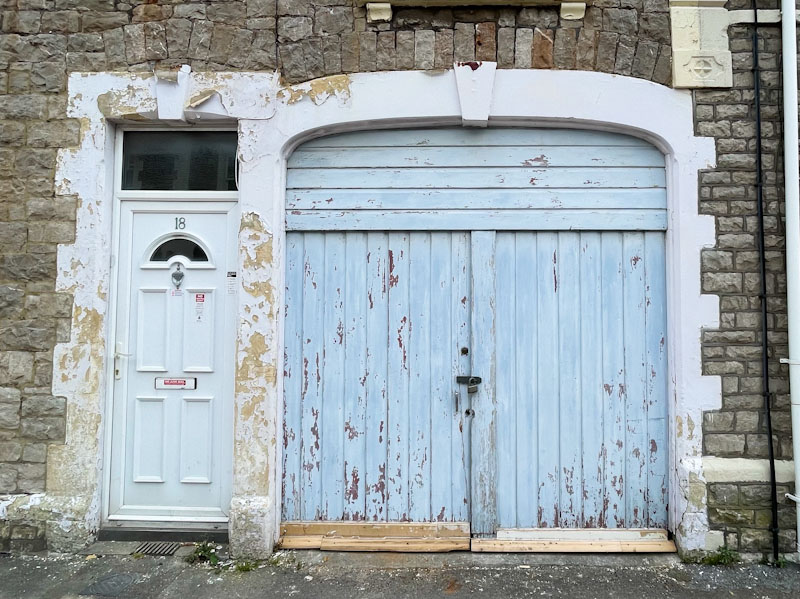
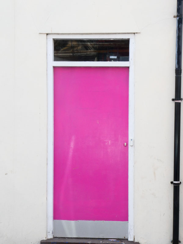
Doors 224 – Doors of Weston-super-Mare (2)
Obviously, I like to take pictures of doors, especially when I visit places that I don’t go to all that often, it becomes a bit of a habit to stop and look at a door that grabs my attention. It is difficult to know what constitutes a ‘good’ door and a door that is nothing out of the ordinary. I think this selection of doors from Weston-super-Mare on the north coat of Somerset sail quite close to the wind in terms of being ordinary, and being a little bit more interesting than that. I will let you be the judges of that, though.
I hope you enjoy this selection:


A short one this week – a very busy work day ahead.
May I wish you a great rest of week and weekend.
If you have made it this far, you probably like doors, and you really ought to take a look at the No Facilities blog by Dan Anton who has taken over the hosting of Thursday Doors from Norm 2.0 blog. Links to more doorscursions can be found in the comments section of Dan Anton’s Thursday Doors post.
by Scooj
![]()
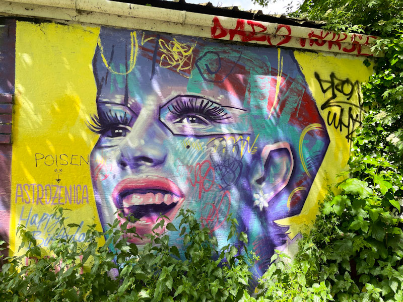
I am inherently lazy, or at least that is a self-perception reinforced by years of my mother and teachers telling me so when I was in my teens. A self-fulfilling prophecy? Maybe. I took this picture about a week ago, but am not too happy with it because of the dappled shadow cast across it. I am posting it now, however, because it is a great piece from David Puck, and I am not sure that I can be bothered to return to get a clean shot of it. There is also the factor that I rarely walk around this spot, and have other places that I prioritise.
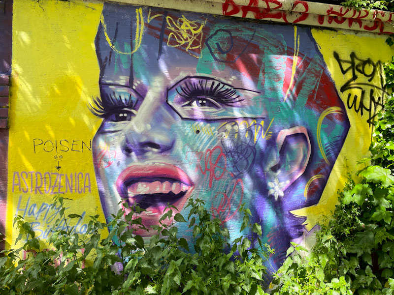
I haven’t posted many pieces by David Puck, but he (they) is a Bristol artist (I think) who has painted wheatpastes in the city and some murals too. While they don’t paint a lot on the streets, their portraits are always rather attractive and engaging, and this one is a beauty. I have a feeling it might have been here for quite a while as it references Astrozeneca, which is sooo last year. A fine piece indeed.

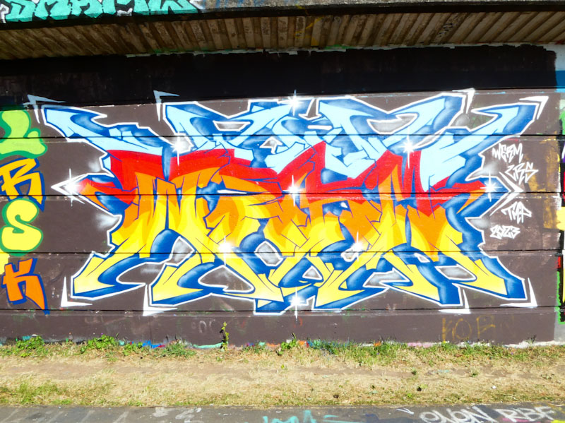
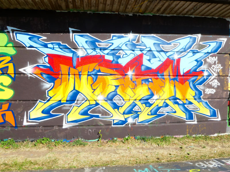
Since the weather improved, which has been about a four-week spell now, this wall has been hit pretty hard with a high turnover of graffiti art, so you have to be on your toes if you want to see it all. Although I have missed several recent pieces here, I was lucky enough to see this absolute beauty by Hemper.
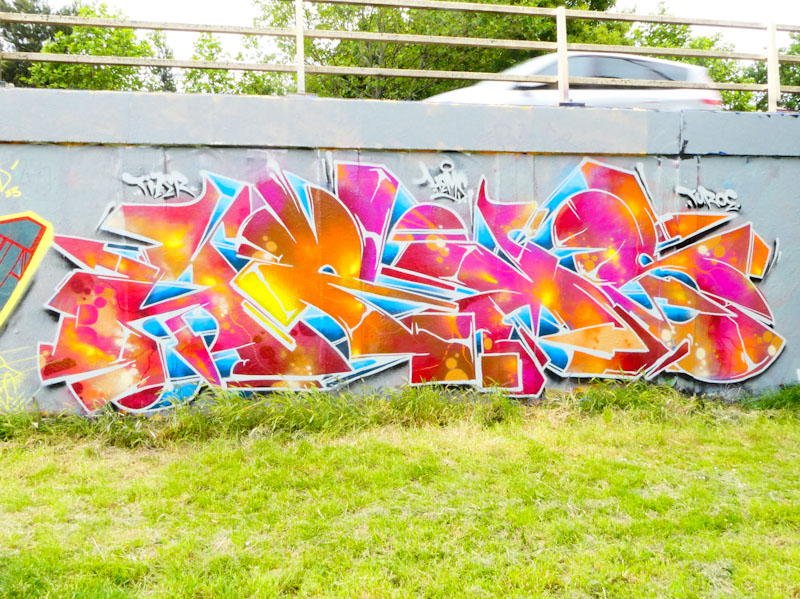
This piece of graffiti writing is indescribably good. Incredible colours, an outstanding 3D effect and stunning design combine to make this one of the best pieces I have seen this year. The letters HEMS are blasting out of the wall from a central vanishing point and smacking you around the face, forcing you to pay attention. One of the best from one of the best.


