
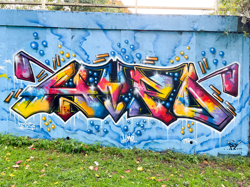
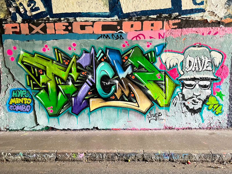
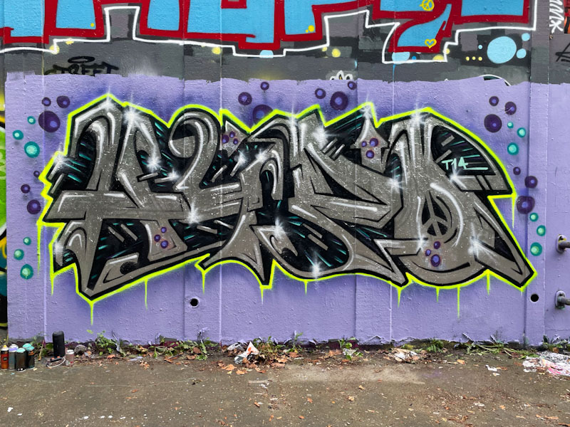
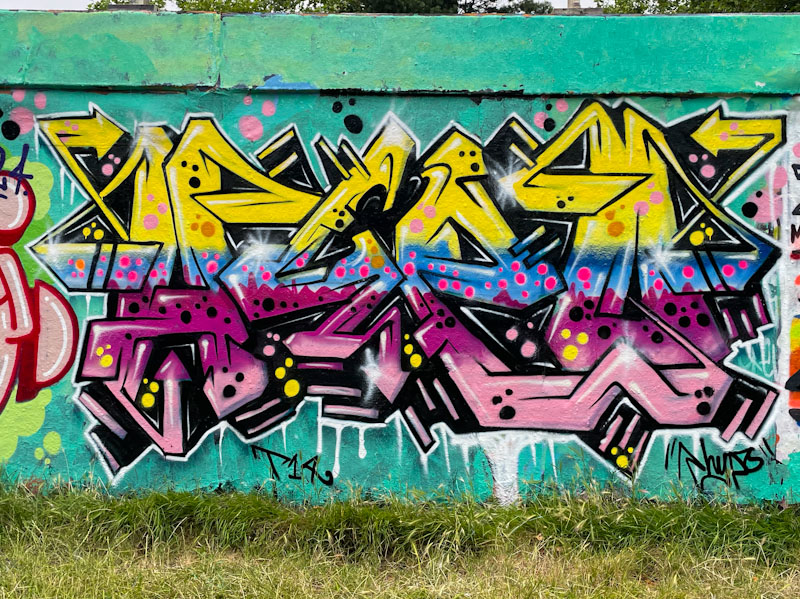
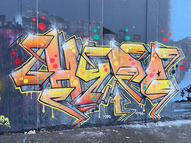
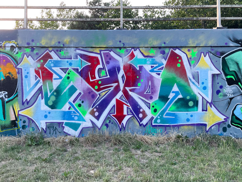
A gallery of fabulous graffiti writing from Bristol artist Hypo
Instagram: @Hypograffiti
all photographs by Scooj
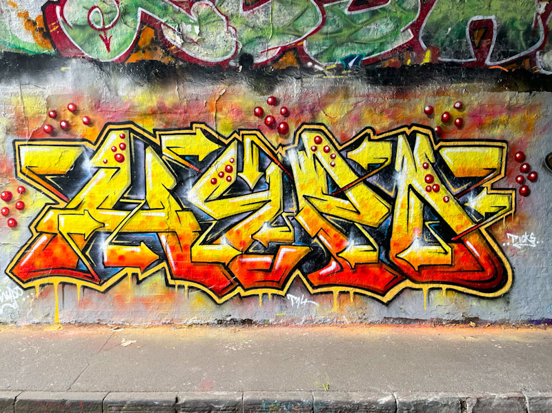


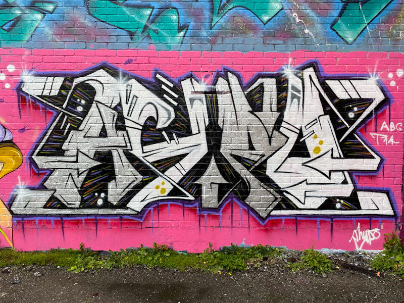

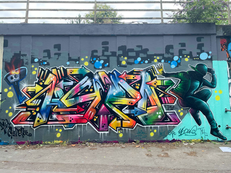

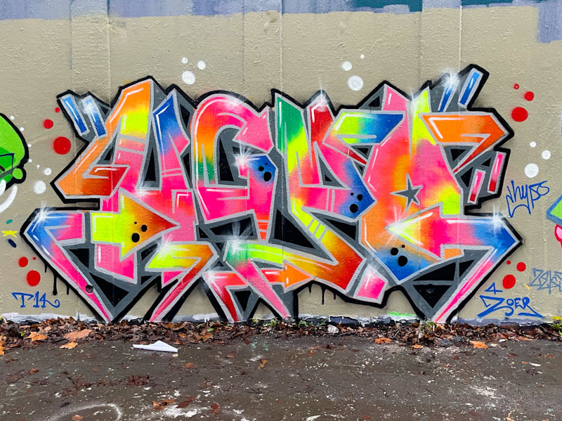


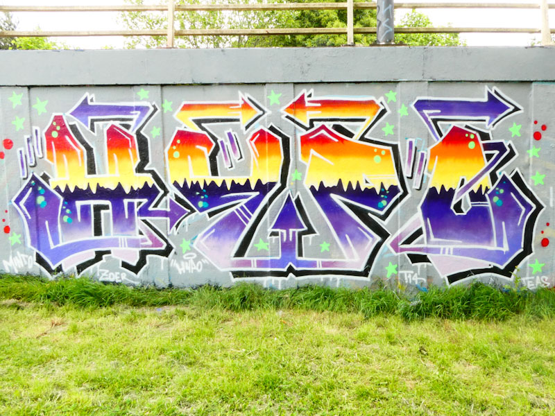


A gallery of fabulous graffiti writing from Bristol artist Hypo
Instagram: @Hypograffiti
all photographs by Scooj
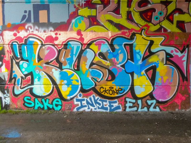
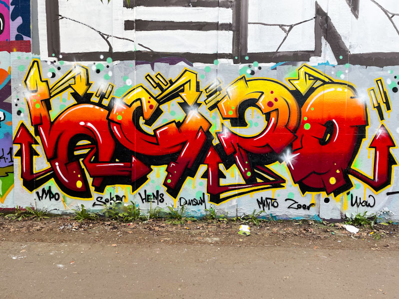
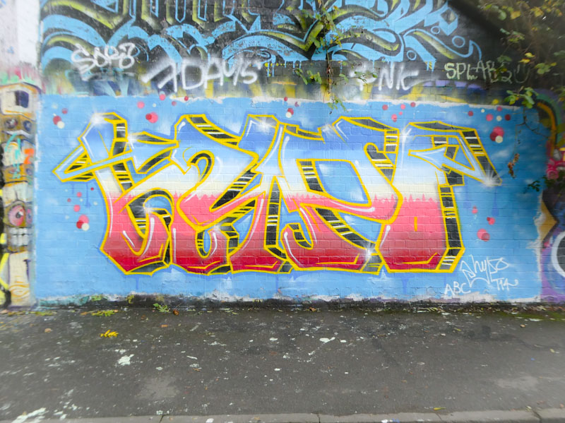
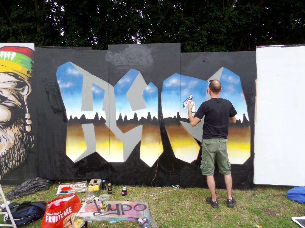
I have been photographing Kush pieces for a few years, but I think that this might be the first that I have published. I think that this horrendous under-representation on Natural Adventures has simply been down to not knowing who Kush is or even which artists he associates with. Anyhow, I feel it is time to start publishing his work, so expect to see some archive Kush pieces over the coming weeks and months.
Kush is an artist who pretty much always writes the same letters but always in a different form or design, demonstrating his skill, experience and technique on every outing. This piece, under Brunel Way, has rather nice curvy, cartoonish letters which are filled with a wonderful splash of colours – this is a classy piece. It might be my imagination, but it feels like Kush is painting more frequently these days, which means I am sure to be featuring his work more often.

When I first encountered Face 1st’s work, his pieces were more commonly painted solo, with occasional PWA paint jams, particularly with Soap, but more recently he has rarely painted without some of his buddies, this piece on the M32 roundabout being an exception. Maybe all his PWA mates were busy that day.

I love the way that Face 1st constantly plays with new ideas and themes, and then adds them to his repertoire. This is a traditional Face 1st idea, a face with hair spelling FACE, but the letters are deep 3D block letters which he has been including more often recently, and there is a lot of gloopy dripping going on, something he started to include in his work about two years ago. This is a fun and eye-catching piece from the prolific Face 1st.
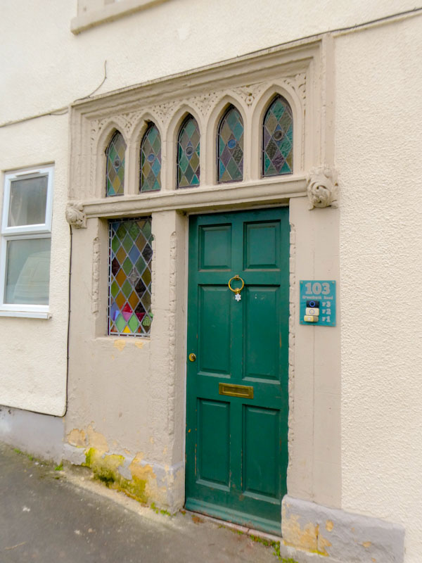
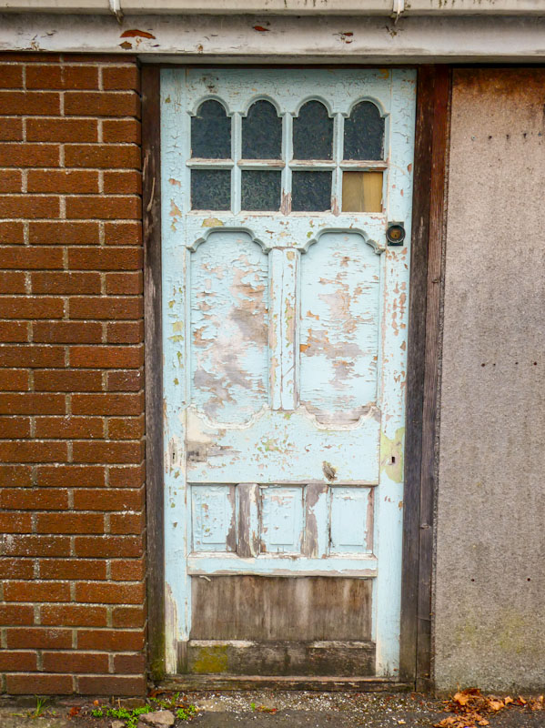
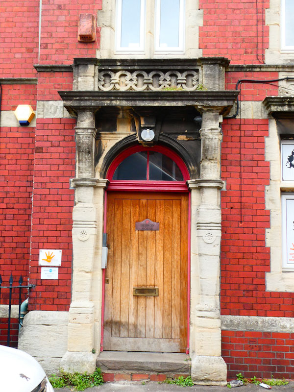
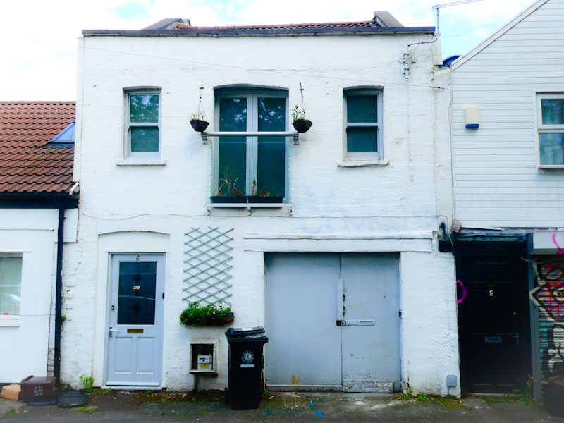
Doors 216 – Random Bristol doors
A quick trawl through my archives this week has thrown up some interesting doors from around the city of Bristol. These pictures were taken a little while back, and I can’t actually remember where most of them are from.
The selection is a real mixed bag of styles and periods, which rather fairly represents the eclectic architecture in Bristol. Before the blitz, there was a much more uniform transition of architectural periods, but the bomb damage has fragmented the styles, and some of the modern replacement buildings certainly favoured function over form.
I hope you enjoy this small selection:

That’s it for another week – I need to go on a couple of doorscursions soon, because my supply is drying up a little. May I wish you a happy weekend.
If you have made it this far, you probably like doors, and you really ought to take a look at the No Facilities blog by Dan Anton who has taken over the hosting of Thursday Doors from Norm 2.0 blog. Links to more doorscursions can be found in the comments section of Dan Anton’s Thursday Doors post.
by Scooj
![]()

What a lovely and rather original piece this is from Sprat, who really doesn’t paint on our streets nearly as often as I would like to see. I think I have photographed four of his works, of which this is one, but that is over a period of a year or two. His work always makes an impression because of its originality.

The first thought that came into my head when I saw this, was the film ‘mask’ starring Jim Carry, but the more I look at it, the more I realise how this piece is nothing like the Mask character. The overall image is striking, and the colour of the hat contrasts so well with the sickly green of the face. This is a nicely designed and stylised portrait piece, and I’d love to see more like this.
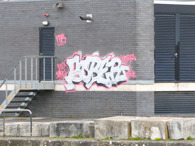
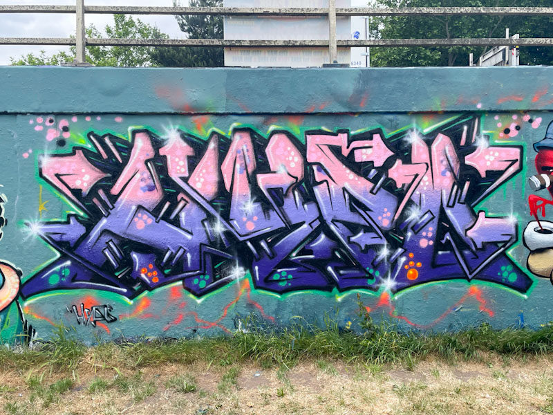
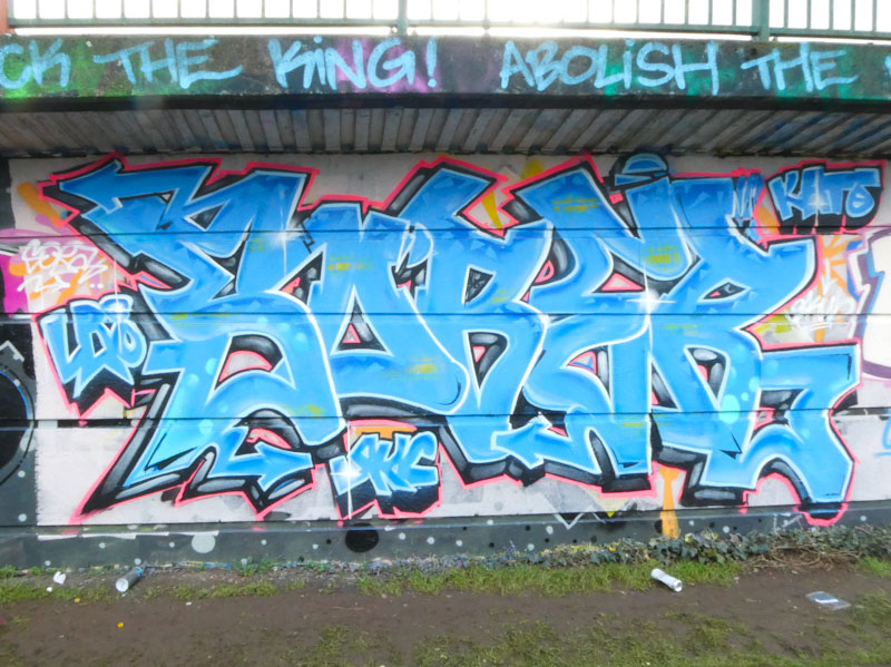
Klashwhensober continues to paint frequently, and in as many spots as he can find. These two pieces are from Cumberland Basin, in slightly different places. The first piece, on a virgin wall, is rather noticeable as it is on the side of one of the buildings that have something to do with the lock gates into the Floating Harbour. Definitely an edgy spot.
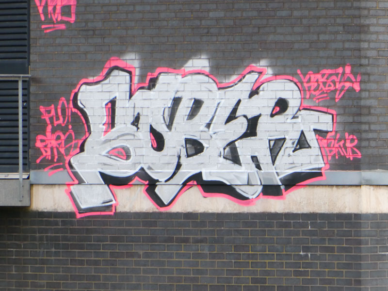
I was fortunate enough to catch up klashwhensober while he was painting this rather nice blue piece. Strangely, this was our second encounter in two days, after a long period when our paths didn’t cross at all. We got talking a lot, and it turns out that we have more in common than we might have thought, including attendance at the same school in London, although at completely different times.
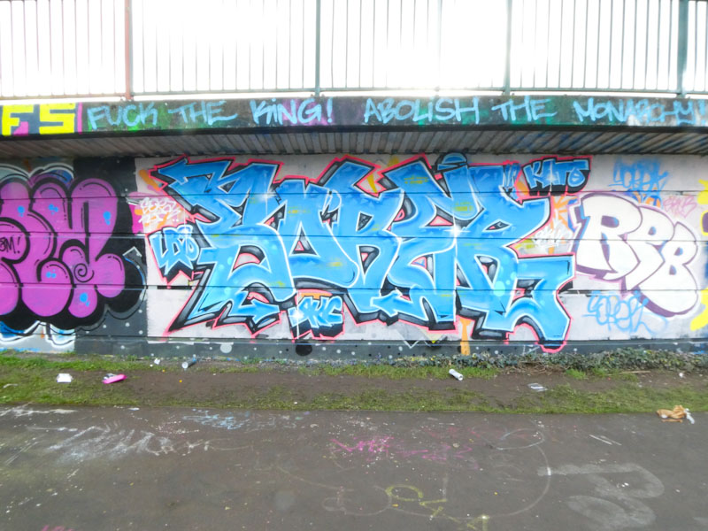
The piece itself is fairly straightforward, spelling SOBER with nicely defined letters and plenty of designs in the fills. There are no ‘explosive’ elements in the writing, which has been a bit of a trend recently, but it is nicely done nonetheless.

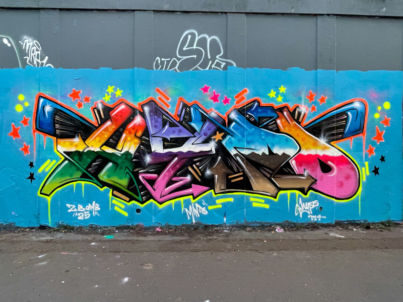
I have a feeling that we are going to see a lot more of Bbygwya’s work on Natural Adventures over the coming months. This RBF crew member has only recently arrived on my radar, but I know I already have a handful of her works in my photograph folders.
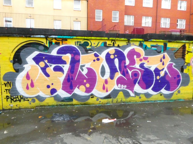
I haven’t yet worked out what the letters spell, but I am sure that Paul H will be able to help me out with that (it seems obvious now, but Paul H informs me it says FLUKS). This is accomplished writing, with a pleasing form and nicely crafted fills, drop shadow and background elements. I am also happy to see that Moon street is having a little bit of a renaissance at the moment. Watch this space for more from Bbygwya.
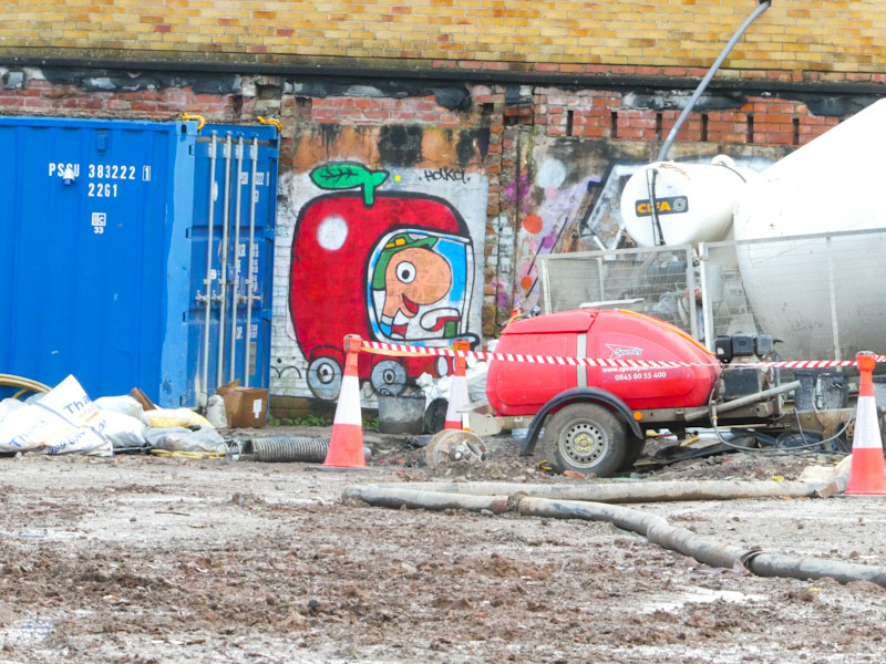
Catching a glimpse of this piece across a building site took me straight back to my childhood and my favourite children’s picture books authored and illustrated by Richard Scarry. Particular favourite books were ‘Busy Busy World’ and ‘What do People do all Day’, the latter even made an appearance in a TV commercial with me and my sister, but that is a whole other story.

I have no idea when Haka painted this wonderful piece of Lowly Worm driving in his apple car, and I have probably only just noticed it because of the building site possibly exposing the wall. Haka certainly has a knack of escalating levels of nostalgia with his picture book character series of pieces, but this one absolutely is my favourite so far. I now feel like I need to find a copy of one of Richard Scarry’s books, just for old times’ sake. Perfection.
.
Dance of the mayfly
choreographic display
nobody’s watching
.
by Scooj

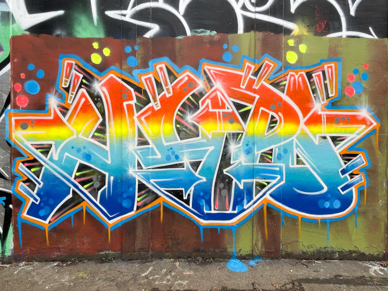
With this piece, that incidentally didn’t last very long, Kid Krishna demonstrated his incredible versatility. If I hadn’t met him when he was painting this piece, I’m not sure that I would have known it was one of his, although the fact that it was painted next to a Markinetic piece might have been a bit of a clue, together with the FFS, NKA and TPN.
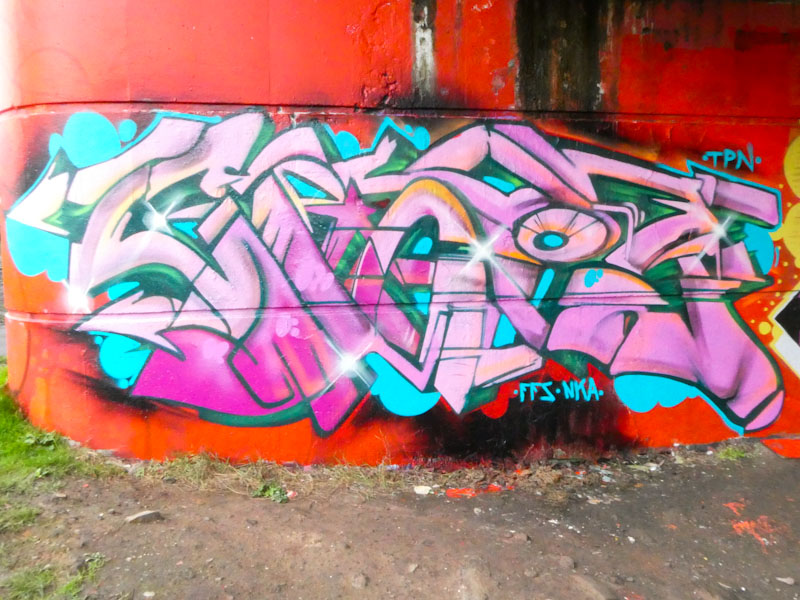
I think that I can see the letters CRIE in this rather more traditional wildstyle graffiti writing, which is so full of different textures and tones – a classy piece of work. We chatted for quite a long time, and I like it that Kid Krishna seems to be happy to stop and chew the fat – the subject of our conversation was one I seem to be having a lot lately, and the clamp down by BCC on graffiti/street art, and the recent announcement from the Government (and opposition) bout antisocial behaviour.
Of course in my mind, there is a big difference between tagging someone’s front door, which is vandalism, and painting creative artworks in places that have a culture of such. Maybe a topic of conversation for another post.


