.
Double body-blow
voters come to their senses
and reject Johnson
.
by Scooj
.
Double body-blow
voters come to their senses
and reject Johnson
.
by Scooj
I genuinely thought that this wall would become redundant when work began on redeveloping the building about a year ago, a suspicion exacerbated when they put some windows in the wall. My fears may have been unfounded, as the wall appears to be intact and has regular makeovers, many of them quite fantastic, like this PWA collaborative wall from a short while ago.
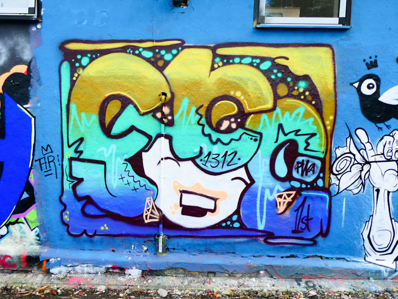
The three artists are Face 1st, Chill and Soap, and together they have created an upbeat and rather fun triptych. Face 1st on the left ha painted one of his traditional smiling face characters whose hair is made up of the letters FACE – full of joy.
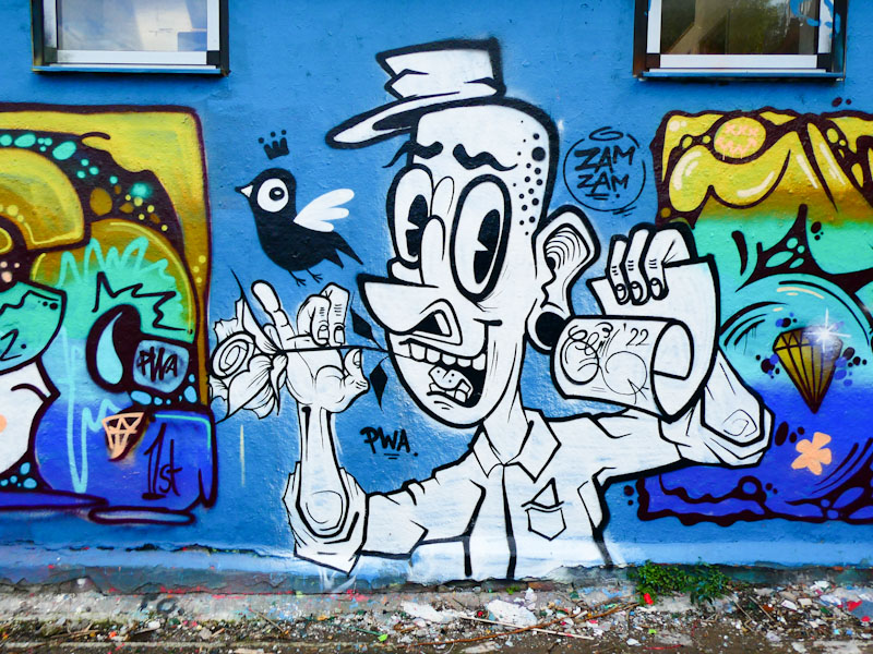
In the middle, Chill has created one of his cartoon-style line drawings with quite a story going on. I don’t know what the story is, but it includes a bird, a rose and a scroll with the artist’s name on it. More mischief and fun.
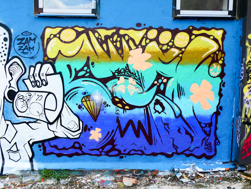
To the right is Soap’s contribution in which he continues the colour selections, backfilling his letters spelling SOAP and featuring (a many of his posts do) the Ice King from Adventure Time – a cartoon series that sadly passed me by. Nice work from this PWA trio.
Very short of time today, so this write-up will be relatively brief. Klashwhensober is a lovely guy who is smashing out pieces all over the place, and I find it quite hard to keep up with them, so I have started to gather them up, writing about more than one per post. If I didn’t do this, I wouldn’t be able to share them all.
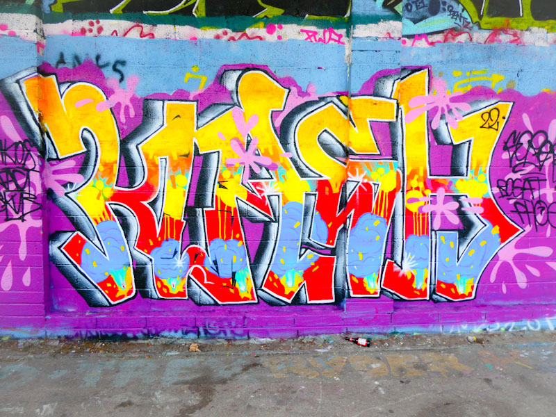
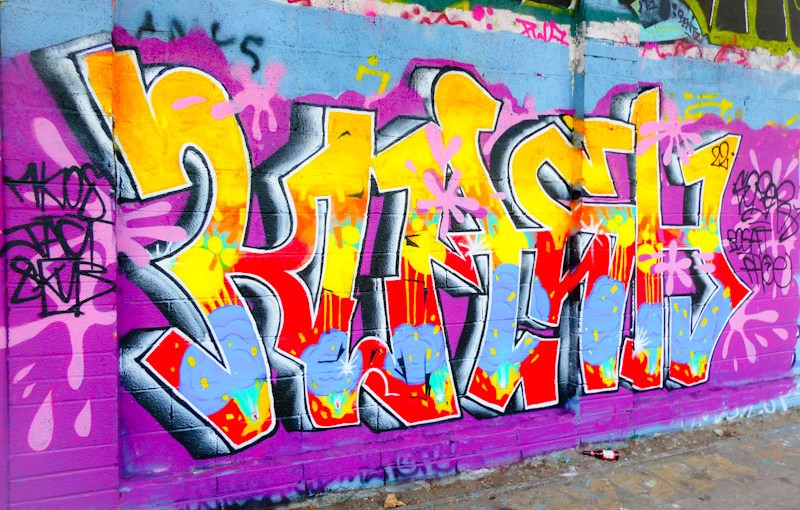
This selection are all recent pieces along the M32 Cycle path, each very different, but in the Klashwhensober style. This first one spells out KLASH in lovely 3D letters with a colourful and imaginative array of fills and given a bit of pink splat treatment for good measure.
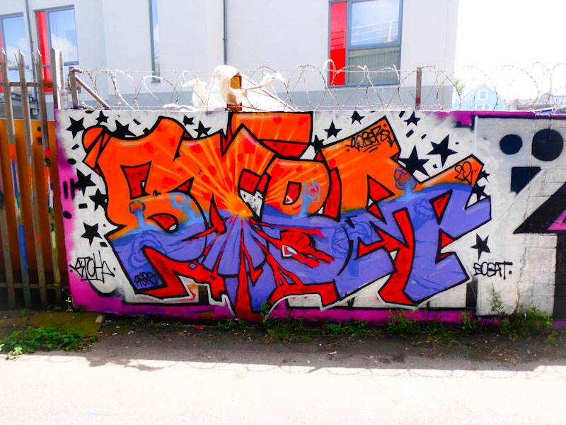
The second piece, pretty much opposite the first, is once again full of colour and dynamism, spelling out SOBA, some patterns in the lower half of the letters are similar to those in the first piece. I rather like the explosion in the middle of the letters, which has contrasting effects above and below the transition line.
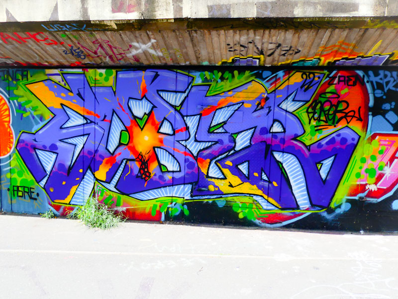
The final piece is a few yards further along the path, spelling SOBER, and is once again a tidy piece with a nice 3D effect and central vanishing point. The theme with all three of these seems to be around explosions of some kind or another, bright lights and colour emanating from a central point and radiating outwards. I suspect there is some deep conscious or unconscious meaning here – I shall have to ask him next time I see him.
.
It’s been four long days,
long days without a kitchen
without a kitchen!
.
by Scooj
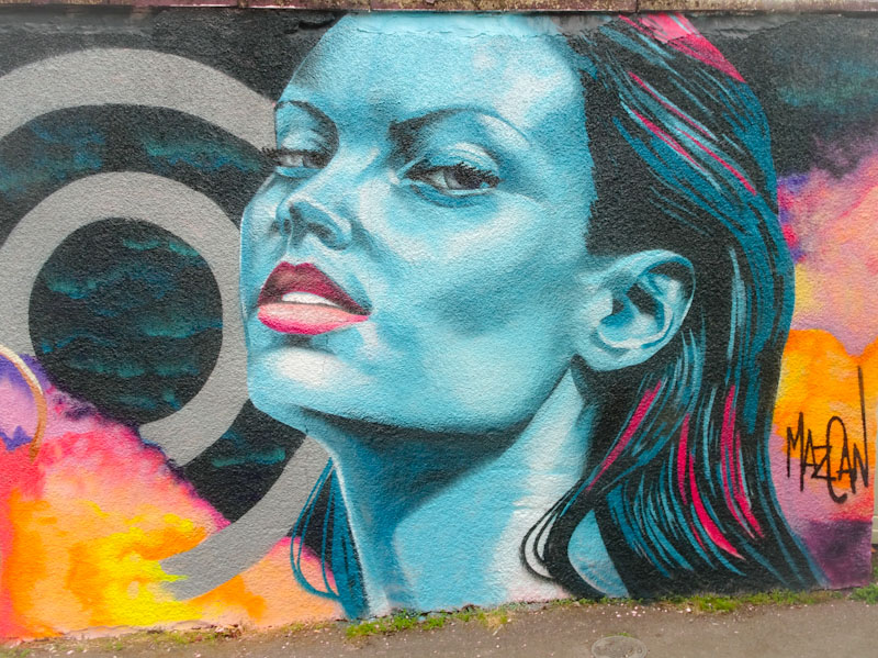
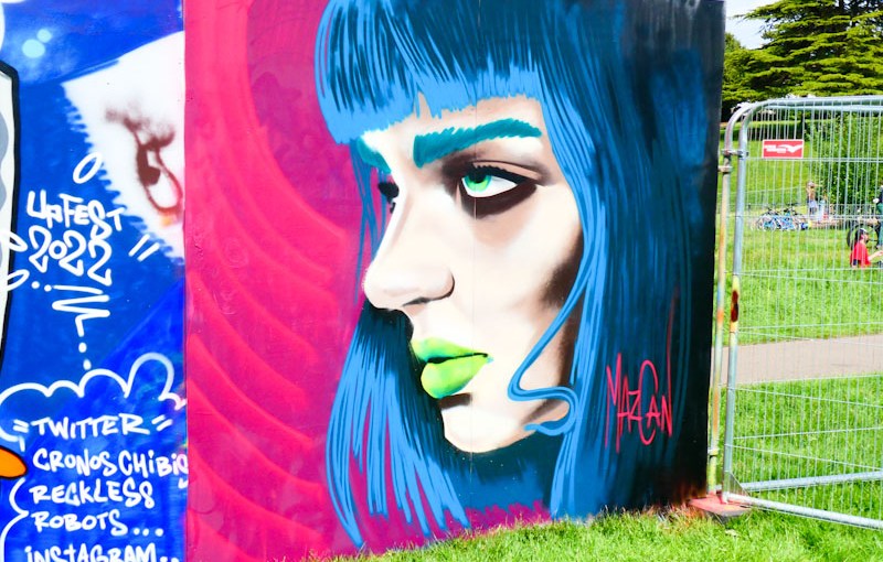
Mazcan produced my absolute favourite collaboration of last year’s Upfest 75 walls in 75 days (75×75) event, so it was a great pleasure to meet her while painting the second of two portraits, both in Greville Smyth Park over the two days of the festival.
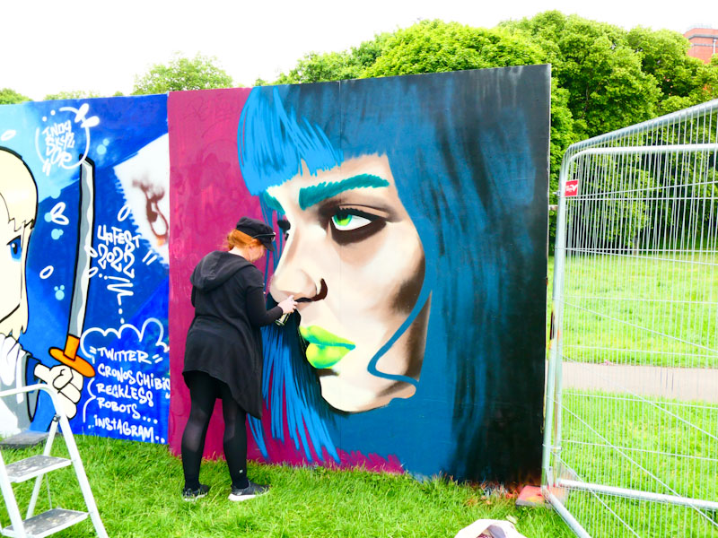
The portrait, you might recognise as Uma Thurman and in my view, is an excellent likeness in her stylised form. It was interesting to see how quickly Mazcan was able to produce this piece, which was a bit of a bonus extra piece, using up one of the spare boards available on the second day.
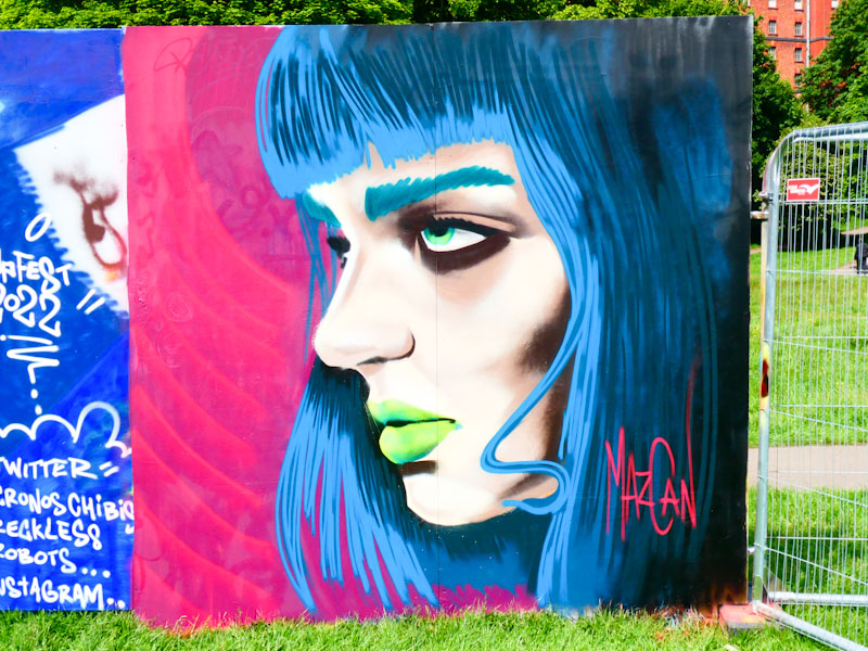
When I see art like this, I realise how lucky we are in Bristol to host Europe’s largest street art festival in the shape of Upfest, and I offer huge respect to Steve and Emma who together with their team manage to organise a truly phenomenal event on such a regular basis. Lovely stuff.
How wonderful to see a familiar Bristol artist taking up one of the semi-permanent walls at Upfest this year. The artist in question is the magnificent Kid Crayon with the first of two Upfest pieces, the other being on a temporary board in Greville Smyth Park.
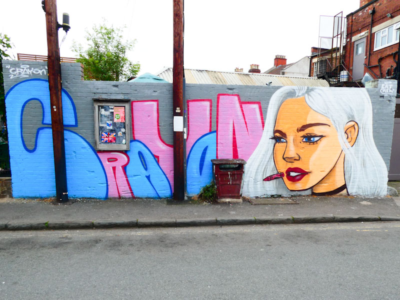
This rather rare (these days) street piece by Kid Crayon features his name in blues and pinks, nicely worked around the notice board on the wall and a beautiful cartoon-style portrait. The portrait of a silver-haired woman wearing a choker round her neck, is a fine portrait indeed and works so well with his style. The best bit is a return of a floating crayon just in front of the woman’s mouth. It is so good to see Kid Crayon hitting walls again, I only hope he finds time to keep up the momentum.
Doors 187 – Porto doors (Part 1)
A little part of me was rather hoping that Porto (or Oporto in Portuguese), meant door, as Porte in French and Porta in Italian do, however it means ‘harbour’. In a way though, I guess that a harbour is a type of doorway into a city/town, so I will run with the analogy because it works for Thursday doors.
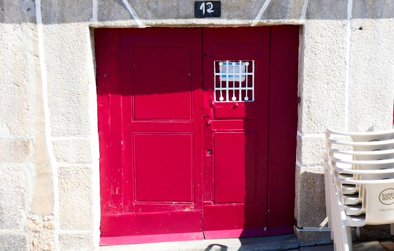
At the very start of June my daughter and I went to Porto in the north of Portugal, for a mini-break, and what an amazing city it is. Over the three full days we walked miles and miles up and down steep hills but without a plan, and we were rewarded with making some incredible discoveries. The other thing about not having a plan is that stopping to take photographs of doors is completely legitimate, and my daughter was most accommodating in this respect.
This is the first of several Porto door posts, which I will be sharing over the coming weeks when time permits. Forgive me if I become a bit of a Porto door bore. I hope you enjoy this first selection:
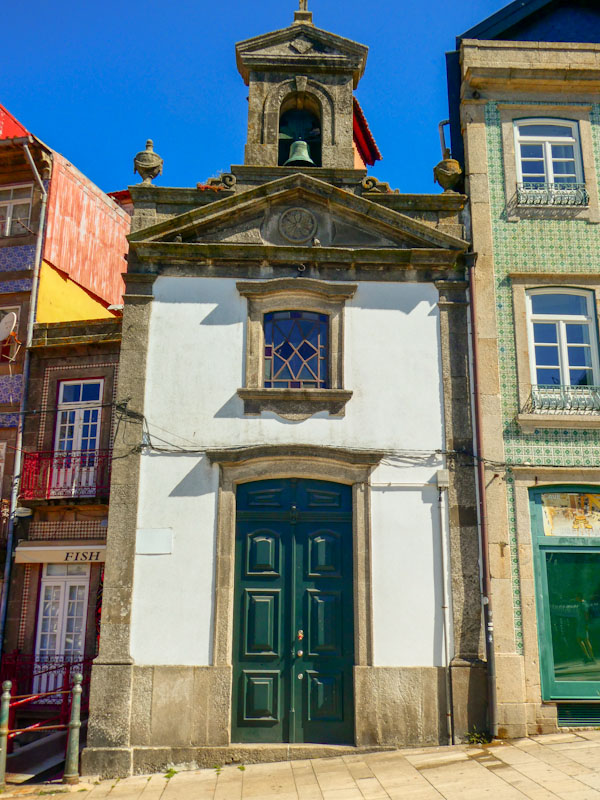
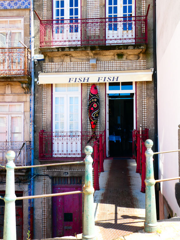

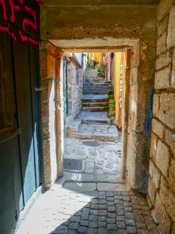

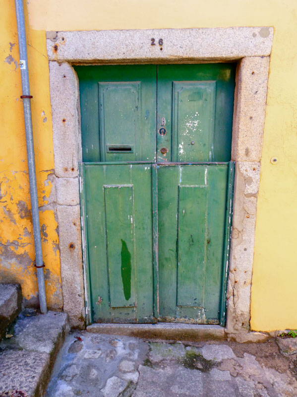
These doors are just a taster of what is to come, and I am very much looking forward to sharing them with you. Have a fabulous weekend wherever you are.
If you have made it this far, you probably like doors, and you really ought to take a look at the No Facilities blog by Dan Anton who has taken over the hosting of Thursday Doors from Norm 2.0 blog. Links to more doorscursions can be found in the comments section of Dan Anton’s Thursday Doors post.
by Scooj
.
Tiniest fledglings
no tail feathers to speak of
ground-hugging test flights.
.
by Scooj
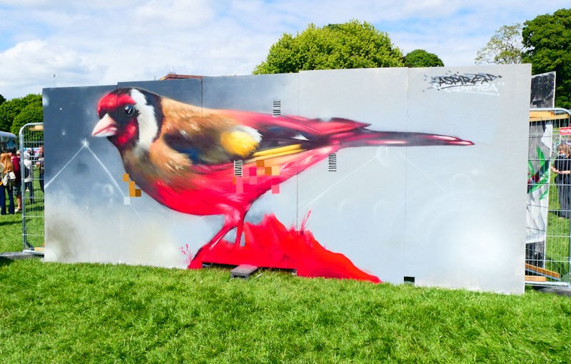
One of Bristol’s biggest losses (in street art terms) in recent years was the departure of Aspire, who took up residence in the old smoke, making the opposite decision to the one I made many years ago. I definitely know where I’d rather live, and it is not in London. On the upside, Aspire does come to visit Bristol from time to time, and he always seems to dazzle us during Upfest.
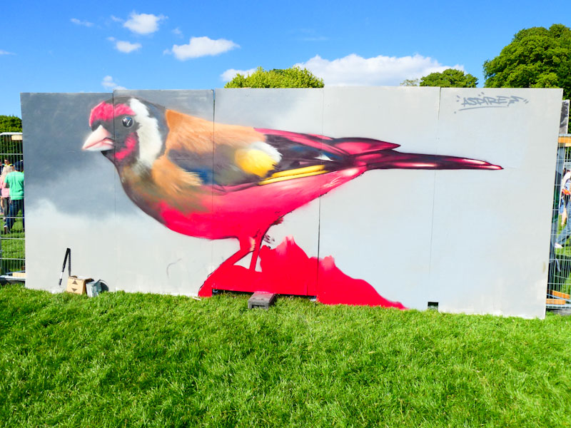
Aspire specialises in creating the most beautiful pictures of birds and in this Upfest piece he has perfectly captured my favourite British bird, the Goldfinch. His work is never complete without his trademark pixelation, and it is interesting to see from this work in progress, that he adds the pixels at the end of the painting process.
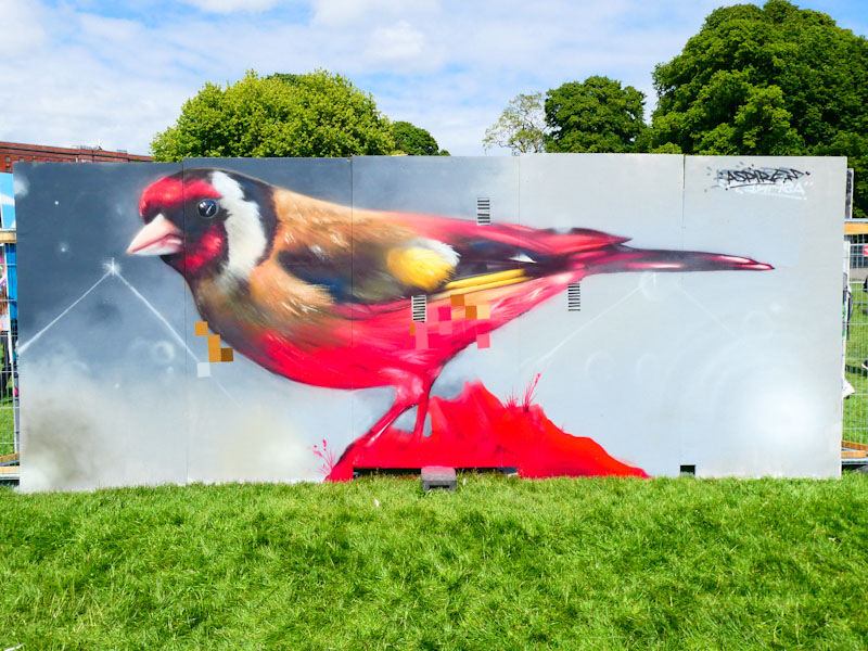
I love this piece, it feels very uncluttered, and the neutral skyline background serves to lift the goldfinch out from the boards. If you are interested in seeing more of Aspire’s work, I recommend you take a little look at a gallery I compiled in 2018, and updated today.
I leave you with three Haiku poems I wrote about goldfinches:
Charm
Goldfinches return
colours exaggerated
in bright winter sun
Lucky Charm
One…two…five…seven…
nine goldfinches together
in our silver birch.
Haiku 7
Vibrant tricolor
and flanking golden flashes
majestic goldfinch
This is an extraordinary piece from TEAone for Upfest 2022, and one of my firm favourites this year. From a distance, the piece has a photorealistic quality, looking like an old photograph from a scrapbook or something like that. The effect is quite amazing.

TEAone manages to create an incredible atmosphere in this scene with what looks like a continental street. It is set in a warm climate, with the air conditioning units and washing hanging out to dry, and the archway and shopfront and awning have all the hallmarks of a European country, and the word Cucina suggests it would be Italy. I absolutely love this piece… it fills my nostrils with the smells of abroad and a longing to be where this is. I can lose myself in this piece and forget that I am standing in the middle of Bedminster. Bravo TEAone.



 Natural adventures