.
Peri peri chicken breasts
tomato, lettuce, peppers
not forgetting cheese
.
by Scooj
.
Peri peri chicken breasts
tomato, lettuce, peppers
not forgetting cheese
.
by Scooj
On the opposite side of the Dare To building from the Smak piece in my previous post on Natural Adventures is a fine quintet of pieces of which this is one. Each piece hosts the writers name together with a little character. This gorgeous rhapsody in green is by Hemper.
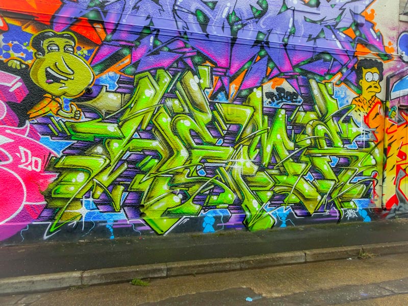
Spelling out HEMS, this intricate piece is absolutely amazing and incredibly detailed. The letters seem to pop out all over the place thanks to the skillful 3D shading effects. This is a work by a fine craftsman. I’m not too sure who the little green character is to the top left, but I think I recognise him from a contemporary cartoon series.
The paint jam at Dare To a couple of weeks ago really did throw up some fantastic work from an ‘A’ list of Bristol artists and it would seem that each artist bounced off the next to up their game a little.

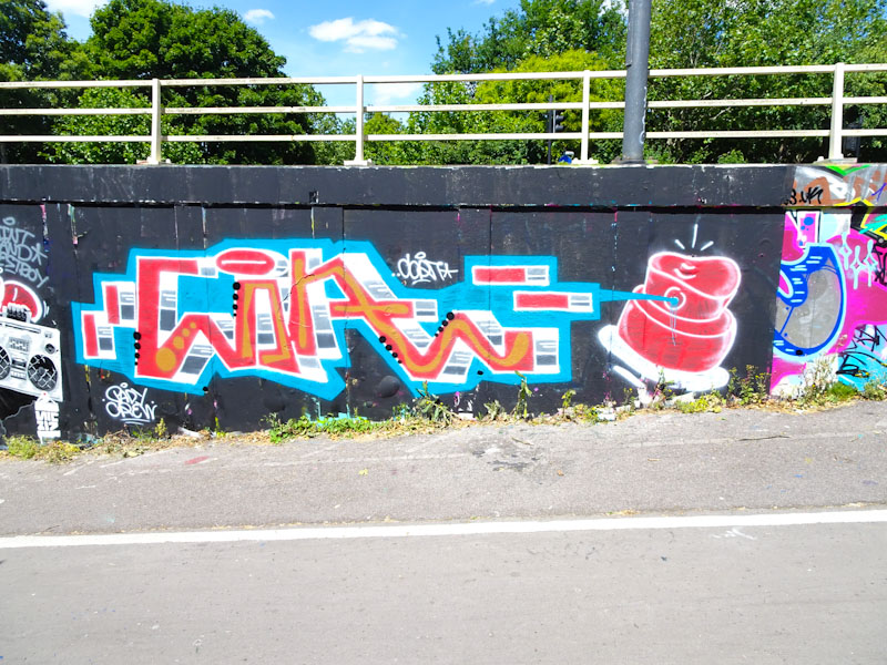
This is a cheeky number (getting into the spirit of the adult nature of the Dare To club) by Smak. Tucked away, and slightly awkward to photograph, this bright and colourful piece includes a little devil complete with cherries on his pants. The writing is typically top quality and has that double letter style where each letter seems to have been painted twice over. More excellent work from Smak.
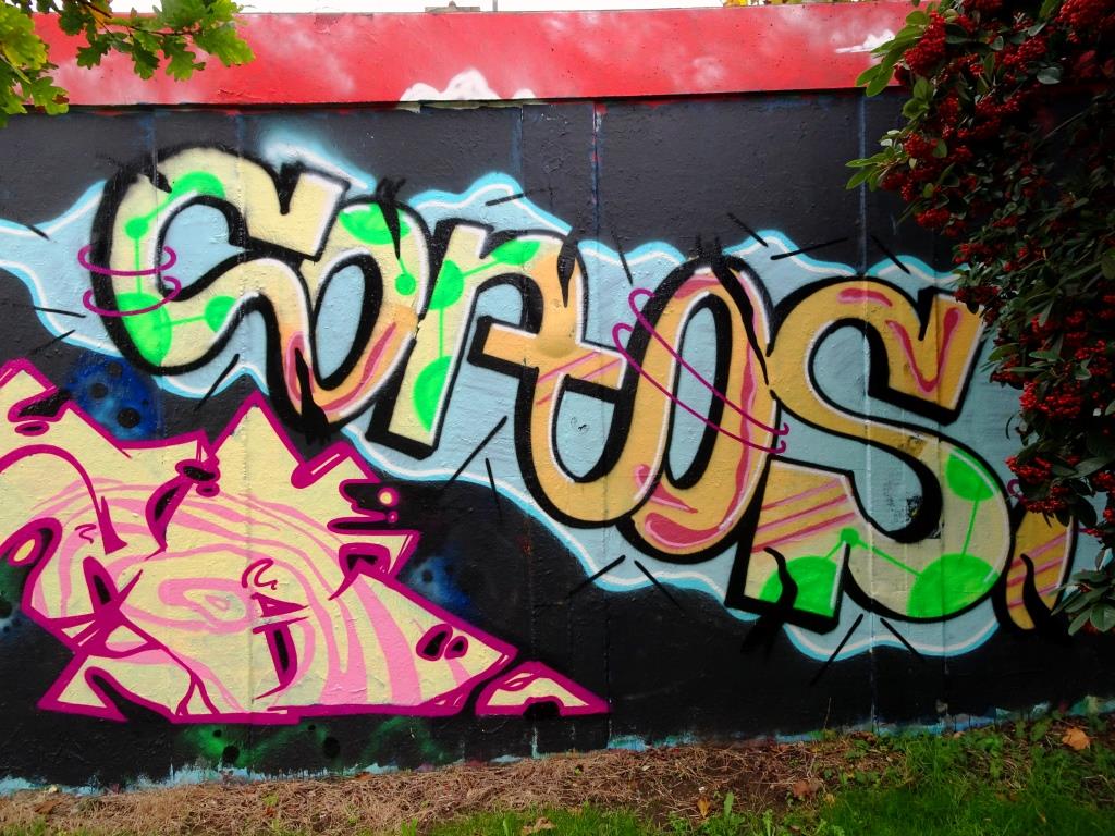
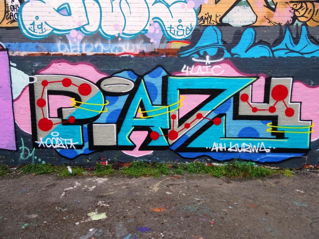
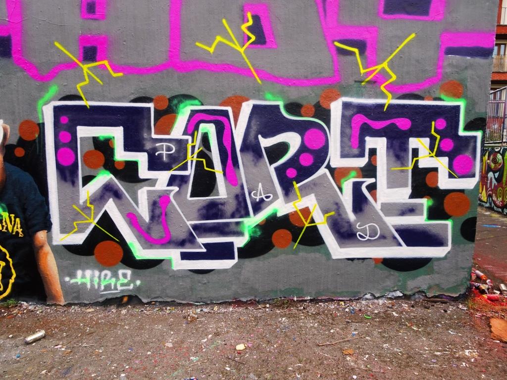
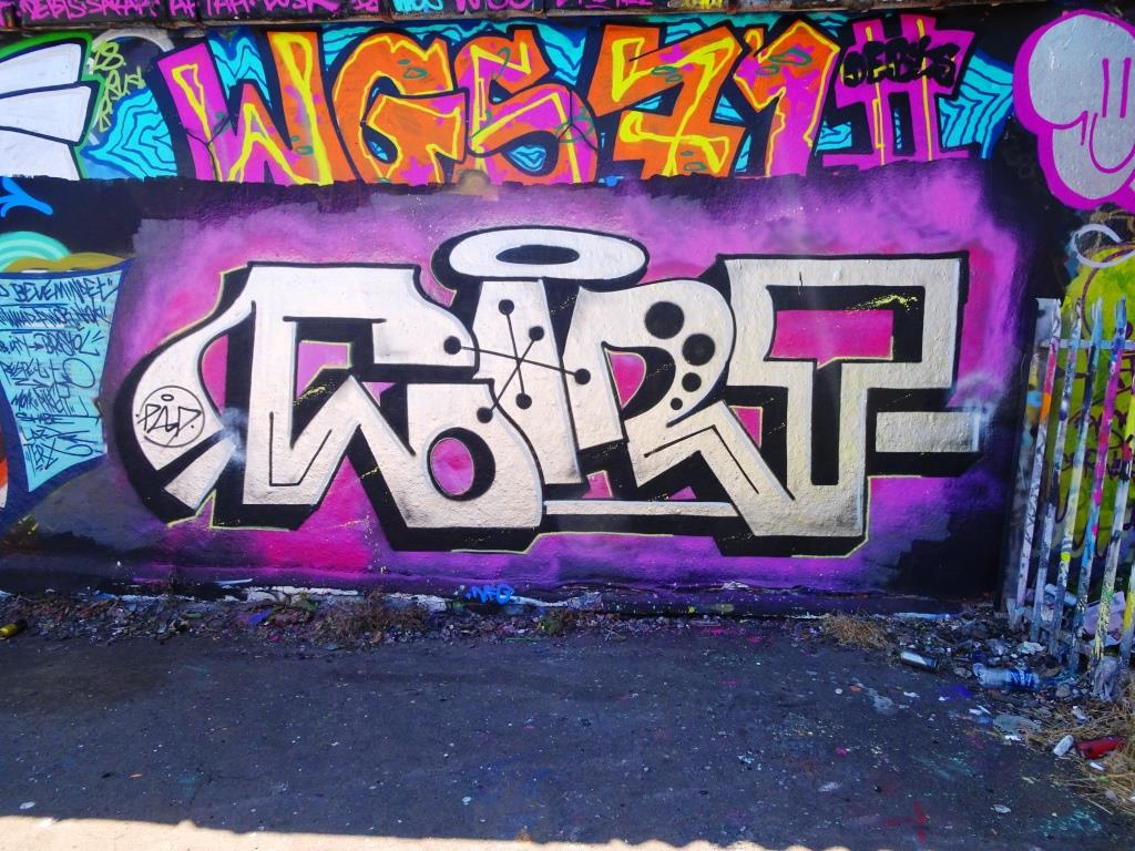
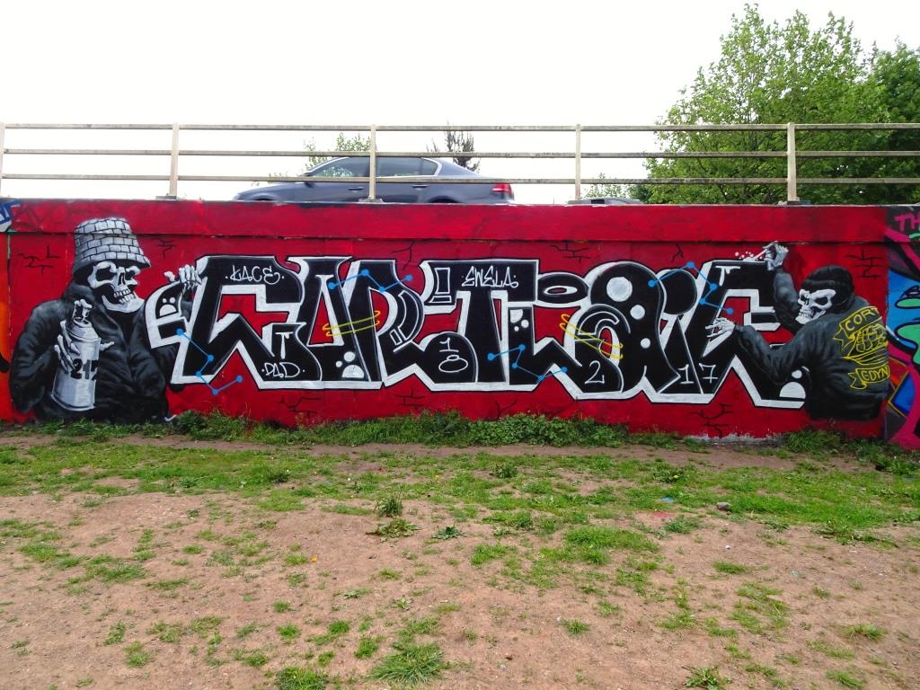
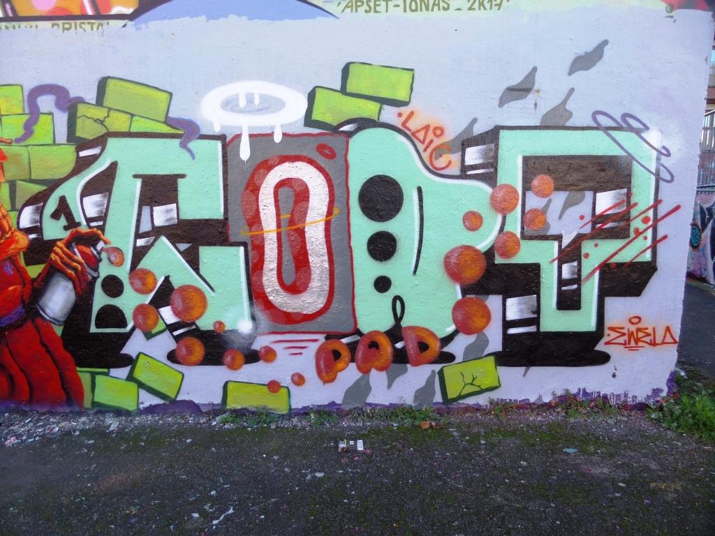
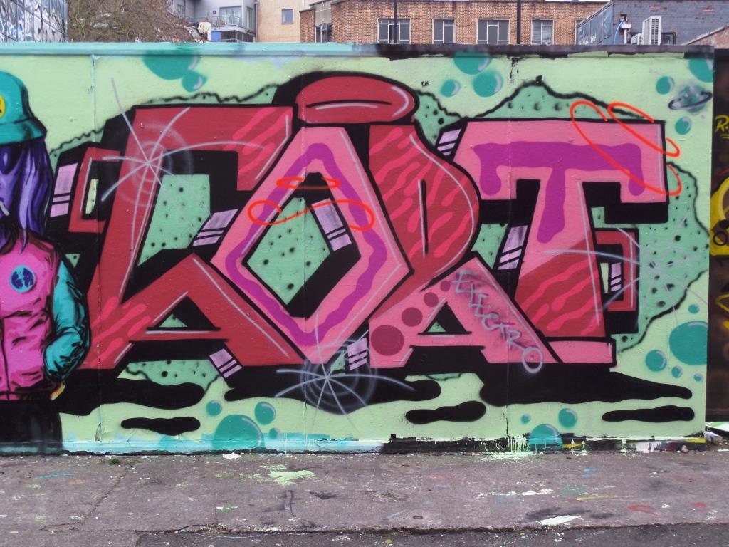
A gallery of fabulous and distinctive graffiti writing from Bristol-based artist Cort
All photographs by Scooj


.
Thank God it’s Friday
there is time to decompress
temporarily
.
by Scooj
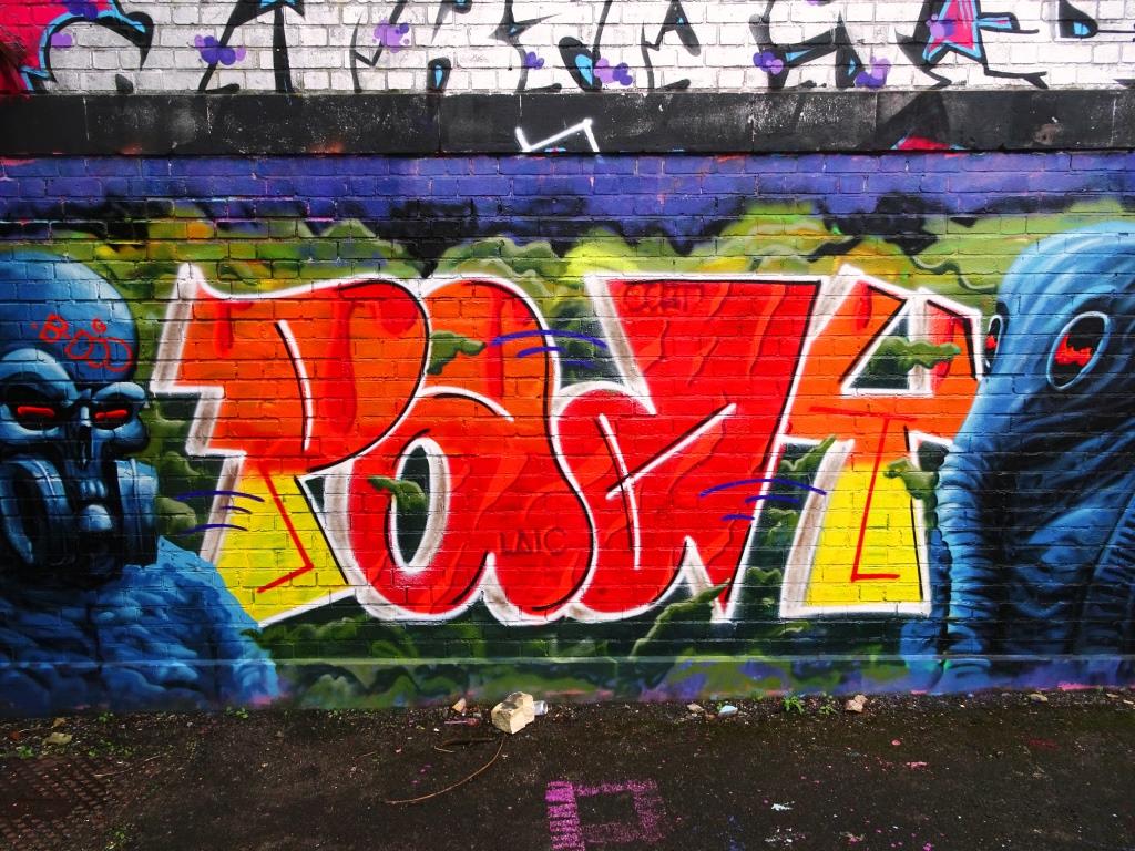
No signature, but who needs a signature when your work screams out Fiva? It feels like an eternity since Fiva hit any walls, but this is quite some comeback. I don’t need to tell you what it spells, but I am probably as curious as you are as to why he decided upon the word Puffin.
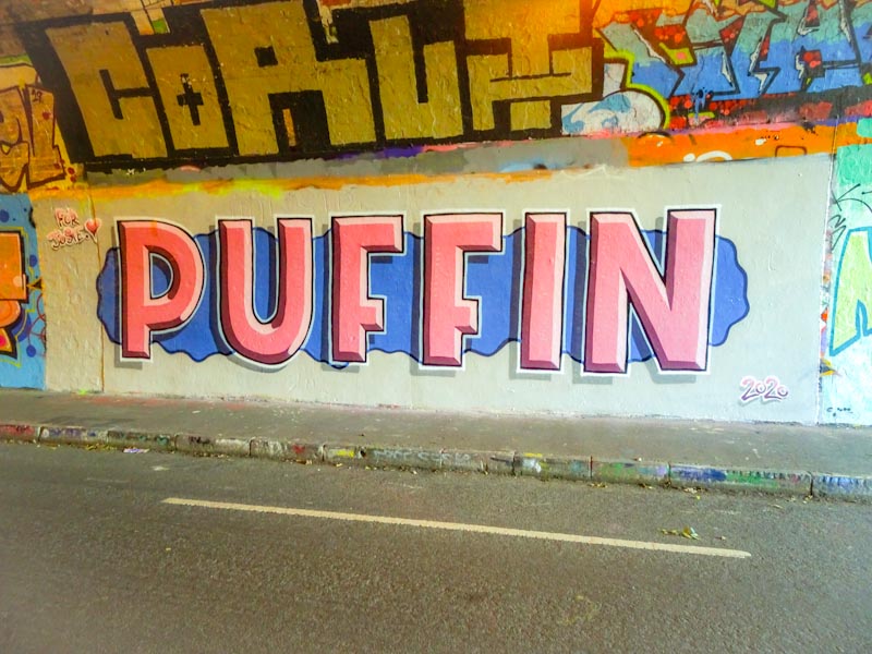
The piece is dedicated to Josie and perhaps the word puffin means something to her. The writing is big and bold, but I can assure you that just because it looks simple does not mean it is simple to do. For a start there are all those straight lines and the correct spacing between letters etc. There is an extremely nice touch with the grey shadows to the left and bottom of each letter. A magnificent piece. I tried to emulate one of his letters last year, with a rather disappointing result… very difficult to do.
This is the last post in this little digression from the Cheltenham Paint Festival (although I will post some more in the coming weeks) and it falls to the brilliant Bristol artist Sepr to round off his cluster. Some of the best pieces at the CPF are painted on the pavilion in Pittville Park and this is no exception.
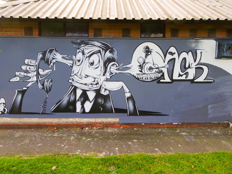
Sepr’s style is so appealing to me, the retrospective style so reminiscent of the 1950s and 1960s and illustrations that used to appear in children’s books. The story here is of a man on the telephone listening to a penguin with a guitar and maracas. Go figure… stunningly executed work as always.
Doors 120 – Some Cheltenham doors (posted a day late)
It has been a month since I last posted Thursday doors and like the idiot I am, I missed this Thursday for my comeback, so here is my offering a day (and a month) late.
I took these pictures on a trip to Cheltenham for the annual Paint Festival hosted there a couple of weekends ago. I can’t remember the last time I posted some newly photographed doors rather than the archive graffiti ones I have been posting lately, so I hope you enjoy them.

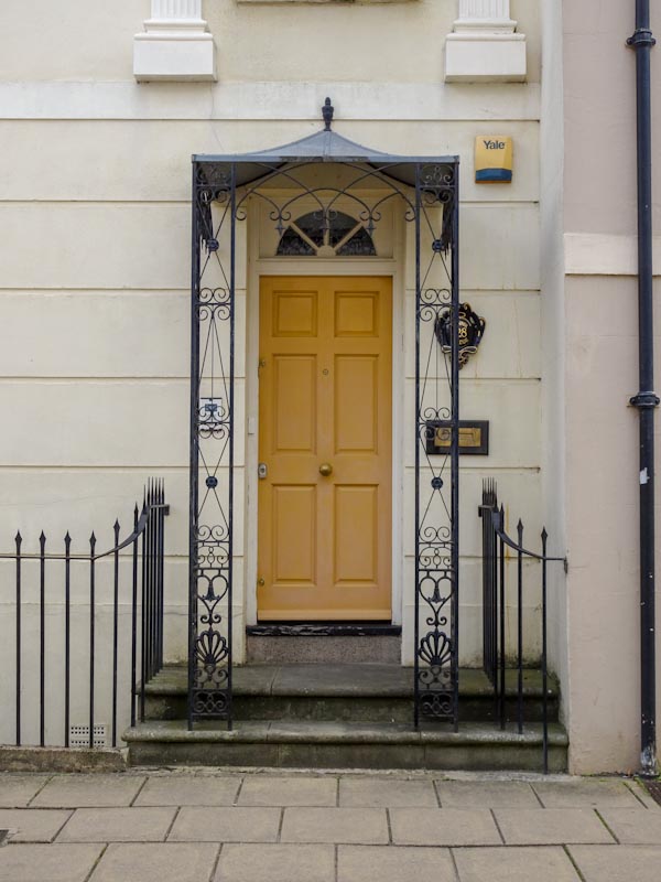
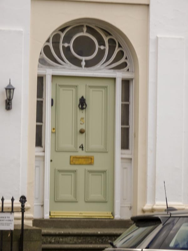

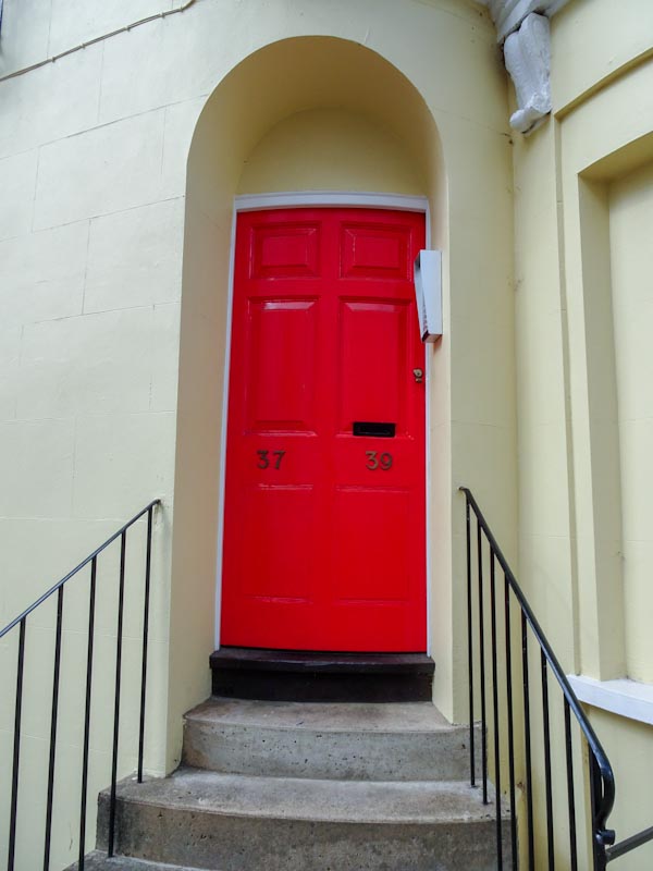
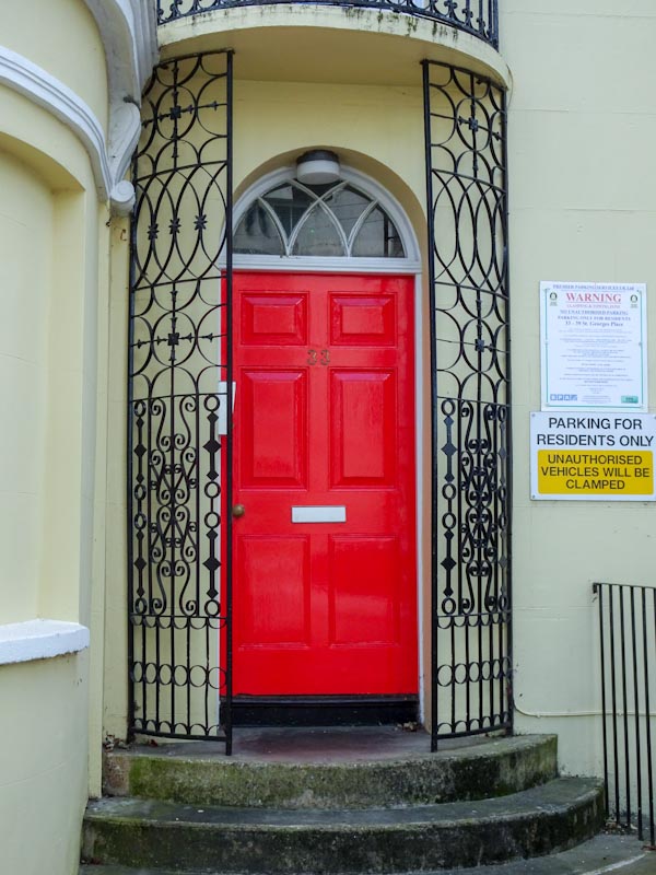
So there we have it, I managed to get myself back into the swing of things, albeit a day late. Expect more archive pictures next week, unless I get myself out for a walk somewhere.
If you have made it this far, you probably like doors and you really ought to take a look at the Norm 2.0 blog – the originator of Thursday Doors where there are links to yet more doors in the comments section at the end.
by Scooj
.
Stranger to my desk
shared in these days of Covid
weeks since last I wrote
.
by Scooj
One of the nice things about the Cheltenham Paint Festival is the large number of Bristol-based artists that are asked to paint. Mr Klue is a particular favourite of mine. His modest demeanour betrays his obvious talent and unique abstract style
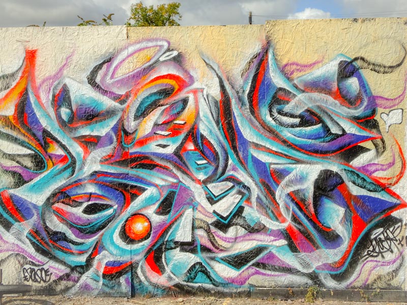
I am not overjoyed at my hopeless photography. The close-up is a little too close and I have cut off the left hand edge of the piece. This is a colourful piece that probably spells out KLUE, but might not, and presents many of the trademark features we would expect to see in one of his pieces; floating steps, wisps of smoke and coiled cones give the artist away. I am rather taken with the orange ball, a nice feature.


