Can it really be
thirteen years? Adolescence,
the next stage in life.
by Scooj
Can it really be
thirteen years? Adolescence,
the next stage in life.
by Scooj
This is a wall that has required a bit of a makeover, having had a rather tired piece on it for a couple of years now. Of course, who should come along to spruce it up a bit…NEVERGIVEUP, who is becoming a bit of a presence in The Bearpit.
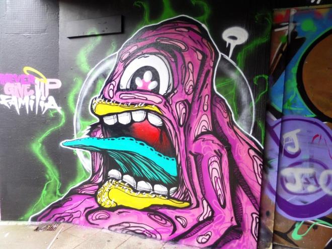
It is another monster to join his previous recent works, and is really rather nicely sprayed. The way he marks the detail using black lines on the underside of the tongue and the surface of the skin of the monster have an illustration quality and is a rather different technique to ones I have seen before. A good piece.


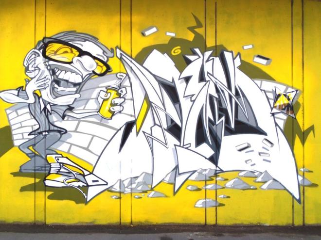
Well this is an absolute cracker from Deamze on the wall in Stapleton Road at the M32 Spot. Really sharp work in monochrome against a yellow backdrop. I can honestly say that this is one of my favourites from this Bristol master.
This bit of wall has only recently been properly taken up by steet artists, where before it was just a few untidy tags. It has become a fine stretch of wall with four great pieces, one of which, the rocket man by SPZero76, I have already posted.
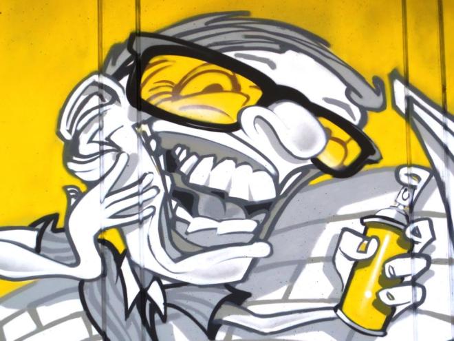
Taking a closer look at this piece, you can see the fine detail and the extra sharp lettering making up the name Deam. Other details really cap this piece off, such as the yellow tinted glasses worn by the character (I’m not too sure who it is meant to be) and the shadows cast by the little rocks in the foreground. A really great piece.
At the top of Church road there are a whole bunch of reasonably new pieces from members of the ASK crew of which this is one. The three sections are by Soker, Cheo and Deamze, although the Soker and Deamze writing are in exactly the same style and lettering and I am left wondering if only one artist was involved in those bits.


It is a colourful collaboration that is nicely balanced. The Cheo character in the middle is ready to spray…was it in fact this character that sprayed the rest of the piece? Always good to see ASK collaborations around the place.

Another one from my time in London last year. This one is by Artista, whose work is characterised by this rather sweet little toast guy. I think that this is an avocado-toast hybrid – a lovely piece, nicely framed and in amongst a hotchpotch of graffiti, tags and wheatpastes.
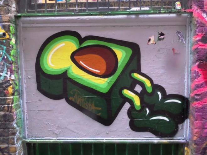
I may have seen other pieces by Artista during my walks in Shoreditch, but this was the one that leapt out at me. I have seen a lot of work by the artist as she seems to be something of a favourite on the London Calling street art blog.
Just a quick canter back to last summer when I spent a while working in London and, of course, took quite a lot of pictures of street art in Shoreditch and Camden Town. Most of the pictures I took are so far unpublished, but I will try to post a few more.

This amazing piece in Shoreditch is by Ananda Nahu. I will let her Facebook profile do her talking for her:
‘Ananda Nahu was born in Juazeiro, on Bahia, Brazil, in 1985. Moved to Salvador in 2001, in 2003 she attended College of Design abandoning it to start in 2004 to attend Fine Arts at the Federal University of Bahia. In this period, she became interested in studying photography and engravings, marked by time studies and research lithography, Serigraphs, metal engraving, and consequently a deepening works in references to these engraving techniques that are Posters.
In 2005 begins to develop the stencil, one type of engraving that is leaked into the mold to obtain shapes of and pictures. From the beginning of the fitting colors of the pictures, apply this combination on the stencil and began to work with multiple layers of color. Use these pictures in creating artistic compositions in urban environments and canvases, also begins to improve regional fabric painting, oriental and African, as well as calligraphy and sources together to compose the picture stencil.
The photographs used to make stencil or free hand painting of his (sic) characters are mostly written by the artist itself, which is done a photographic essay for construction work, or if not, are based on photographs from renowned photographers of Latin America.
In her references are album covers and movie posters, posters and banners, black culture, Latin, Islamic and Asian, urban and goticas calligraphy, printing and fabrics Brazilian, African, Chinese and Japanese, also classical and religious paintings.
Ananda has established itself as a reference in the technique of stenciling and painting, she maintains an international presence for the Arts since 2006, mainly in Holland, Germany, France and Brazil, having many collectors around the world.’

This was one of the first pieces I saw in London and it had a lasting impression on me. There is something about it that reminds me of Gustav Klimt. It is a lovely piece.
Fine decorations
adorn a tough carapace;
king of camouflage.
by Scooj
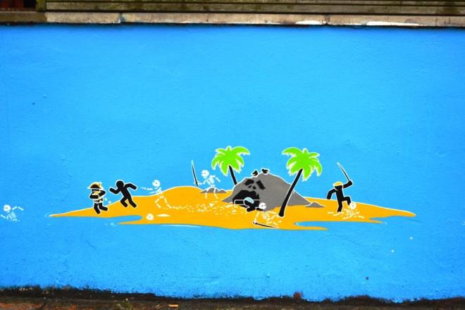
Pahnl were the selected festival artists for Upfest 2017, which meant that they had to work twice as hard as any of the other artists. They provided the visuals for the programme, map and other publicity material and they produced two stencils to advertise the upcoming event, previously covered in this blog.
Their work consists of beautifully designed stylized figures, looking a bit like they have marched off a corporate logo portfolio, set in various, often witty scenes. The work is very time consuming, as each element is stencilled onto the overall scene.
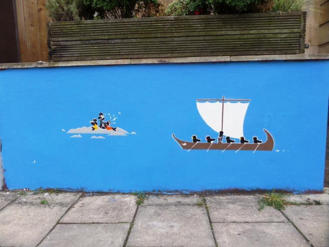
The effect is a world of colourful small designs interacting with each other and the viewer. Something about the figures reminds me a bit of Play Mobil figures.
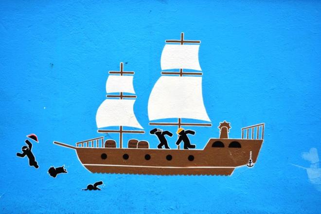
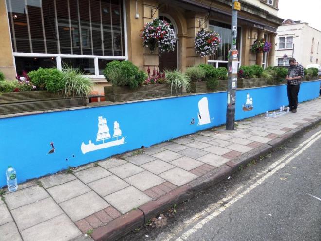
This wall, alongside the ‘Hen and Chicken’ was the first of two ambitious pieces by Pahnl which at various times saw them valiantly spraying under plastic sheeting cowering from the rain. There are loads of individual pirate stories going on here involving these little people.
Just occasionally at Upfest, it is impossible to write about one piece without writing about a piece adjacent to it. This happens particularly with the portrait boards, most of which were in North Street Green this year.
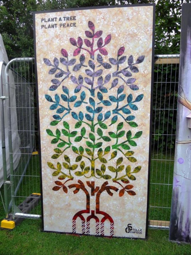
The piece on the left is by Stelle Confuse, an artist from Florence, who is one of the most active protagonists of sticker and stencil art in Italy. Here his message is clear and simple – Plant a tree, plant peace. It is a fine stencil piece, with extraordinarily beautiful patterning and shading of the leaves.
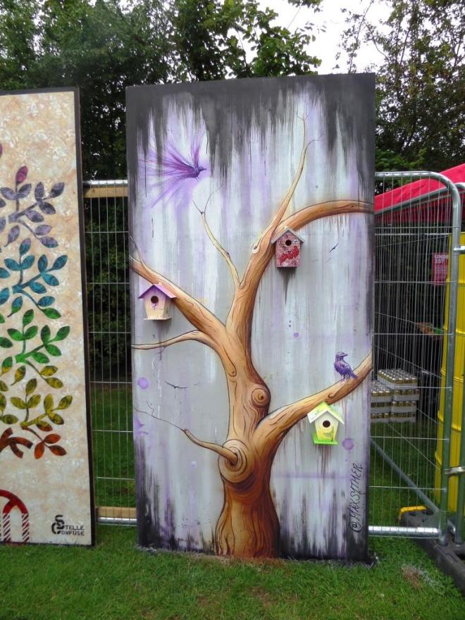
The piece on the right is by Max ‘Syther’ Oughton, and artist based in East Anglia. This is another beautiful work which has an added three dimensional element in the shape of bird boxes attached to the tree.
I don’t know if it was deliberate or coincidental, but it is great to see two interpretations of trees in two very different styles. Both beautiful.
Anyone who was at Upfest 2016 would have been utterly charmed by the incredible tree frogs by JXC. It was one of my favourite pieces from last year, and I wrote about it here.

This year he was afforded a larger wall, one that Voyder wrote ‘Bristol’ on last time round. Instead of tree frogs, JXC treated us to an extraordinary seascape with a rather intimidating octopus in the foreground and some naval mines in the background.
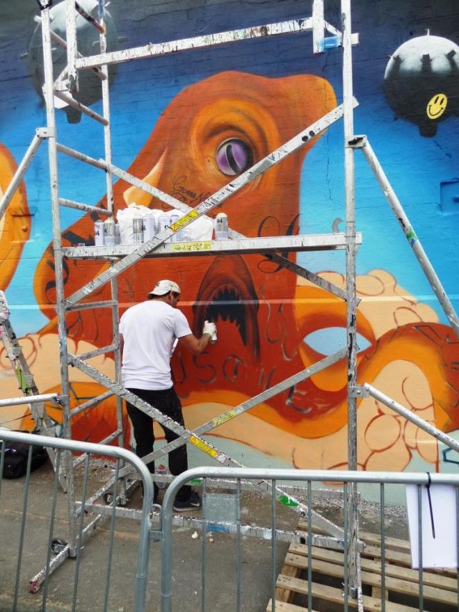
This was another of the pieces that probably took longer to create than might have been expected, due to the constant rain interruptions over the three days of the festival.

The mouth on the side of the octopus isn’t the octopuss’s beak, rather is it a shark mouth inked onto its side. JXC’s work is heavily inkled with words and drawings that resemble tattoos, creating an interesting effect o the surface texture of the subject.

There is a story going on in this piece which is a little tricky to decypher. The words ‘Just Lie’ appear under the shark but I’m not sure what that refers to. Nice to see a smiley on the bomb – some ironic commentary there?


