.
Serendipity
cloudless, dark, warm starlit sky
Perseid shower
.
by Scooj
.
Serendipity
cloudless, dark, warm starlit sky
Perseid shower
.
by Scooj

Dirtygypo is making his presence felt in Bristol, with his pieces appearing in various spots with some regularity. With this piece in the little tunnel at Cumberland Basin, he has abandoned his customary colours for monochrome letters with a black border.

I am still struggling to read what his letters spell out. I can see an S, a couple of Is a Z and a T perhaps, I am sure the penny will drop eventually. His playful graffiti writing has a light-hearted touch to it, and I am very much enjoying finding them on my ’rounds’ with the dog.
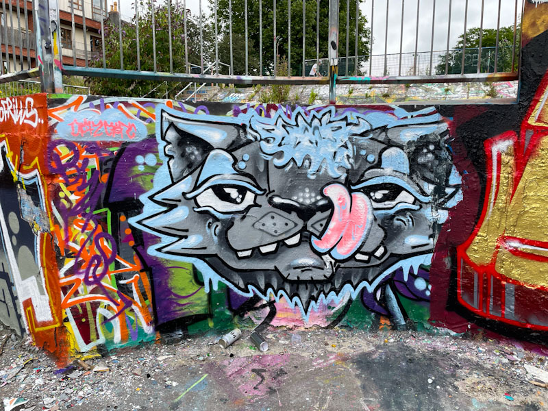
In Dean Lane on the edge of the curved wall, Daz Cat has painted one of his trademark cats, but how his artwork has come on. In recent years, he has worked on and improved, immeasurably, his depth and features, which in his earlier work were rather flat. I guess I am saying that his work has become much more sophisticated. If you look at the image below, you will see what I mean.
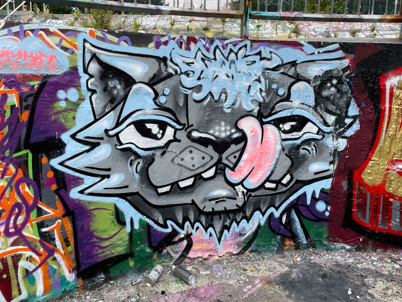
This cheeky cat, sporting a bit of a quiff, is licking his face, something that cats seem to delight in being able to do. While this is a bit of a quick ‘stamp’ it is nonetheless really rather good.

.
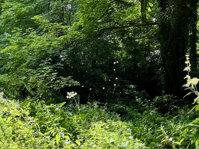
A bright shaft of light
countless butterflies delight
and then they are gone
.
by Scooj

I met Hardie while he was painting at Upfest, and what a friendly fellow he is. Although I think I have only ever posted one or two of his pieces on Natural Adventures, he seemed to know who I was and was familiar with my blog, which was most encouraging.

The Bristol-based artist doesn’t tend to paint the streets all that often the odd shutter or wall here or there but rarely in the popular hotspots, so it was a super surprise to find two of his pieces side by side in the wartime gun emplacement. His characteristic character portraits are made up of a patchwork of crosshatches, creating a really interesting effect. As you can see from these two pieces, Hardie uses a stencil to create his faces, and it also demonstrates how using different colours can create a different look from essentially the same template. What a pleasure to come across these rarities.

Well this is a bit weird, even by Zake standards, and I am not entirely sure what to make of it. To me the piece looks a bit like a cross between an aristocrat and a spaniel, and once seen, I can’t unsee it. There is something about that pointy nose that I find quite unsettling.
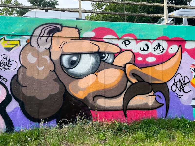
Zake has been on fire for a very long time and continues to push boundaries, but also reverts from time to time to his basic round face characters. His USP is working with light and shade to create depth and texture, great example of which can be seen in the eyes and cheeks of this character. Both bizarre and wonderful work from Zake.
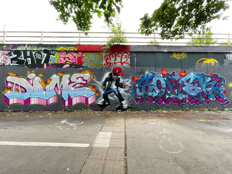
What a wonderful triptych piece on the roundabout which is what I would describe as a unique collaboration between Dime, Jody and Turoe. I am not familiar with Dime and am guessing that he was visiting Bristol and made contact with artists in the city to see who’d like to have a paint. That is how I imagine these kind of things happen.
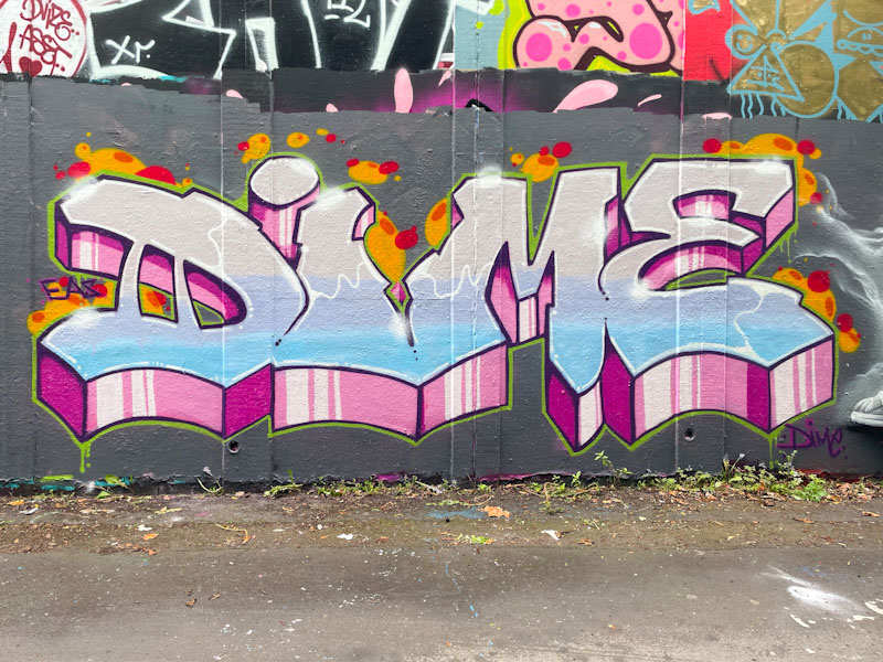
The collaboration starts with a stunning piece of graffiti writing from Dime, with nicely defined letters, beautiful fill colours and a deep 3D drop shadow. The borders are nice and thin and flawless, and the letters are lifted with contrasting orange and red blobby decorations around the outside. The way I think about decorations in a piece is to try and imagine what it would look like without them – often they enrich what might have been something a little ordinary. Decorations are part of the composition, not just an afterthought.

Jody has been smashing it all over the place for a sustained period, and I understand from talking to Fade, is really enjoying himself. In this piece he provides the filling in a graffiti writing sandwich and features a cartoon style cool character striking a pose with a cloudy background. I love the sparkle on the sunglasses, a brilliant touch.

Rounding off the collaboration is a piece of writing from a Bristol legend, Turoe, although I originally thought it was by Soker it is actually a tribute collaboration to Soker who had a cycling accident recently (Thanks to Jay for the background information). If ever you want to know what outstanding graffiti writing looks like, then look no further than Turoe, and this piece demonstrates why. Perfect colour selection, superb interlocking letters without being over-engineered, a deep and contrasting 3D drop shadow and tight border. All the elements are there and they are brought together by a master of his craft. All in all, this is a fabulous and quite unexpected collaboration. We are blessed, and a fabulous tribute.

I think that this piece by The Art of Sok has been around for a little while, but I was pointed in the direction of it by the artist himself, which was lucky, because I don’t visit this spot as a matter of routine. It was painted as part of a collaboration with Smak, which makes sense because they are friends and share a Welsh heritage.
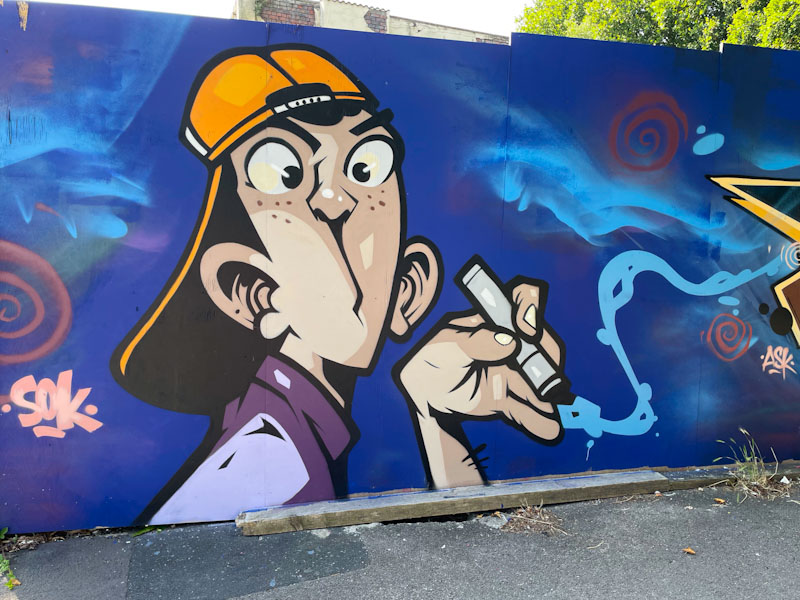
The Art of Sok has done here what he does so well; he has created an outstanding comic-book style cartoon of a young man wearing a baseball cap and smoking. The piece is perfectly clean and tight as a nut. Even the smoke coming from the cigarette is stylised, and you can see the two styles meeting where the much more wispy smoke drifts across from Smak’s adjacent piece. Wonderful work from The Art of Sok.
.
Summer holidays
a break from school and routine
more time for nature
.
by Scooj

I have been suffering from Elvs withdrawal symptoms… it seems such an age since he regularly visited the city, although this is his second piece painted in July, so there is some hope, I guess. This piece feels like classic Elvs, and I think I know what I mean when I say this, because his writing remains similar from piece to pieces, but there is something here that reminds me of some of his older work.
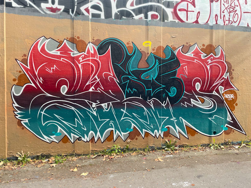
The colour selection, including the background colours, just seem to work so well together, with the break in red tones disrupted through the central section. The writing spells ELVS and the letters are created with the thin highlight lines, so typical of Elvs’ work. There is a lovely grey drop shadow with a central vanishing point which rounds the piece off nicely and without which it would all look pretty odd. Excellent stuff from Elvs.


