.
The mild weather yields
conceding territory
cold winter begins
.
by Scooj
.
The mild weather yields
conceding territory
cold winter begins
.
by Scooj
This is the first piece I have posted from an artist new to me who writes under the name EMAN. I note from his Instagram that he has been painting Bristol walls for a while, but I just don’t seem to have come across his work before. In the gloom of an evening a couple of weeks back I was lucky enough to meet him while painting this piece during an impromptu paint jam along the M32 cycle path.
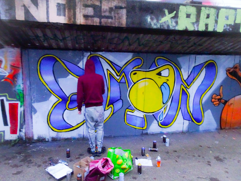
Eman was rather pleased with his character in yellow, which he was developing and which I think might become a bit of a signature element to his work, a bit like Chuck is in Decay’s work. This piece spells out EMAN in a thin yellow strip with a shadow that gives the sense of a piece of ribbon, which is rather clever.
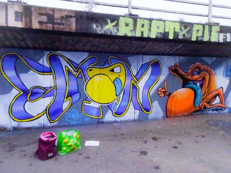
This is a nice piece and I already have a few more on file for posting sometime soon.
It’s that man again, Todoaciem, with one of his outstanding calligraphy pieces spelling out CIEM1. He really has been turning out some of the most consistently brilliant pieces of late and is fast establishing himself on the Bristol scene.

There is something of a mini Spanish armada in Bristol at the moment, and along with the strong Polish contingent, the city is becoming a wonderful culturally diverse melting pot for street art. We are blessed to be able to see so much art on our walls each day in so many styles from so many resident artists.
The piece itself not only stands out for its uniformity of typeface, but also for those incredible gold fills and the striped blue and white 3D shadow. One to admire.
.
As predictable
as Christmas dinner itself
pie waits in the wings
.
by Scooj
I made a special effort to photograph this piece as quickly after I saw it because I never got a clean picture of its predecessor by Tom Miller that had been there for a long while on account of the difficulty of parking nearby. Lazy me. As a result, this one from 3Dom was not going to get away from me.

Surprises are always good, and this piece from 3Dom was certainly that. No warnings, no Instagram, it was just suddenly there one morning. The piece itself is typically crazy and surreal and has a joyful charm about it. 3Dom has signed it with his Instagram handle which makes me wonder if it was perhaps a commission, or at the very least he would have sought permission to do it. I think it is an expression of weather and space, with elements such as clouds, a rainbow, the sun combined with stars (see Orion’s belt?) a galaxy and a rocket. Nicely painted and bright and colourful. Thank you 3Dom.
There is just enough time to squeeze in another post from Turoe featuring one of his end-of-year “shite year” pieces before this trying 2020 finally comes to an end. The pain has been relentless, but I have a sense that things will start to ease for all of us over the coming months. Scars will be left, and we will never forget 2020, but we will move on, and it will pass… we need to make time and space to turn our attention to more pressing (yes more pressing) issues such as climate change and biodiversity loss.

This one from Turoe in Dean Lane is another very nicely crafted burner, and there is absolutely no doubting Turoe’s talent. I have noticed that one of the No Frills (crew) trademarks is these bubble backgrounds, which several other members also use. I feel that these “shite (shyte)” pieces will act as a reminder for archivists, when we review 2020 in years to come.
.
It’s been a long time
Laca, Xhaka, Saka goals
it had to happen
.
by Scooj
It is good to see another Zace piece featuring a stone face similar to the one I posted a short while ago from St Werburghs tunnel. In this little corner of the skate spot, Zace has used the unusual shape of the board to good effect. This is the kind of small piece that will often be overlooked, and it is always fun to find little gems like this one.
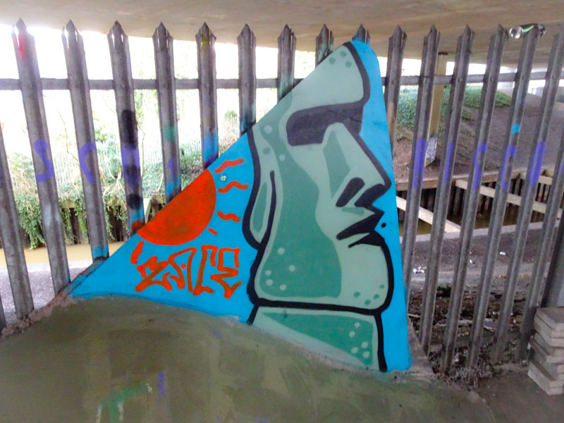
Zace has a fairly straightforward style and manages to execute it very tidily. I like the reversed out colours used in the face, with the lighter dots on the darker background and the darker dots on the lighter background – a clever technique. I am genuinely looking forward to seeing loads more from Zace in 202 because I like what I have seen in 2020.
Coming across a Soker piece is never disappointing and when it is a variation away from his usual letters SOKER or SOKEM it is especially noteworthy. This wonderfully colourful burner spells out Super FREAK. I don’t know what the reference is, but I do know that the result is superb.
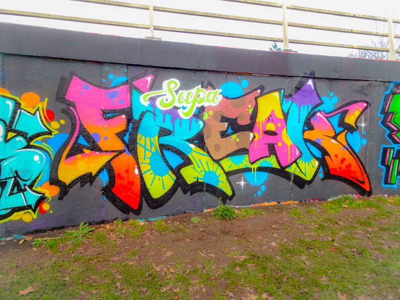
I can’t quite put my finger on it, but there is something about Soker’s style that is uniquely his and that makes identification relatively easy… maybe it is the curves in the letters or the 3D shadow, I don’t know, but most of the time it is possible to get it right. The fills in the letters are to die for, and overall this is the work of a craftsman at the very top of his game.
.
One of the great lines
‘same old shit, different day’
Perfect Christmas film
.
by Scooj


