Going back through my pictures from Upfest 2016 I am left a little puzzled by some of the pieces that I failed to post. This work by Diff looks rather like a studio study as much as it does a piece of street art. A silhouetted woman wearing a bowler hat surrounded by pink yellow and white bubbles.
Diff, Upfest, Bristol, July 2016
Although not necessarily one of Diff’s best pieces, there is an air of grace about it and some care and attention to detail has gone in to the bubbles, especially where they overlap.
Aaah, familiar stuff from Mr Draws and one that had been inadvertently omitted earlier in the year, which is surprising really, because it is so very good.
Mr Draws, Dean Lane, Bristol, February 2018
There is always something very cheery about his work that works for me. In this piece, the filler is absolutely beautiful, the two colour palettes above and below the yellow line are brilliantly complementary and the bubble effect imperious. I really love the simple idea and lovely execution of this one. Can’t believe it has taken almost a year to post it!
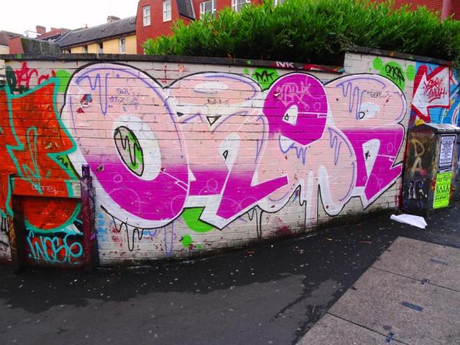
I realise that some of you might think that I am overdoing it a bit with the Oner thing – this is my fifth post from this writer since mid-May – but I think that both his artistry and productivity deserve it.
Oner, Moon Street, Bristol, June 2018
At first glance the piece may look a bit messy, but there is lots that is good about it. His lines are clean and he has cut in the edges of his letters really skillfully so that each is distinct from the next. His shading regime has been reversed on the ‘e’ with the dark pink at the top and the light pink underneath. He has added in some nice drip decoration and if you look closely you can see some subtle bubbles on his dark pink. I think I could learn a lot from this writer.
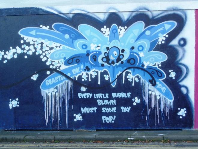
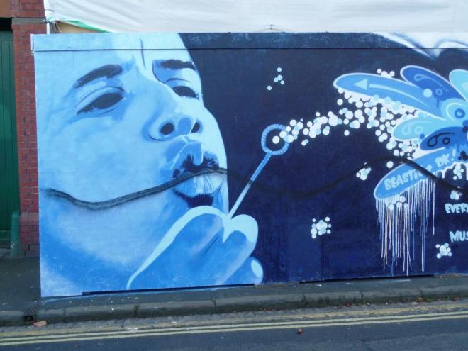
Alongside works by Voyder, Deamze and Soker sits this unusual and rather good collaboration by two great graffiti artists – Beastie and Decay. The Decay element is easy to identify, displaying all his concentric shapes and tones although this time in blues, rather than the usual reds, greys, whites and blacks that are his favoured colours.
Decay, Raleigh Road, Bristol, November 2016
Had the piece not been signed, it would have taken me a little while to identify Beastie’s contribution on the left. Some will remember his mischievous cat in Stokes Croft that had been tagged, but has now been resurrected. Because I only see occasional works by Beastie, I haven’t properly ‘got my eye in’ with his stuff, and his style is rather more broad than some other artists.
Beastie, Raleigh Road, Bristol, November 2016
This is an interesting collaboration with a rather solemn message, but i think they have carried it off really well. Such a pity about the black line through the piece, but you have to be quick these days.