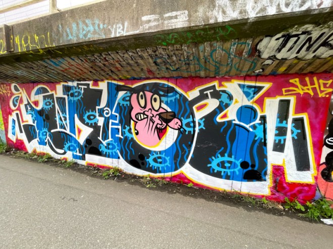
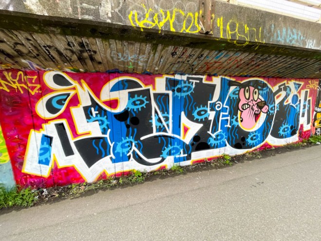
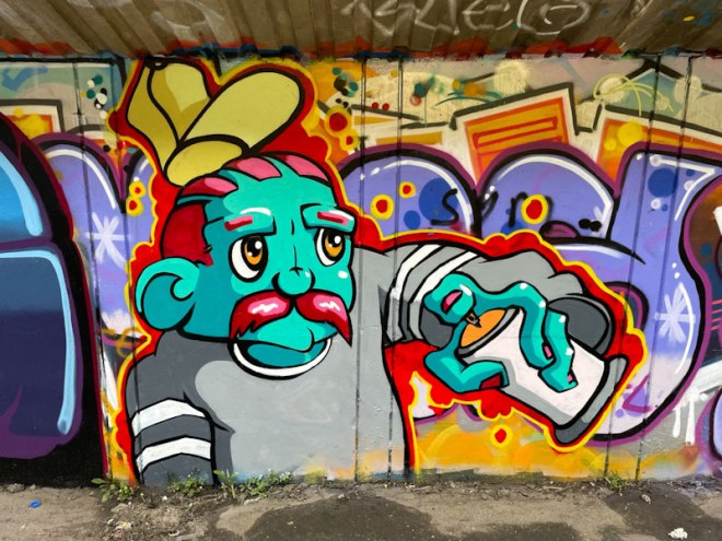
A gallery of outstanding cartoon characters and writing from Bristol artist Bean
Instagram: @ceelo_bean
All photographs by Scooj


A gallery of outstanding cartoon characters and writing from Bristol artist Bean
Instagram: @ceelo_bean
All photographs by Scooj


Awkward tends to drop his pieces in twos and threes, which is something he can easily do because his mega-tag characters are generally quite small. On this occasion he painted one on the door at the bottom right-hand end of Dean Lane and the other on the wall of the swimming pool, about 50 meters apart.

This door is a candidate for the One Wall, Many Faces series of posts which I will get on to when I have a bit of spare time (thumbs diary, that’ll be 2029 then). Awkward has created a vision in yellow, with vibrant blue eyes and speech bubble set on a gorgeous black and red background. The characters he paints are a little bit on the eccentric, some might say, weird side, but they are distinctive and compelling.

The character on the swimming pool wall uses the same three colours which are rotated, so the face is blue, the eyes and background yellow and the speech bubbles red. The writing in the speech bubbles is usually a signature, AWK WARD split over two lines, and in this piece he has included a year date ’24’. It is always a great bonus to find his work.

There is a lot of truth and honesty about Klashwhensober’s work. Sometimes his work can be a little scruffy and rushed, and sometimes it can be glorious, clean tidy and creative. This piece falls into the latter category, and s a general observation, his trajectory is upward and he is producing quite a lot of classy pieces at the moment.

The black letters on a blue background, spelling SOBER, are nicely done and complemented with a fine blue drop-shadow and tidy accents and starbursts. The inclusion of a character in the middle of the piece definitely improves the overall look and balances out the piece well. Great work from a still-productive Klashwhensober.

The Easter break from his studies has been a productive time for Bean, and I expect we’ll be fortunate enough to see a whole load more in the summer holiday. With each piece, Bean’s work appears to get more sophisticated in both composition and execution.

In this piece he features a man, who looks like he might be a little upset, with steam coming out of his ears. On his finger, he is dangling a tomato(?) which is of course normal behaviour… not. There is so much great detail in the piece and plenty of perspective, and the medallion with his signature is a fabulous touch. I am pleased to see again that Bean has put a bit of a buffer background to differentiate his work from the noise of previous graffiti on the surrounding wall. Outstanding work from a young artist who I think will be wowing us for some years to come.

There has been no stopping Biers and his WD40 pieces this year, each one a real pleasure to find and photograph. His tried and tested formula of writing his letters and incorporating a character in the ‘0’ continues to delight and keeps his inspiration fresh. The idea is one adopted by other writing/character combination artists such as Zaenone, and builds a series of ‘collectible’ works.

It looks like Biers spent plenty of time with this one… it is neat and tidy with plenty of clean sharp lines and borders. Although the letters are generally fairly static from piece to piece, the two elements that give Biers scope for inspiration are the colour scheme and the character. Although these colours are not my personal favourite, he has worked them superbly into the horizontal layers with some drift shapes between them. The character is a treat, although I don’t know what popular culture cartoon he comes from. Altogether an awesome piece from Biers.
A gallery of the wild and wonderful creations of Bristol street artist Stupid Stupid Meathole.
All photographs by Scooj


Set on the windy hilltop of Purdown, overlooking North Bristol, we find a glorious piece by Slakarts at his simple best. His regular stylised character has been given something of a facelift (literally) with both colour fills and patterns. The oranges and reds contrast beautifully with the background blues, rounding the piece off really nicely.

It has been an absolute age since I last met Slakarts (the last time was in St Werburghs tunnel during a lockdown) and now that he appears to be painting a little more frequently, there is a chance I might bump into him soon, which would be nice, because he is a really sound bloke. I am definitely enjoying his spring renaissance.

My initial irritation with finding this piece – I had come to find something else (I think a piece by Hire) that I hadn’t yet photographed and that had only been on this wall for a few hours – was quickly replaced with the joy of seeing another fine piece from visiting artist Zaenone.

Zaenone’s pieces can be broadly described as having chunky letters ZAEN, with character bookends, although occasionally he omits the characters. The sumptuous reds of the letters occupy much of the space of the piece and smack you in the face. The strength of the colours is offset and counterbalanced by the two wizard characters augmenting the whole thing perfectly. It is always a pleasure to find Zaenone’s work, even when painted over other artist’s recent work – it is a jungle out there.

There is an artist in Bristol, who occasionally hits the walls of the city with his curious creations, often in chrome. I am talking about Blimma Blamma, at least I think that is what he is called (he/she doesn’t sign his/her work).

This piece includes some letters, which I can’t make out and a character,, customarily wrapped up in clothes with only his face poking through. There is something endearing about the characters and mysterious about the work, which leaves one guessing what the story is. I think I need to do a little more research on the enigmatic Blimma Blamma.

Conrico has been turning out some sensational pieces lately, and what is interesting about this one is that he posted on his Instagram feed some sketches of the animated Chinese lantern before painting this wall, which goes to show how much thought goes into the pieces that artists paint.

The letters CONRICO are superimposed on what looks like an afternoon landscape with the lantern on the left and a building on the right. As ever, Conrico’s artwork looks like it is painted with a brush rather than a spray can, and I imagine he paints with lots of short controlled sprays to achieve this effect. There is character writing on the side of the building, hinting at an East Asian scene. Wonderful stylised clouds finish off this fine combination piece from Conrico.