A gallery of superb graffiti writing from Wxttsart, a.k.a. whatsxmilk. Writing the word MILK in a cross-over of anti-style and calligraffiti.
Instagram: @whatsxmilk


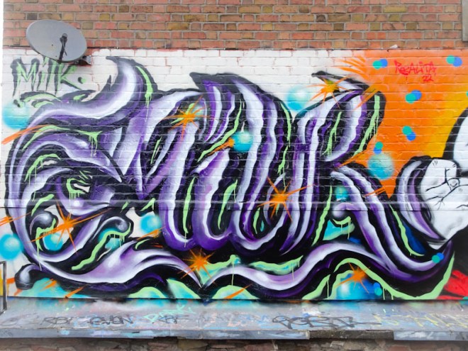
A gallery of superb graffiti writing from Wxttsart, a.k.a. whatsxmilk. Writing the word MILK in a cross-over of anti-style and calligraffiti.
Instagram: @whatsxmilk


I am enjoying the regular flow of MILK from Wxttsart, and this yellow and black number from a paint jam in the tunnel a little while back is another great example of his writing that is definitely crossing-over into calligraffiti.

His two-tone grey letters have a mid-line running through them and a yellow 3D shadow dropping off to the left, providing some depth to the writing. Adding a little bit of interest are some lightening strikes at the base of the letters and a few highlight spots, without which the piece might appear to be a little flat. Some nice work from Wxttsart.
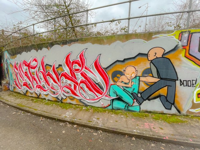
I knew that upgrading my mobile phone was a good idea, not just because my old one was becoming a liability, but because the new one has a camera with the capability of going slightly wide-angle, without distorting images too much. At last I have a better chance of capturing those pieces painted in narrow spaces. This collaboration is one such piece.
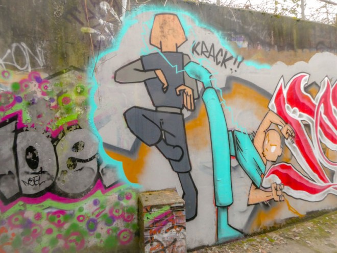
Wxttsart and Rudini Dudini have joined forces to create this beautifully book-ended graffiti writing piece. The characters at each end of the writing are by Rudini Dudini, and are conducting some form of martial art… Krack!!

The cartoon-style characters are fairly typical of Rudini Dudini’s work and are playing out a story. The characters in blue are fighting off the attackers in grey and guarding the writing in the middle.

Which brings us on to yet another stunning piece of stylised calligraffiti writing by Wxttsart, spelling as you would expect ‘MILK’. This really is an exceptionally well executed piece with loads of texture and interest in the letters. From where I sit, he is just getting better and better.
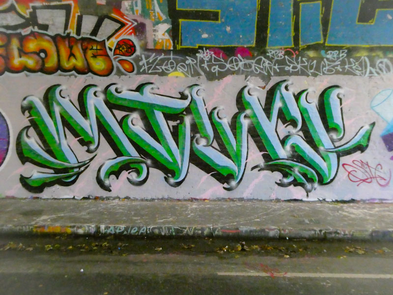
In the tunnel, alongside some of his LRS crew mates, is another wonderful MILK piece from Wxttsart. The more I see of his work, the more I want to categorise it as calligraffiti, because of the uniformity of letter style and the central line running down each letter, and it has a heraldic look to it.

Every time I see the word MILK on a wall, it just makes me laugh. The word is so incongruous in the settings wher we find it and with the graffiti art form. It is a word I would more readily associate with wholesome activities, such as having a cup of tea or a bowl of cereal. Well done to Wxttsart for breaking the mould on this one.
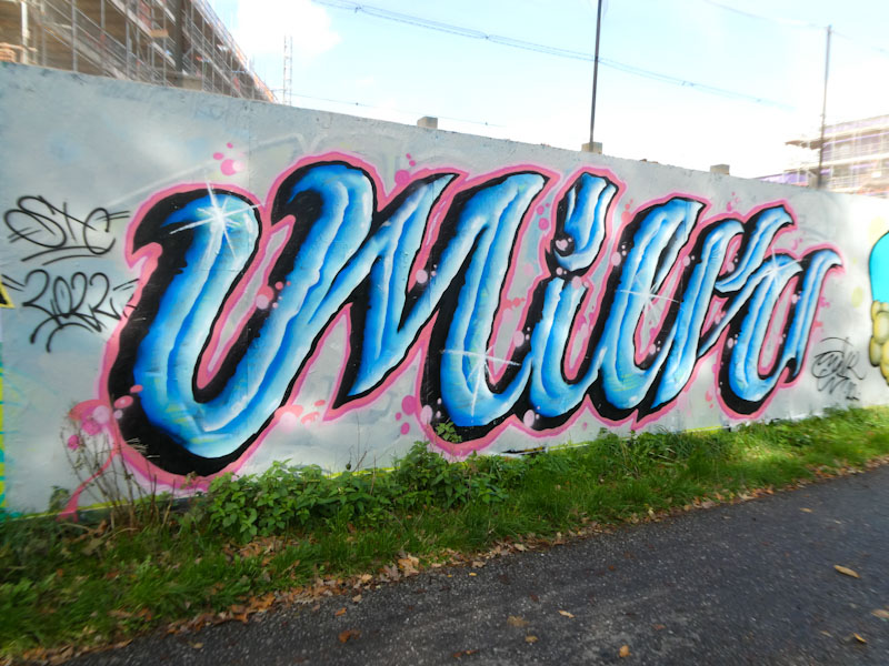
Often painting with his LRS crew mates, Wxttsart continues to charm us with his unconventional graffiti writing style and funny word ‘MILK’. It always amuses me that anyone would write milk, and I’d love to know what the story of the genesis of these letters was.
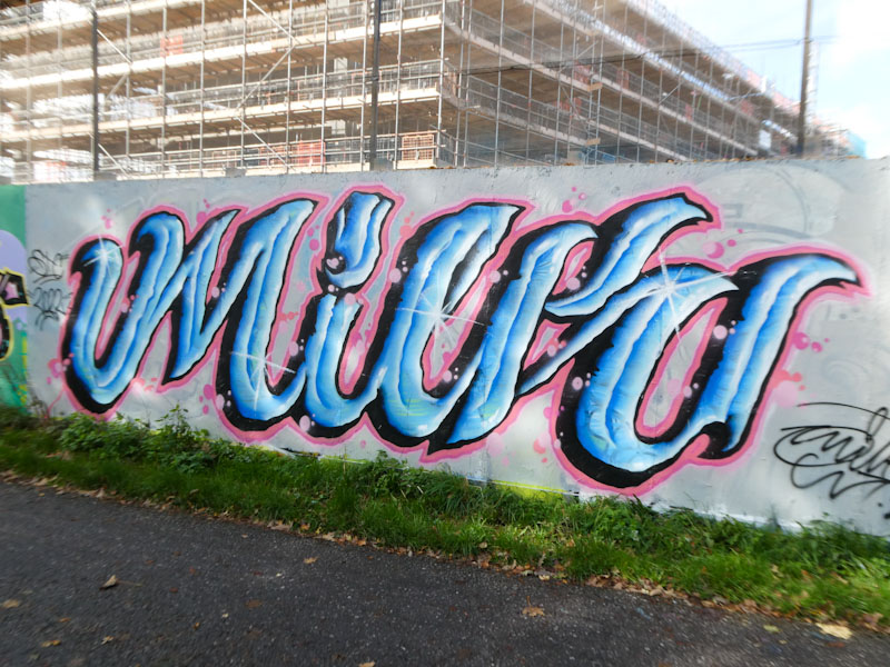
The colours light blue and pink go so well together, and Wxttsart has made great use of the match with some stunning blue letters bounded with a fine pink border. I would describe Wxttsart’s style as a mash up of anti-graffiti and calligraffiti, which is a rare achievement, because those two styles are probably at opposite ends of the writing spectrum. A refreshing piece from Wxttsart.

A short couple of posts today, I have things to do and people to see etc. and have left everything a bit late.
This is a fine piece of writing by Wxttsart in Peel Street Green. It is a nice tidy piece and is verging on the style of calligraffiti with its uniform lettering style, but a touch of Wxttsart chaos.
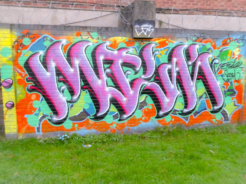
I love his letters MILK, it somehow softens the edge presented by graffiti in the first place, unthreatening and wholesome. Another fine piece of writing from the artist. More to come very soon…
Wxttsart is an established member of the Bristol LRS crew, and when there is an LRS paint jam, he is usually there. His work is easily identified as he is the only artist who writes ‘MILK’, to my knowledge. But of course, it isn’t just his letters that mark out his work, but the style too.
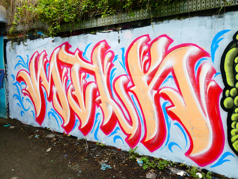
Wxttsart has created a decorative piece of graffiti writing, verging on calligraffiti, with cream letters and a red 3D shadow. For me, though, the whole thing is brought to life by the blue feathering surrounding the piece, and the white highlights on the letters, both of which lift this piece significantly.
‘Milk’ seems to be such an unusual word to choose for a writer, but I guess there is plenty of scope for playing with letters, and it is certainly memorable; I would be interested to know why Wxttsart chose it. Whatever the reason, he has made it his own and Bristol is becoming a bit of a Milk city.

Wxttsart creates these script letters that feel quite organic in both the wobbliness of the letters and the fills, in contrast to some writers where it is all about straight lines or solid fills or angles etc, this somehow feels much more free and expressive. Some lovely blue drips to finish the piece off. Nice work from this LRS crew member.
If you see the word ‘Milk’ written in a streaky script style on a Bristol wall, the liklihood is that is is by Wxttsart. In recent months the number of these pieces has swelled significantly, and Wxttsart would appear to be a rather busy man.
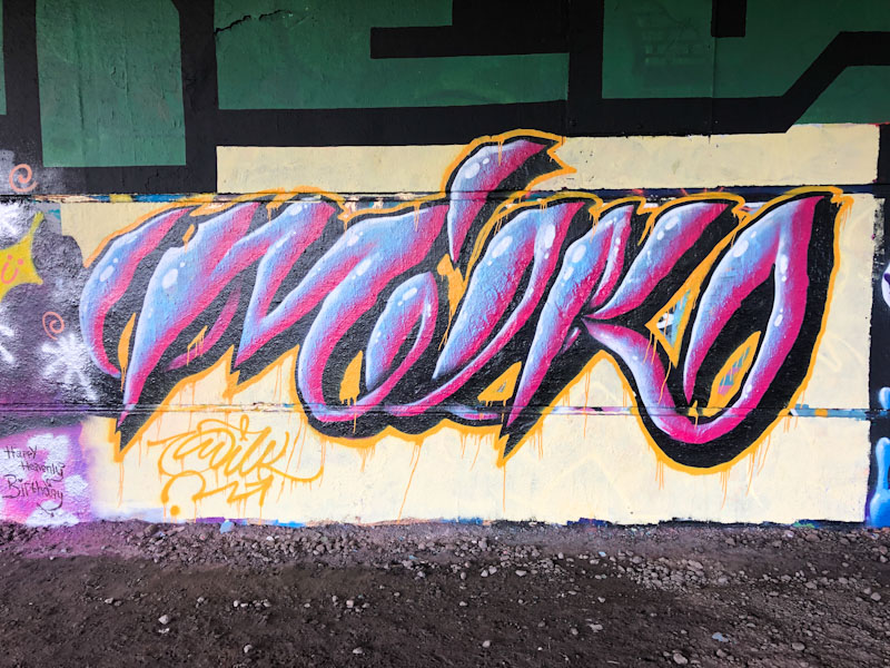
This fine piece is on the long wall under Brunel Way, and showcases Wxttsaet’s fine skill as a graffiti writer. His style is unorthodox, and very much his own, and is beautifully worked. What is quite clever about his work is that at first glance it looks a bit untidy, but on closer inspection it is very carefully crafted and finished. Watch out for more milk art in coming weeks.