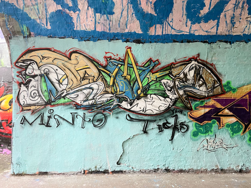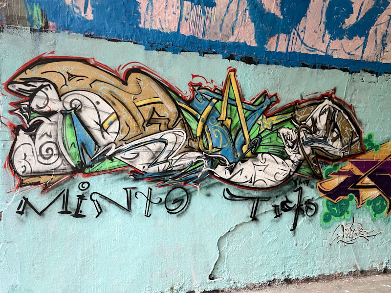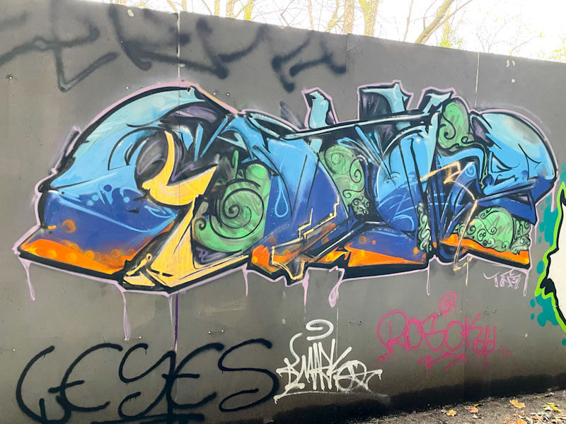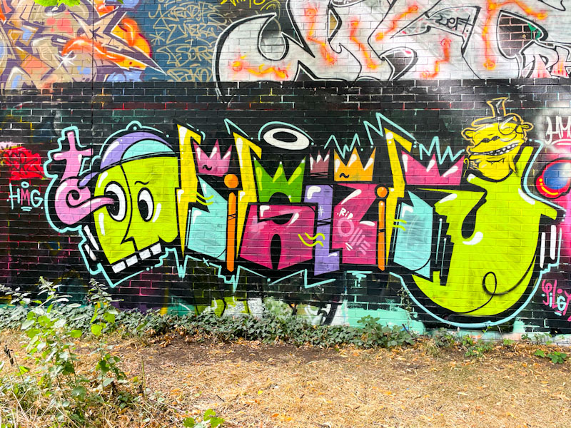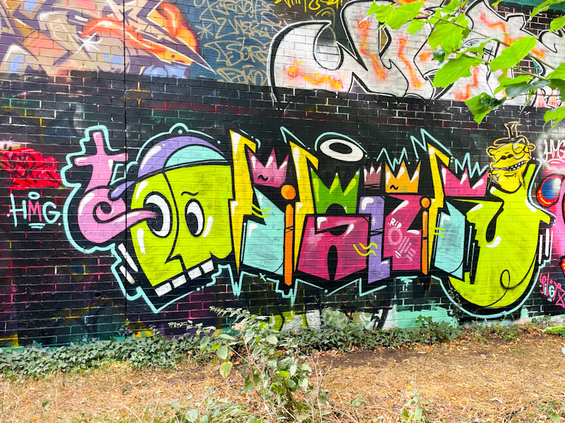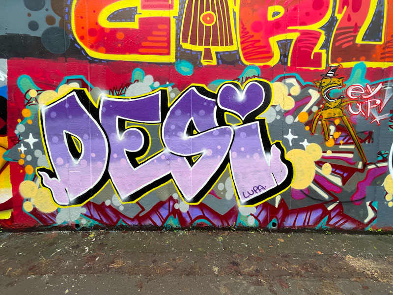
Another amazing piece of detailed sketchy writing from Posh, this time as part of the Minto Birthday paint jam. Once again, I can see letter shapes here, but really struggle to be able to read them. I could assume that they might say Posh, but Who knows?
Posh, St Werburghs, Bristol, November 2025
There are some nice earthy colours in this piece, but it is the sketchy scribbles and details that mark this out as a Posh piece. Nice script shout-outs to Minto and Ticks. I expect to see more of these in the new year.
There are a lot of contenders for surging artist of the year in Bristol, and what I mean by that is artists who have been about a while, but taken huge steps forward in 2025. Candidates would include, Zinso, Asre, Creamylines and of course, Posh.
Posh, 32 Spot, Bristol, December 2025
In the latter half of the year, Posh appears to have been concentrating on his graffiti writing. His style is difficult to pin down, but I would describe it as ‘busy abstract scribble’. It is obvious that there are some letters here, but far less obvious what those letters might be. Posh likes to work with darkish colours, and has used this blue/green combination a few times recently. This is a nice piece, tucked away in a corner of the M32 spot.
Posh’s work has been something of a revelation this year. He manages to maintain a house-style which is like an elaborate sketch/scribble with both his graffiti writing and his character pieces. He also has a knack for inserting his characters large or small into places, seemingly just for the hell of it.
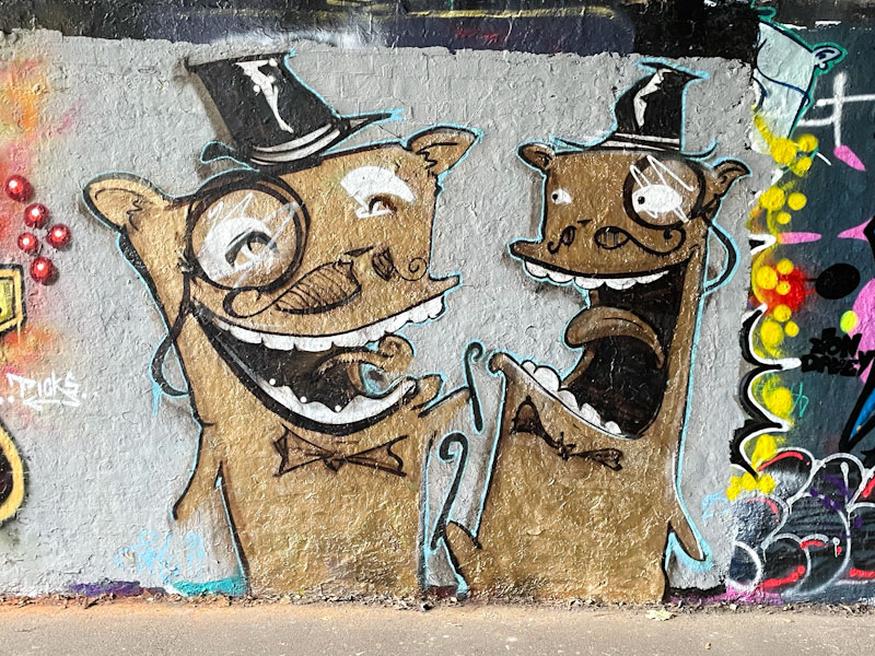
Posh, St Werburghs, Bristol, October 2025
This piece features a couple of Posh’s finest caricature characters, with bow ties, top hats, canes and monocles. They represent the epitome of poshness, which is exactly what he is setting out to do and does so well. There is so much life in the piece, and we can only imagine what hollow conversation is going on between the pair. Great work by Posh.
Posh has been on fire since the spring, and it has been a pure joy to see the wide range of characters and writing from the artist over that time. His style is rather unusual, and probably best described as a form of paint sketch work, incorporating tons of busy detail… perhaps the sign of a busy mind.
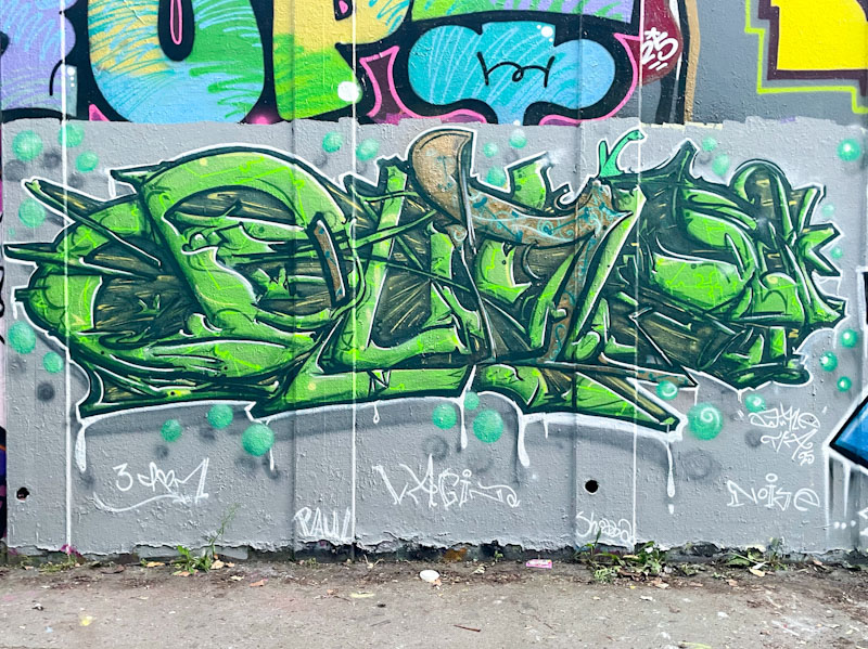
Posh, M32 roundabout, Bristol, September 2025
I think these heavily disguised letters spell POSH, although they could pretty much spell anything. The complexity and depth of the piece is quite mind-boggling, with layer upon layer of detail. I rather like the subtle shift of colour two-thirds of the way through the piece, with brassy tones. Fabulous work from Posh.
I would say that 2025 has been the year when Posh upgraded from being a bit-part player to a fully fledged star of the Bristol street art scene. His occasional little characters have developed into a diverse range of larger combination pieces that show off his unquestionable talent.
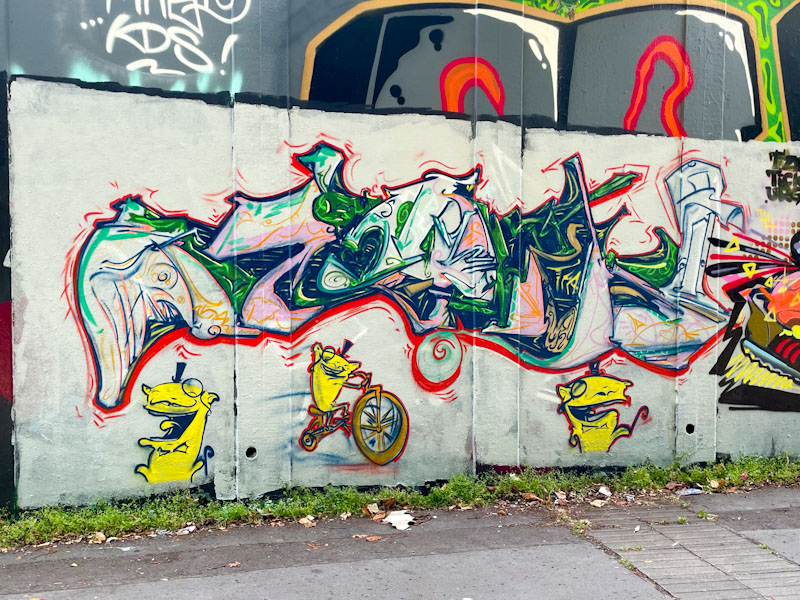
Posh, M32 roundabout, Bristol, August 2025
In this piece Posh has combined his mischievous toffee-nosed imps with some unusual writing, which I can’t read, both in his sketchy style. The writing is full of colour and movement and quite unlike any other graffiti writing I have seen before. His characters continue to amuse, and I particularly like the fellow riding the bicycle. This piece is clear evidence of Posh’s growth and development.
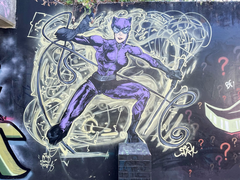
This is something a little different from Posh, demonstrating that he is so much more than a one-trick pony with his little posh characters. This is a magnificent Catwoman action hero piece – although I have never quite worked out if Catwoman was a hero or a villain – I haven’t paid enough attention.
Posh, L Dub, Bristol, July 2025
There is so much movement and activity in the piece, created by the swirls of yellow patterns all around the character. The Catwoman character herself is really well portrayed, with lots of perspective and depth, and of course her long whip for good measure. Posh is a busy man these days, and has had a purple patch this summer.
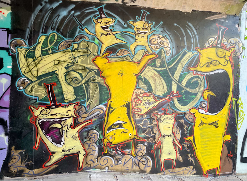
Posh has without doubt flourished this summer, turning his occasional small doodles into lively vibrant pieces filled with his mischievous top-hatted, monocled characters, these painted at L Dub, a spot that Posh seems to rather enjoy.
Posh, L Dub, Bristol, July 2025
I love Posh’s style that has a sketchbook quality to it, with a lot of action crammed in and plenty to occupy the viewer as you uncover layer after layer of story. There is some highly decorated writing that underpins the whole piece, but I am not too sure what is spells out. I could easily see these little rascals forming the central thread of illustrated children’s picture books. Great work.
Noise and Posh, Boiling Wells Lane, Bristol, August 2025
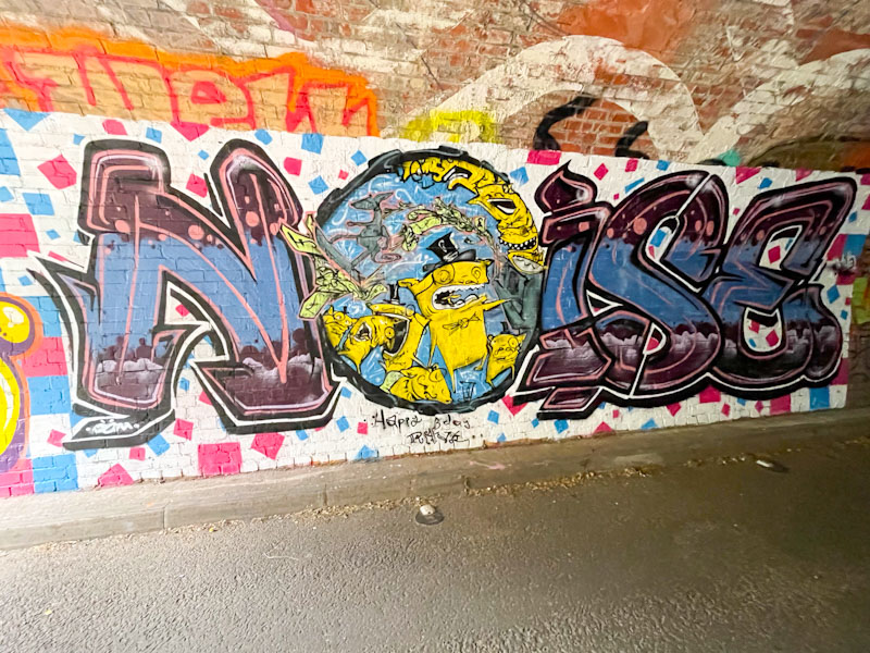
This was a bit of a find, and is a collaboration between Posh and Noise, not a pairing that I would necessarily have expected, but welcome nonetheless. Tucked away in a tunnel that is infrequently painted, but has recently come alive, this is a collaboration that won’t get as much exposure as it certainly deserves.
Noise and Posh, Boiling Wells Lane, Bristol, August 2025
Noise has painted some of his chunky letters with superbly worked horizontal fills and a rather nice midline in pink, which helps to add depth and interest. The ‘O’ of NOISE has been commandeered by Posh and brings together two very different styles.
Posh, Boiling Wells Lane, Bristol, August 2025
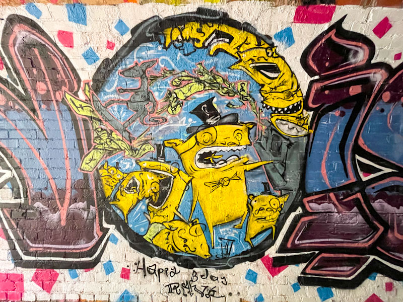
Posh has upped his game this year significantly and either works on his own, or in collaborations or augments other artist’s work, demonstrating his versatility. He has framed his little yellow posh characters within the boundary of the ‘O’, and created quite a scene, which seems to include a skateboarding kangaroo? A really unusual and fun collaboration.
Dirtygypo and Posh, Sparke Evans Park, Bristol, July 2025
Although this superb piece of graffiti writing from Dirtygypo isn’t really a collaboration, it does have a cheeky collaborative element from the inclusion of one of Posh’s distinctive characters, of which there appears to have been an outbreak of across Bristol in the last couple of months.
Dirtygypo and Posh, Sparke Evans Park, Bristol, July 2025
As with many of Dirtygypo’s pieces, each of the letters are assigned a different colour and the word it interspersed with bolts of lightening. I won’t drift into trying to interpret the word this time, I’ll simply have to wait until I meet him to find an answer. All good stuff, and another fine piece from Dirtygypo.
The emphasis of this post will walk through how augmentation works. In street art circles, augmentation (adding to an existing piece) is relatively rare and can be considered as a little insulting to the original artist, or lacking in creativity. On the other hand, it can be seen as flattering and complementary to the original work. Here is a wonderful example of a piece by Mr Klue that has been augmented by Posh.
Mr Klue, St Werburghs, Bristol, May 2025
This rather nice purple ‘KLUE’ abstract writing has been hanging around at the entrance to the tunnel for quite a while, which doesn’t really come as much of a surprise as he kind of ‘owns’ this spot, by occupation at least. The purple is beautifully picked out with white and yellow highlights that create wonderful depth to the piece. Now all is just fine and dandy, and then along comes Posh!
Mr Klue and Posh, St Werburghs, Bristol, July 2025
Quite a while after this piece was painted by Mr Klue, Posh came along and added into it three posh characters, in yellow, picking out some of the colour in the original piece. These ‘toffs’ have a strong political message, one that picked up a lot of coverage at the Glastonbury Festival, ‘Death 2 the IDF’. Once again, street art acts as a wonderful commentary on contemporary issues, and has an important role to play in free speech and expression. This is a great example of how augmentation can work really well, and Mr Klue thought it was rather funny.