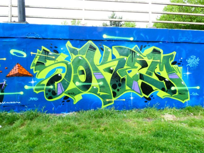
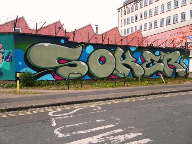
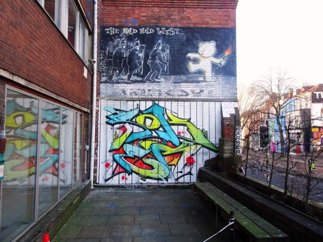
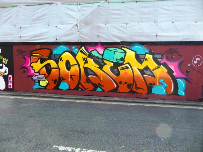
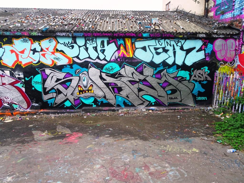
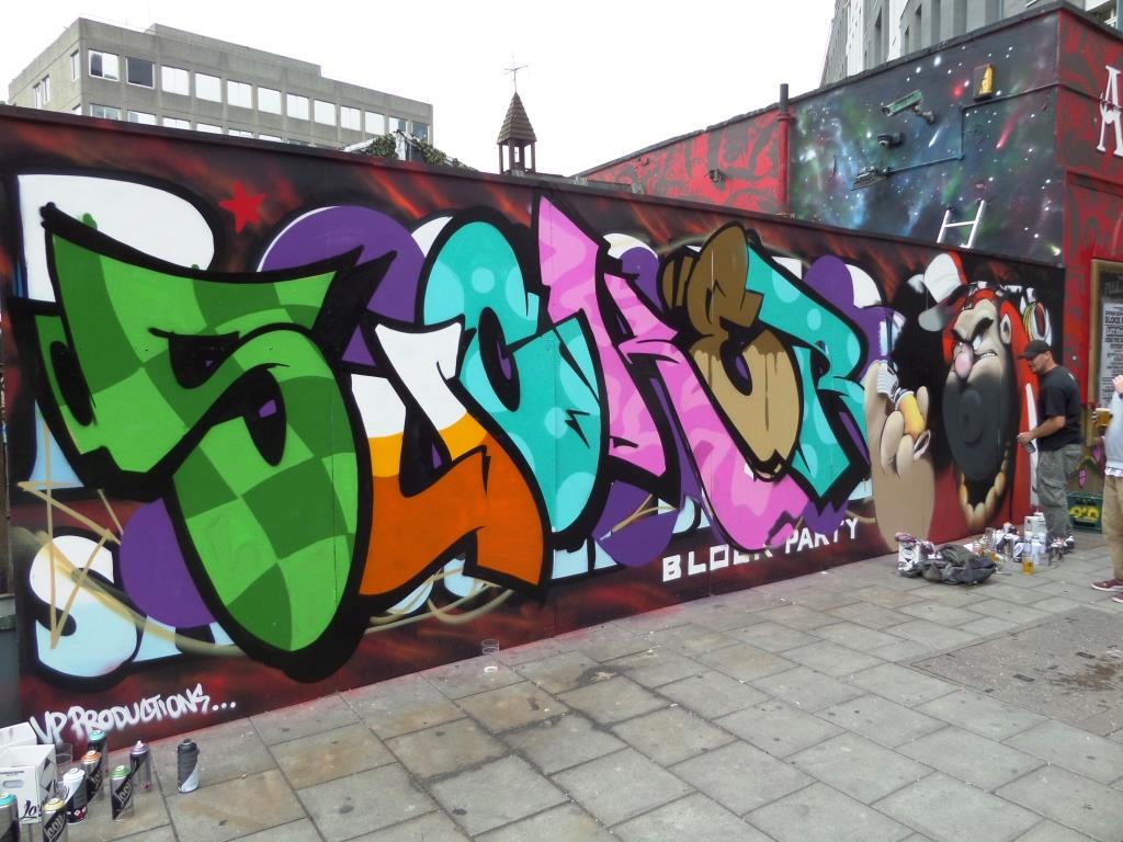
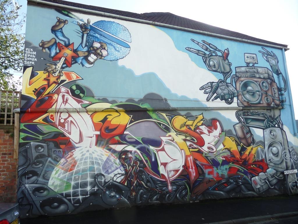
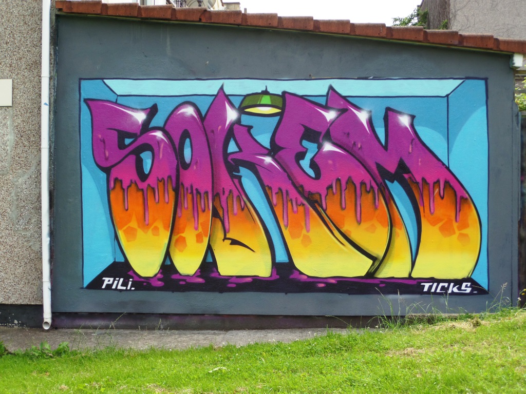
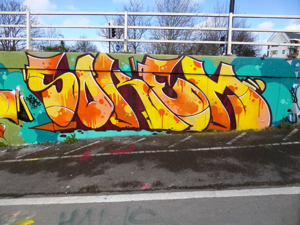
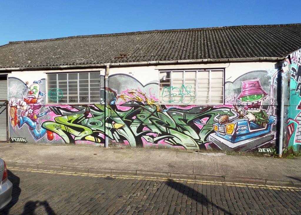
You’d need to go back to 2018 to remember this beauty from Soker. I don’t know how, but this piece got stranded and forgotten deep within my archive, and a quick delve has unearthed it for me to post today. Soker is one of the very best writers in Bristol, which is why it is a little surprising that I never posted this one.
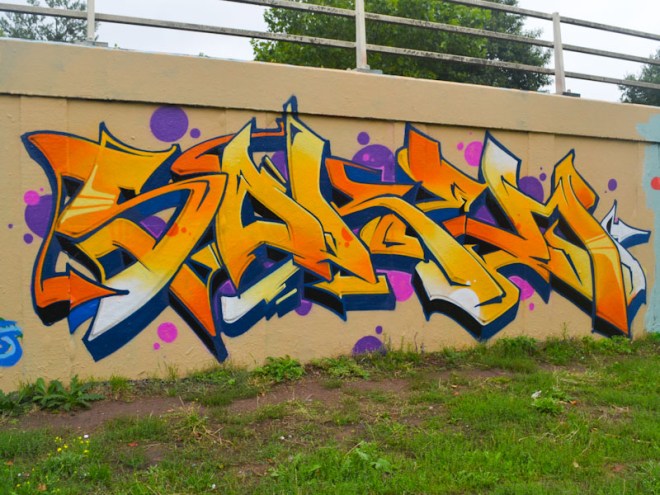
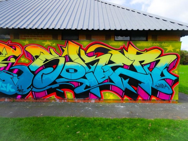
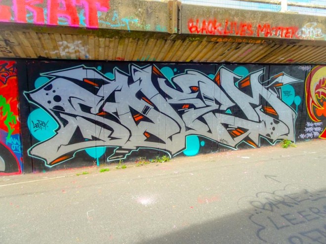
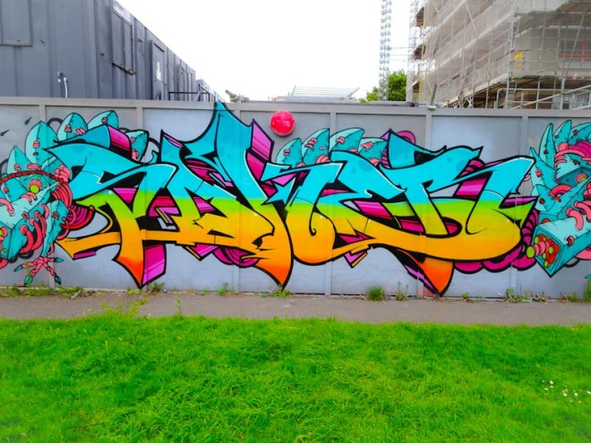
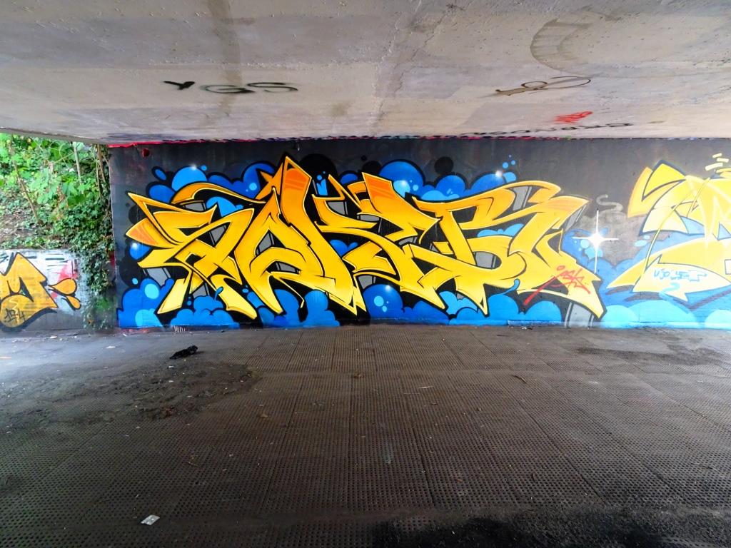
The first thing to grab the attention is the classy colour palette. The fills in the seamlessly intertwined letters are of the very highest class, drifting from which, through yellow to oranges with consummate ease. The letters spelling SOKEM are pretty much perfect, and so cleanly finished. The buffed wall helps the piece to stand out and the pink and purple spots the cherry on the top. As close to perfect wildstyle writing as you will see.