A gallery of outstanding graffiti writing and character pieces from Bristol’s Taboo
All photographs by Scooj


A gallery of outstanding graffiti writing and character pieces from Bristol’s Taboo
All photographs by Scooj


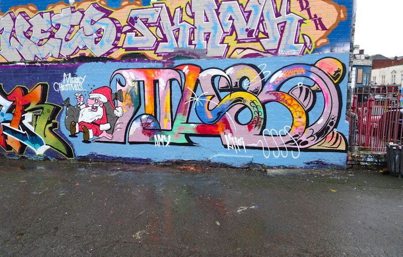
There was quite a good show of Christmas pieces this year including this colourful beauty by Taboo in Dean Lane skate park. As we expect, Taboo’s unconventional writing style challenges us and pushed the boundaries of what we are accustomed to. I love that about his work, he really is leading the way by thinking outside the box.

Although his style is progressive, the format is more conventional with a character, in this instance Father Christmas, combined with the graffiti writing. Santa is looking a little worse for wear, enjoying some Christmas bubbly but the writing, spelling out TABOO, is uplifting and colourful to reflect the Christmas spirit. This is probably my favourite Christmas piece year.
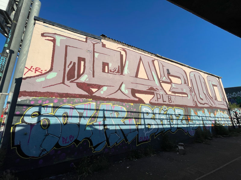
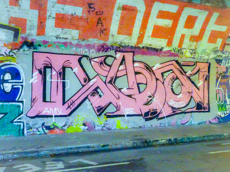
One of the most consistent Bristol graffiti writers (plus characters) of 2020 was Taboo, whose imaginative and unconventional creations brightened up walls all over the city. Although not to everyone’s taste, his unique style and obvious (underplayed) talent brought us a succession of notable and humorous pieces.

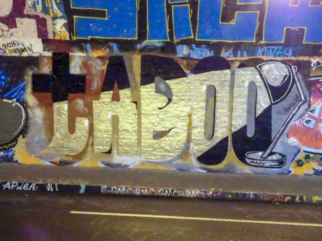
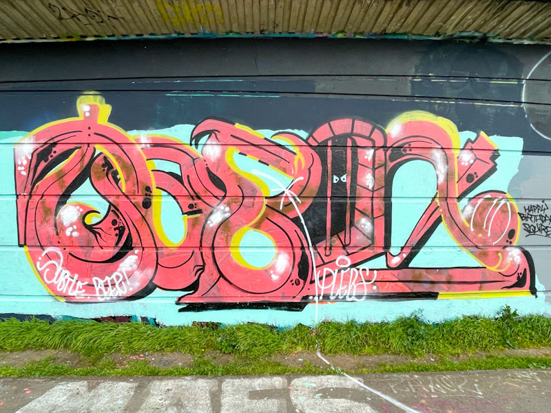
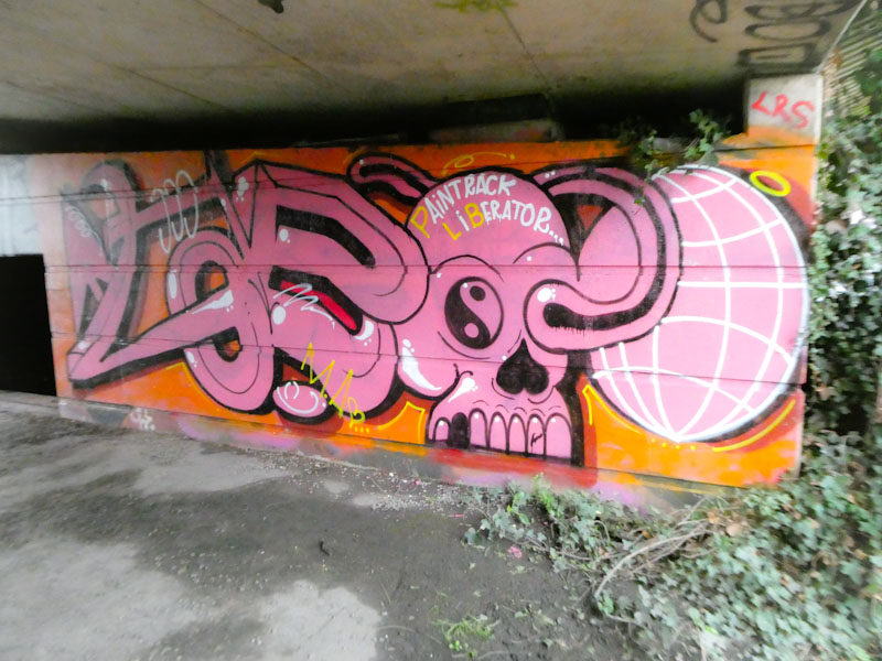
This one in St Werburghs tunnel takes us deep into his root style of oddly shaped letters (spelling TABOO), his favourite pink and black colours and a sense of anarchy that I really like. I had to auto-fix the colours on Photoshop for this one, without which the whole thing looked yellow from the horrible lighting in the tunnel.
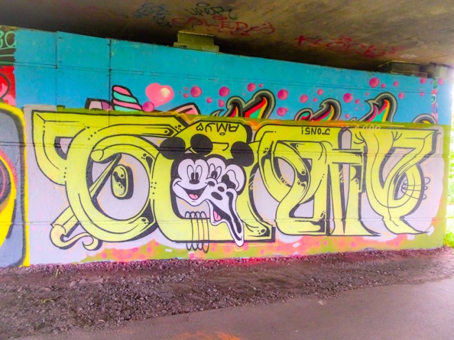
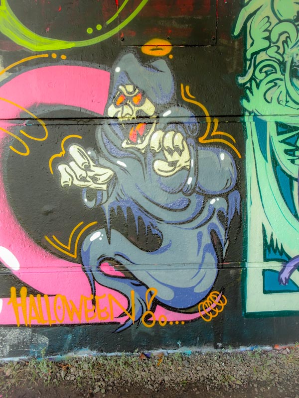
Virtually impossible to photograph properly, but wonderful to see is this Halloween Taboo piece. I seem to recall a little while ago saying that I hadn’t found many Halloween pieces this year – well, scratch that, I have found rather a lot, and on this wall there were six or seven alone.

It is tricky to see the full Taboo on this, but I think you get the idea, and the character ghost is absolutely brilliant. I think the contrast between Taboo’s letters and characters is what makes his work so interesting, almost as if they are by two different artists.

A very fine piece indeed.
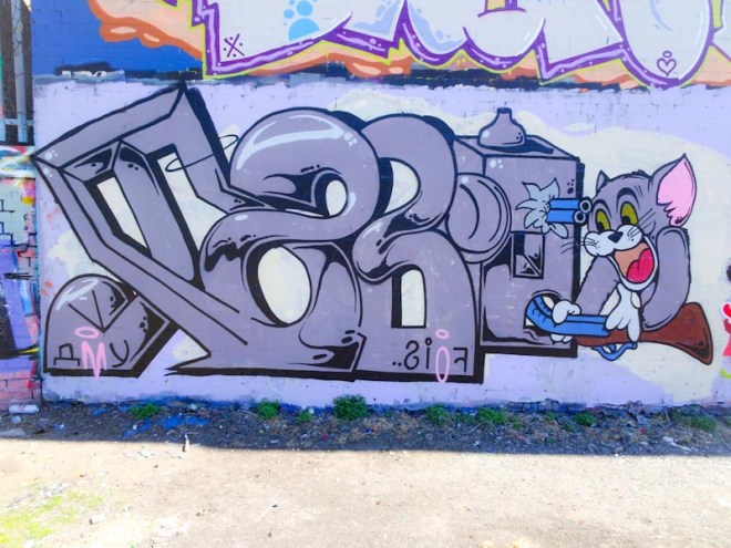
This is the second recent piece from Taboo, the other one was in Dean Lane skate park. A feature of both of these superb pieces is the use of lots of colour, which is noteworthy simply because many of his pieces can be based around two or three colours. Perhaps he has been on a recent spending spree.

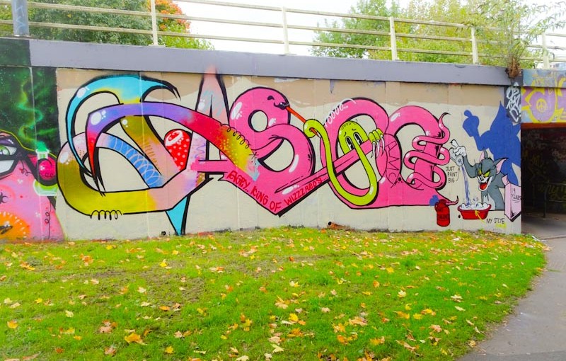
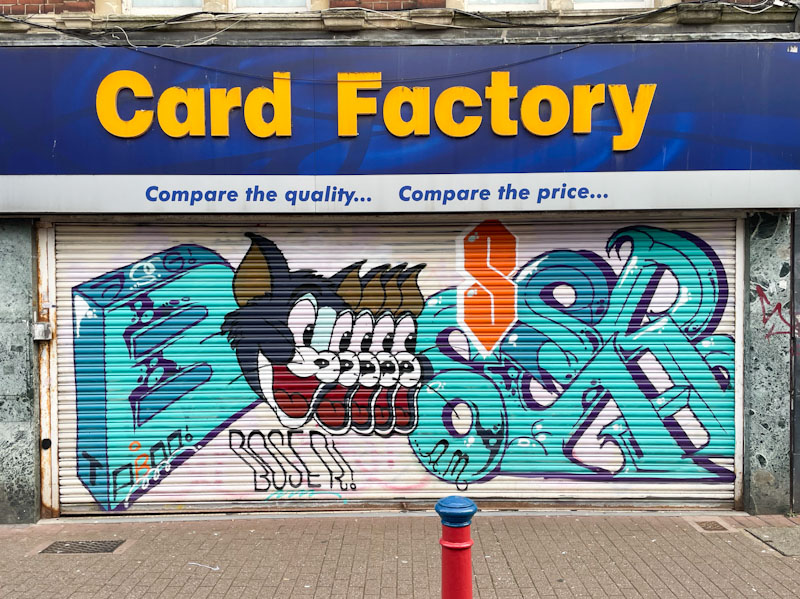
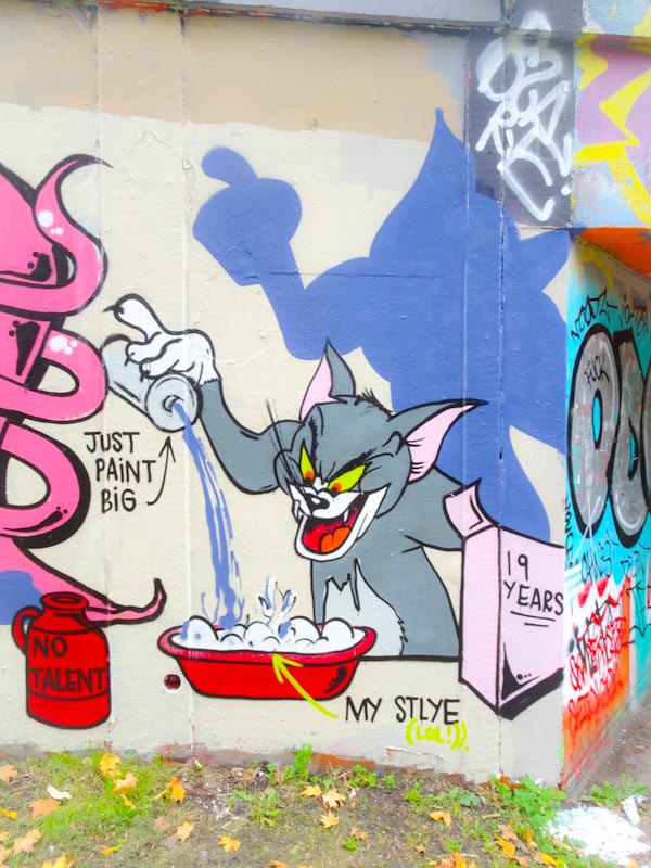
Taboo has stuck to his usual tradition of writing his name followed with a character piece, which will be familiar to most of you as Tom cat from Tom and Jerry. In addition there is an appearance from his Kilroy (was here) character in yellow peering out from one of the ‘O’s.

The Tom is superbly painted and the story being told here would indicate that Taboo considers his work to have been 19 years in the making and combines a mixed up style underpinned by no talent and painting big. I fear this is a modest story, and I consider this piece to demonstrate his obvious talents for all to see. Unusual yes, but nonetheless skilled and creative.
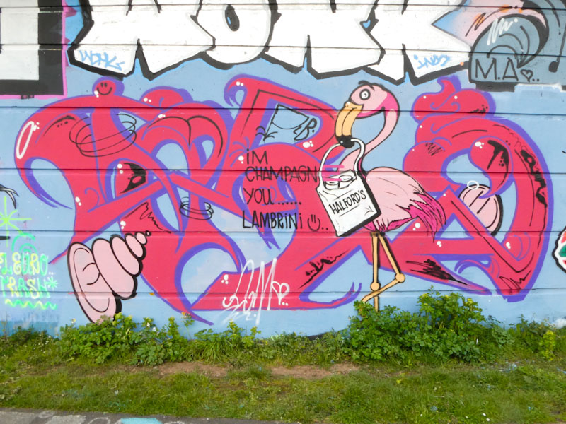
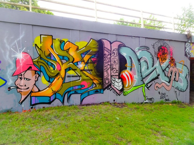
Taboo has been busy again, this time with an uncharacteristically colourful piece in Dean Lane skate park. As with most Taboo pieces, this one is a graffiti writing and character combination and is certainly eye catching.

The letters are unruly as always, not following any strict code of script, rather they appear to be crafted on-the-hoof in an organic creative outpouring. The colours and fills are to be admired and the whole thing is really rather attractive.

Of course, the eye is drawn to the Popeye Character flipping open a tin of spinach, that rather surprisingly has spewed out a train, arcing over his head. What the f…? Whenever I look at pieces by Taboo, I am drawn into a deeply surreal place where anything is possible. This one is a classic.
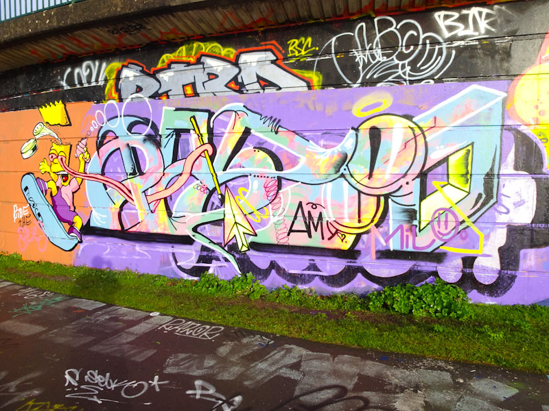
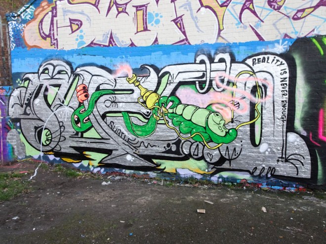
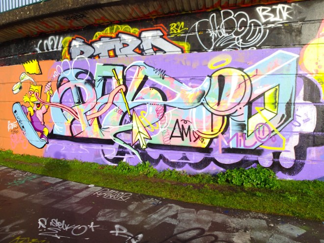
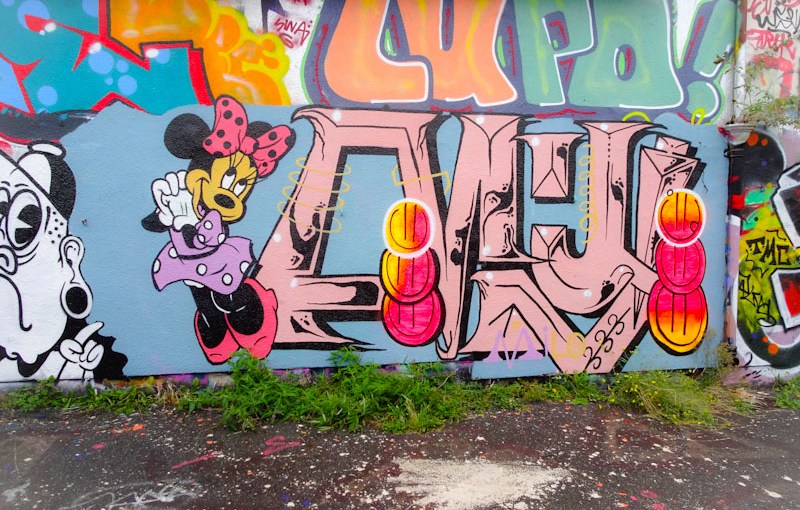
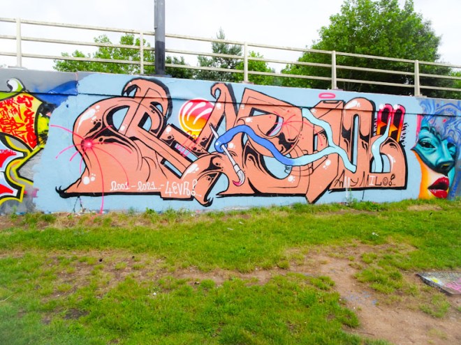
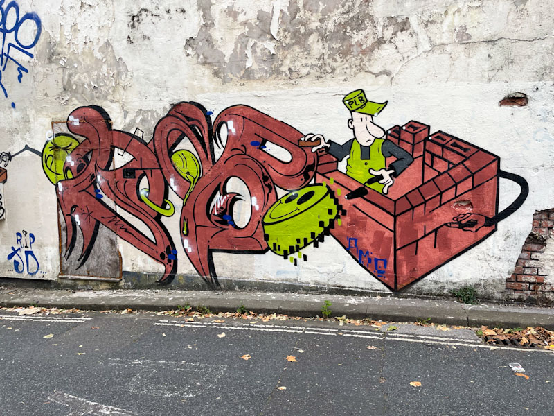
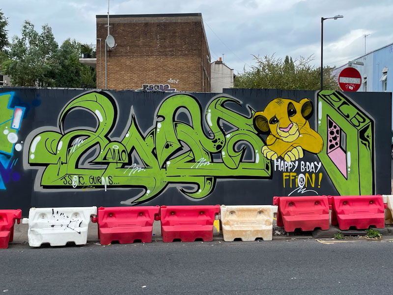
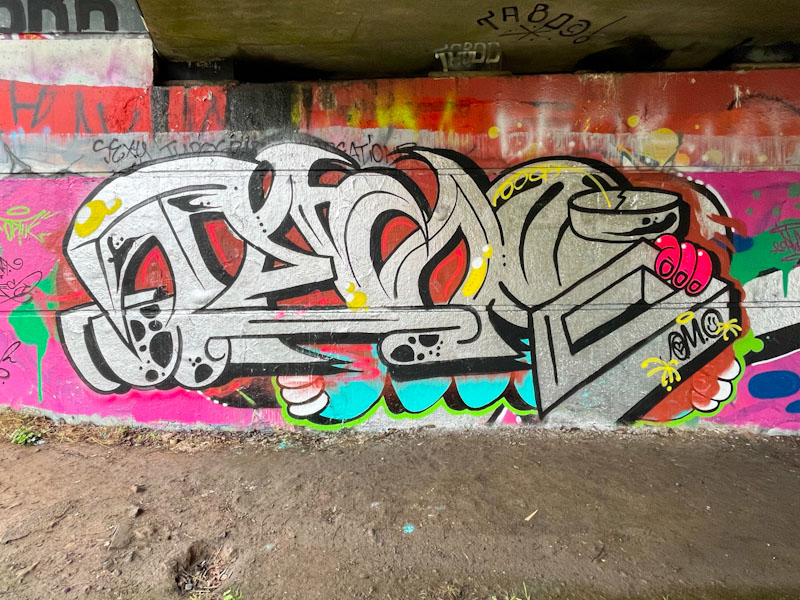
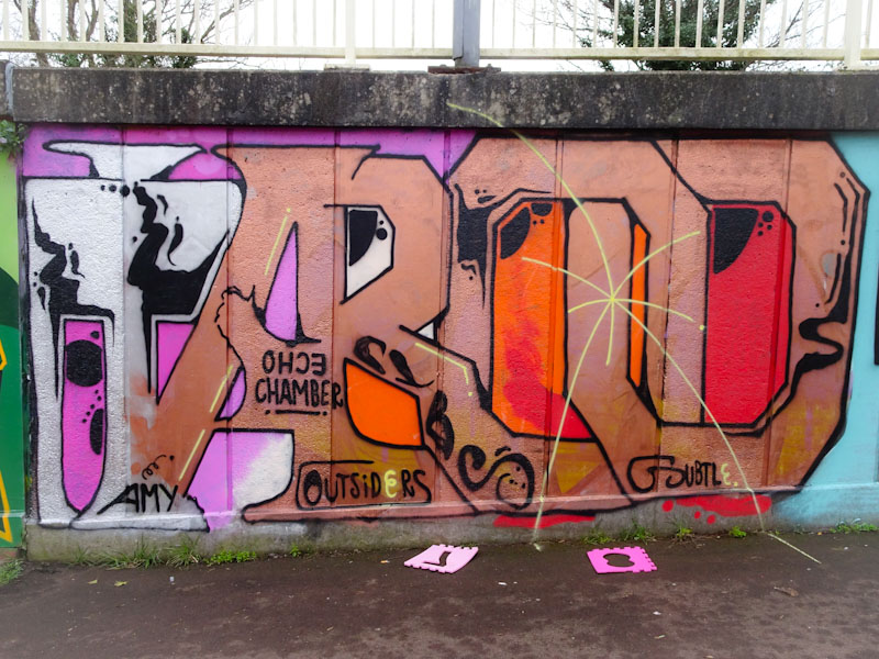
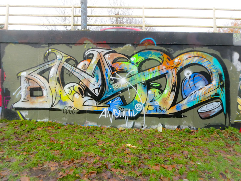
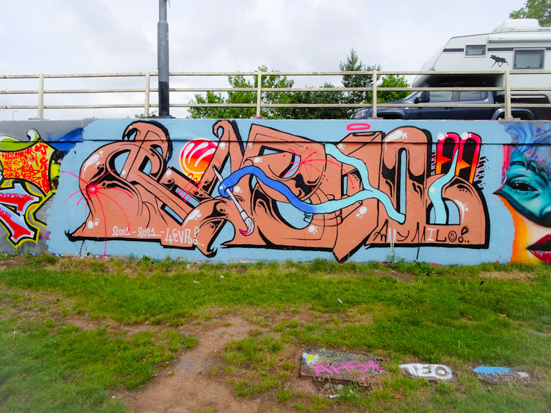
One of the busiest artists over the summer has been Taboo with his rather unconventional style of writing. Why is it unconventional I hear you ask… tumbleweed… well I’ll give you my perspective. His letters look like they are made of rubber. They have no consistent form or size and don’t seem to follow any formula or rules. Letters may be stretched or condensed and some are replaced with motifs or characters. His pieces are quite anarchic in a graffiti writing world that is surprisingly conventional.

This one under Brunel Way by the riverside spells out TABOO with a wobbly skull between the T and A. An Ionic column makes a random appearance in the first O. Unusal and interesting ans as I said at the start unconventional.
Moon Street still holds an important place in my heart. Although it rarely hosts ‘top end’ pieces it represents, for me anyway, the beating heart of the Bristol graffiti scene. The area around Moon Street is steadily being gentrified, and in time these images of street/graffiti art will be distant memories. I don’t recall seeing a Taboo piece in this street before, so I was thrilled to come across this one recently.

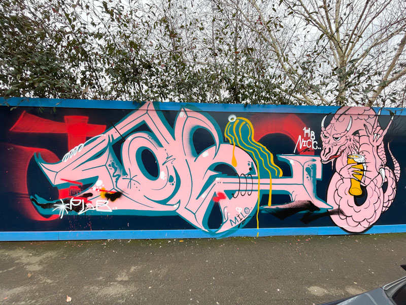
This new piece is beautifully laid out on a blue background that gives it some prominence. In typical fashion, Taboo’s unconventional lettering style spells out TABOO with a long-nosed character on the left and a ghostly face constituting the second O. As is often the case, there is a little shout-out to his girlfriend Amy. I’m really enjoying Taboo’s work at the moment.
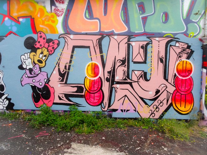
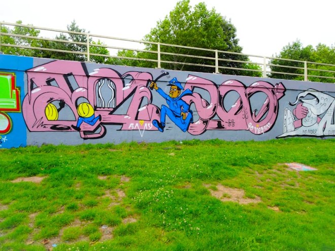
Taboo clearly has a great sense of fun which really comes out in his work. He is an unconventional graffiti writer using large curvy and often erratic lettering that appears to be being used by a number of ‘new school’ artists in Bristol.

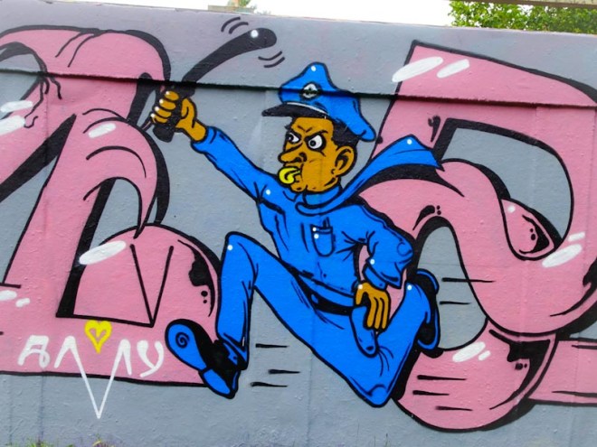
Taboo has incorporated a policeman, looking very much like an American cop, chasing after a smiley face that is scuttling away to the left of the piece. Although his work sometimes looks a bit ragged, I consider Taboo to be a talented street artist who is pushing the boundaries of convention.

The workmanship of the cop character is skilfully done and almost feels slightly underplayed and modest. On its own it would stand up as a fine piece of work. Looking forward to seeing where Taboo will take us next.
Taboo has been so, so busy lately, and up until yesterday he had three large pieces spread out on this wall of which this is one. Taboo is different and most creative. His writing is unlike any other we see about the place and his characters play an integral role in the writing rather than a cheerful add-on. Ok… let’s get this straight… this is not by Taboo, but by Whos, whose writing looks like Taboo’s. So scratch the first half of this paragraph.

I would love to say that the writing says TABOO, but I can’t fully see it myself, so maybe it says something else (yep, it says WHOS). Embracing the letters is a long-armed character, possibly an inmate, because the thrust of the piece is articulated along the bottom ‘no more super prisons’. The sun and the green dog add extra colour and interest. A fine piece from Whos.