Sanctimonious
sour-faced and miserable;
sucks the joy from life.
by Scooj
Sanctimonious
sour-faced and miserable;
sucks the joy from life.
by Scooj
A very quick seasonal piece from Biers. I was lucky enough to come across the artist while he was spraying this piece, but all was not well. The walls were damp and the blue paint hadn’t really properly obscured the graffiti behind it, and it wasn’t drying, which made spraying rather difficult.

There are a few things going on here – the christmas pudding appears to spell out NFS, which might be short for ‘no frills’ a phrase used by Biers in his works. There is deliberate ambiguity here where the pudding might also spell out ‘Noel’.

Even though Biers was quite unhappy with the whole thing, I rather like it, and it is always nice to see these festive pieces. He told me that it is a shortened version of a larger piece that he has an ambition to do. I won’t spoil the surprise, just on case he ever gets time to do the full thing.
small pockets of snow
remain in shady hollows;
there on borrowed time.
by Scooj
This is an extraordinary three piece collaboration by Face F1st and Soap from the PWA crew (Pirate Wall Art). I have featured Face F1st many, many times on this blog, and recently Soap has made a reappearance. Now the two have combined to create these three masterful pieces.

From left to right, the first has a Face F1st face resting atop a soap pair of mouths, which when viewed differently also make the eyes of a skull face. The top face in this piece is very large and the whole thing is clean and has little in the way of detailed work.

The middle piece is more colourful and offers more embelishments and detail. This time the Face F1st part sits beneath the Soap.
The third part of the collaboration is more similar to the middle piece, showing more in the way of detail and decoration. I particularly like the bubbles and patterns in the hair of the Face F1st piece. Another interesting feature is the way that Face F1st has sprayed three circles in the centre of the eyes, those large eyes, which seems to add complexity to the emotion of the face. A lovely collaboration.
I first became aware of PakOne a couple of years back when I found a piece by him that he did for Upfest 2015 in the Steam Crane. Even then I was impressed with the depth he gives to his work through the clever use of shadows and perspective.

This year’s piece is an absolute gem and utterly beautiful, made even more so by the scattered street furniture surrounding it. A floating rock with a tree in full pink blossom, isn’t this what dreams are made of?
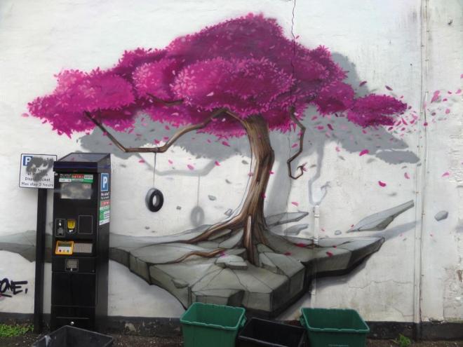
I tried striking up a conversation with the artist, but I think his English is about as good as my French, so we exchanged nods and I went on my way. This is an outstanding Upfest piece.
Door 12

The doors of this church have been boarded up since 1999 when it closed. In 2016 a fire caused structural damage to this listed building and I expect that is when this door was fitted.
The building has not had the easiest of times, having been hit by an incendiary bomb in 1941 during the Bristol blitz. There is more interesting information about this church on the short Wikipedia page.
by Scooj
Table top
covered with new snow
and a leaf
since fallen
reminder of passing time
and lifetime consumed.
by Scooj
Surely one of the most endearing and sympathetic partnerships is that between Copyright and Gemma Compton. At this year’s Upfest these two produced this beautiful collaboration in the very busy yard behind the Steam Crane.

I met them on the Friday, when they were able to make a really good start before the festival started on the Saturday – I think it ws a wise choice as this pub gets incredibly busy.
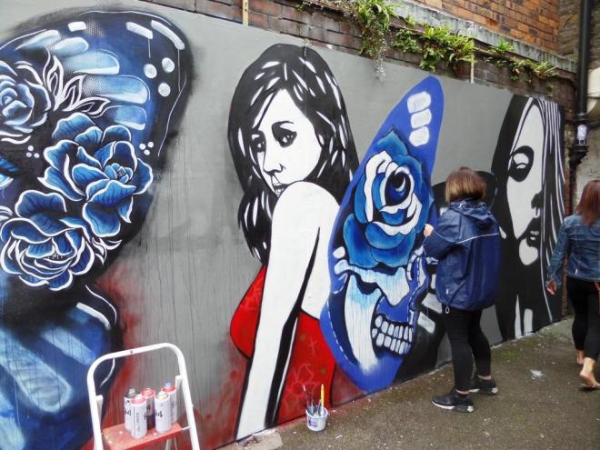
In this piece, so typical of their collaborations, Copyright stencilled the female figures and Gemma Compton created the intricate butterfly wings in her favoured blue tones. The piece as a whole fills this slightly awkward space brilliantly and the eye is drawn along from left to right and back, scrutinising the symmetry of the piece.
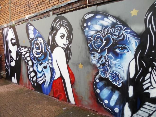
The couple managed to dodge the showers and the crowds to pull off one of the best pieces of the festival and one that screams out Bristol from every inch. Both of these artists produce wonderful artworks for sale, marginally outside my affordability although I might just have to save up – how great it would be to have some of their originals hanging up at home.

Not only do I like their work, but I like both of the artists. They are always happy to have a chat and don’t appear to mind me bothering them when they are at work. Probably my next interview targets.
I met Mr Sleven for the first time this week. He was spraying something outside the Matchbox Gallery in Stokes Croft. As I approached, I asked him his name. He said why, so I told him that I photograph and write about street art in Bristol. Then I told him not to tell me his name and I guessed. I looked at his work and said that it looked like the work of Mr Sleven, he was suitably impressed that I knew his style. In that moment I realised that I know quite a lot about this stuff, albeit in a rather chaotic and unacademic way.
Anyway that was a digression. This is his piece from upfest, which actually I don’t think I would have been able to identify were it not for the signature. It is a nicely balanced piece and the work of a real street artist…I know what I mean by that even if you don’t.
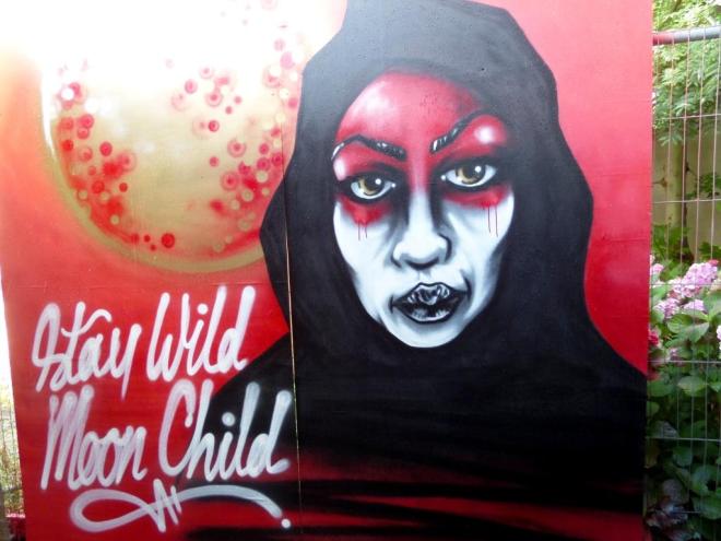
Stay wild moon child.
This is the official and rather awesome piece by Helen Bur who also left Bristol a little extra gift at the M32 roundabout. HB appears to be equally at home on a sketch pad, on canvass or on a wall, and her website showcases her work magnificently – I recommend watching the video of her piece in Cardiff.
I think Helen Bur’s work is really special and her style lends itself so very well to large walls. It would be great if she came back next year and got one of the larger permanent walls so that we could enjoy it for a year, rather than a few days.


