I love Leonard Lane. It is a strange thing I know, to love a narrow claustrophobic alleyway that smells a lot, but I can’t help myself. It was one of the first places I used to visit regularly to photograph street art and graffiti, and I return periodically soaking up its unique atmosphere.
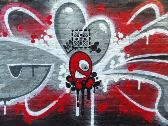
It has been a long while since anything decent went up in Leonard Lane, and how fitting that it should come from Decay. I am still trying to understand the words that accompany this piece ‘my direction will not be controlled by my excuse’.
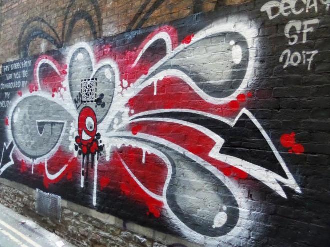
Reverting back to his normal reds, greys and blacks, Decay has really nailed this new addition to the Lane. It is also interesting how the piece has brought out the grille in the wall, which might otherwise have gone unnoticed. A lovely piece.