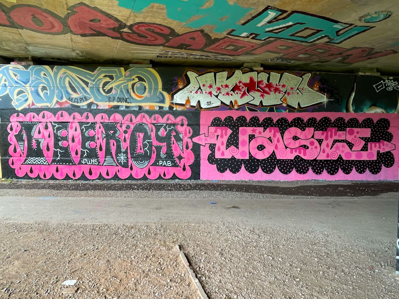
This is one of those stacked collaborations that have to be taken as a pair, because separating them might look a little bit awkward. I am not 100% sure that it was painted as a collaboration or whether both artists painted their pieces separately, but you can see that Piewaste’s piece overlaps Mage’s piece above it, and was therefore completed second.
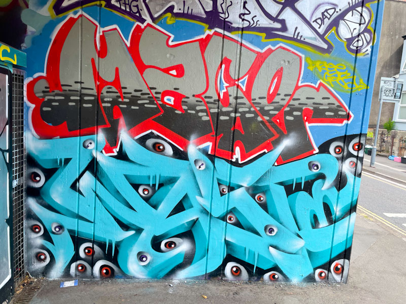
Mage has presented a regular set of letters, but with a creative fill that includes a dashed line pattern reversed out. It is great to see an artist reinventing himself in the way he has with a completely new set of letters, although I have to say I preferred his old letters.
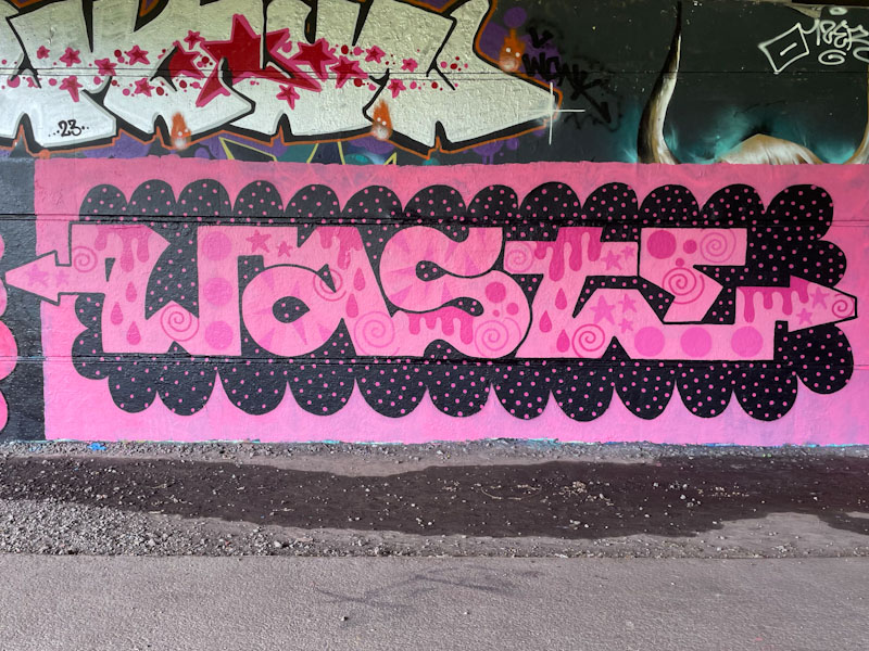
Piewaste, who has written WASTE in letters that are close to anamorphic, creating a strong sense of depth and three dimensions, also includes his trademark eyes looking out from the writing like a cartoon forest at night (kind of thing). Nice to see these two pieces together like this.