
Another rather lovely piece from Decay. It is funny how you can look at things and yet not see them. It wasn’t until I was preparing this post that I noticed the big DECAY in black on red in the background of this piece. I saw what I wanted to see, but not what was actually in front of me.
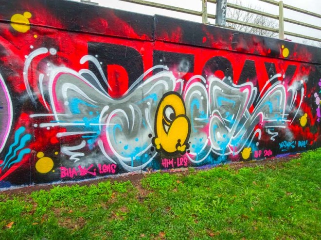
I do like the ephemeral nature of this piece of writing, almost as though it is made out of a mist or fog, with a very bright yellow ‘Chuck’ character the ‘e’ of Decay. Another nice one chalked up for 2020.

I’m really liking this new direction DK has taken with a typography style underneath the graff . . . 🙂
LikeLiked by 1 person
A new theme for 2020?
LikeLiked by 1 person
I think he definitely intends to see where it takes him . . .
LikeLike