
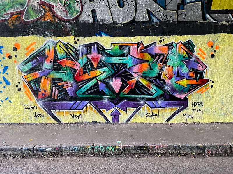
Hypo has been on fire for a couple of years now, re-emerging during Covid, and keeping up a regular rhythm of fine graffiti writing that just seems to be getting better and better. His letters lend themselves to bilateral symmetry like those of Werm, but there the similarity of graffiti writing between the two artists ends.
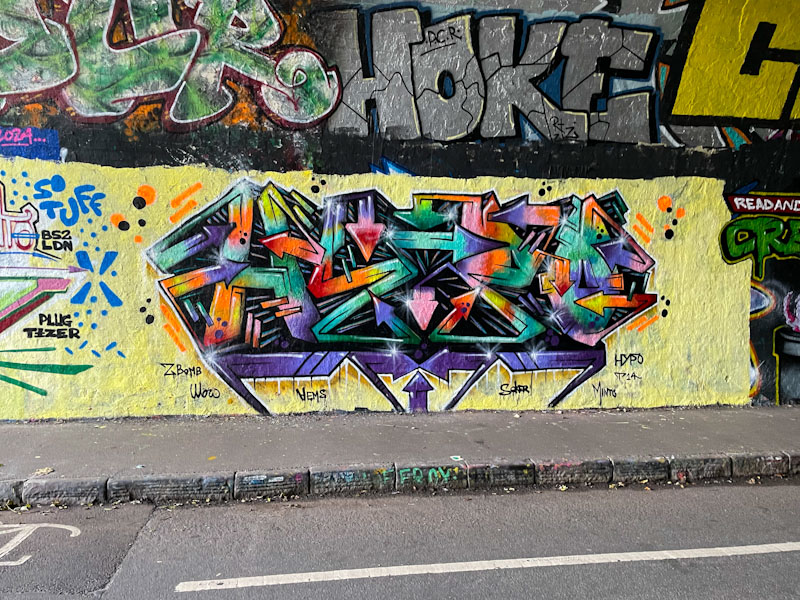
The colours in this piece are its crowning glory. Set on a neutral cream background, the wildstyle letters ‘HYPO’ are festooned with a beautifully blended selection of rainbow colours that manage to remain reasonably subtle, and whilst a colourful piece it avoids being gaudy. Very fine work from a lovely graffiti writer.

That’s a wild one, sharp and really interesting.
LikeLiked by 1 person
He has done so many, but there is something special about this one.
LikeLiked by 1 person
Certainly is.
LikeLiked by 1 person
Wondering if this is a scrap can burner . . . ???
LikeLiked by 1 person
Maybe, but beautifully done.
LikeLiked by 1 person
Indeed, an absolute beauty . . .
LikeLiked by 1 person